
- Joined
- Jun 25, 2008
- Messages
- 2,348

You are working in direct size?

(4 ratings)
 Approved


You are working in direct size?
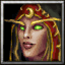
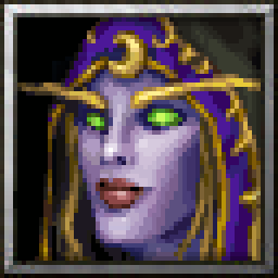
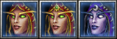
Yeah I pixel the icons, so working on 56x56 size, in this case I made mistake and worked on 64x64 and then the border cut off some details I had put in the picture (like neck etc).. xD
I don't like the idea of reducing the size for multiple reasons.You could just reduce the size, it will allow the neck to show
I don't like the idea of reducing the size for multiple reasons.
I feel like the head will be too small if I do, also if I just simply reduce the size with a tool it'll make the image blury which will reduce the quality and also as a pixel artist I like to see the pixel clusters and AA I've done. I don't think the icon would benefit too much from squeezing in few extra pixels of neck, I have a bigger concern with the bangs of her hair if they're making too much of a disconnection between the model and the icon (issue is the ingame model's portrait has the bangs but the model itself doesn't).
MS Paint.Which program are you using? there are ways to reduce sizes by hand that allow you to preserve a good looking picture/icon.
MS Paint.
I can reduce the size but I don't feel like it would improve the icon..
Oh damn btw I made big mistake, she's supposed to be blood elf lolol, fixed it.It might, try using Paint.Net


Glad you like it!That was fast!
I really like it.
Please fix her left eyebrow. It is too wavy for elf and overall looks weird.
Awaiting Update


What program are you using to do this?I don't care to put more time into converting the files to BLP and re-uploading them than it would take to do this "fix" on the icon.


wtf, why would the mods move it to substandard? all your icons are really great, and this one is no exception o-o?Feel free to move this icon to Substandard


Man icons usually are put to awaiting update for issues which make problems for the icon making it not approvable, do you think this does have really such an issue(s)? Hm.. what do you mean it's too wavy? Elves have really wavy eyebrows, observe this icon by Sin, one of the greatest icons I have ever seen:I am not interested in putting Icons to the Substandart section. This is a good quality Icon, I just suggested to fix two little things that will make it even better. If you dont have time, you dont have to make the changes right now. Theres no time limit for an icon to sit in awaiting update.

You got me wrong Yaser. My point is that left eyebrow should be more smooth.Both eyerbrows are even more wavy than this icon.
Hm.. man that's the right eyebrow (red), that's why I said there is no prob with the left eyebrow.You got me wrong Yaser. My point is that left eyebrow should be more smooth.
View attachment 299063
I wasn't referring to you. I was referring to the strange tone of voice I picked up from Scias.There is no lashing out, we're just discussing friendly. No one is disturbed.
I wasn't referring to you. I was referring to the strange tone of voice I picked up from Scias.
I use Button Manager (Icon Wizard tool), it's not about lenght of the process to convert the files and uploading them (4 icons), but I was bringing up the issue that it does take more work and time to convert & udate the icon than it does to "fix" the issue that made it unapprovable - which makes absolutely no sense to me.KILLICIDE said:What program are you using to do this?
@Scias, if you are not satisfied with review you can always ask for another 2D Art Reviewer and contact Stuff.
It did upset me that after spending 2 hours (for which I could have done many other things) making a icon for the community, and updating it multiple times afterwards.. a moderator would pick on literally 2 pixels of a eyebrow (which I intended to be that way), and decide that for some reason these 2 pixels are enough of a problem for this entire icon not to be approved. The moderators should have more respect for the artists, and consider suggesting opinion-based corrections, rather than requiring as necessary for a icon to be approved.
I would definitely not have reacted this way if I didn't see fair share of this kind of awful reviewing on the icons here, even as I joined the forum there was some drama about the icon section and my own work because it was made by pixel art. I would expect moderators to have little more respect for artists work on here since we're doing this for free, out of our own free will - I say this because the majority of issues they bring up are not artistic flaws but personal opinions they have yet somehow they don't suggest the change but demand it.
 " attitude, I wholeheartedly suggest you to digest and understand what Scias have pointed out.
This is a good quality Icon, I just suggested to fix two little things that will make it even better.
As I said before:
It's not a question will this Icon be approved or not. It is a good Icon. I just gave some time to Scias to remove thing with eye & eyebrow that, yes, in my opinion, will make icon even better. Since @Scias said that he is not going to do it, I will just set Icon to Approved.

@Maxwell is still a new reviewer and I tutored him in how to use the tools for moderation. This is my fault.
I can see where you are coming from. I suppose awaiting update should only be used if the resource would otherwise end up as restricted/substandard if feedback is not applied. A curvy brow is not enough reason for that.
I guess in the future we'd do the following:
- Awaiting update is used if the resource is about to be put into substandard/restricted because of quality issues that the author can fix.
- Approved is used if the quality is good even though the mod/reviewer has feedback to further improve it.
Does that resonate with everybody?

It seems this all stemmed from the fact that you thought this icon was not approvable simply because an eyebrow. This is a fault on our end, for not being explicit enough. The eyebrow was just a suggestion, and you are free to reject the suggestion because it is your art, and it is up to your interpration on how something should look. In the case that the icon is already in an approvable state, it will just be moved to the approved section.
However, I must point out the fact that you flaunt about how you draw icons "for free, out of [your] own free will," yet it seems that you forget that the Reviewers & Moderators do the same exact thing. If you expect us to act professional, then I ask you do the same by knowing how to respond in a respectable manner. With this in mind, Maxwell wanted to help improve your icon; was lashing out at him the appropriate response? Sorry for going back to this, but I just really hate it when people have this idea that everyone on the Staff needs to respect the users like you're all above us. We're all the same, and if you expect me to be professional, I expect the same from everyone else.
There probably are. Unfortunately, I can admit to a few cases where I would completely forget about a submission, and it would take a notification from another user or the submitter themself to remind me to go back to it. With this in mind, people can just poke at us for submissions that are long overdue.And aren't there some icons that have been stuck in "Pending Update" even though the creators have pointed out that they won't make the update?
@Shar Dundred It seems you misunderstood my whole post. My intention was not to point fingers at Scias. If you read my post, the first thing I admitted was the fault being ours; specifically, it was our fault for not being explicit, so I'm not sure how you could have missed that. The end of my post was me voicing my opinion on how much it annoys for me users to think Staff members need to act professional and nice all the time, when users can just scream and cry to get our attention. I want to have good debates about ways to improve the site, and lashing out at each other is not the way to start that, which is why I asked Scias to not lash out. I never blamed him for anything. I'm hoping you did not feel the same way @Scias, but judging from your recent post, you seemed to understand the point I was trying to get at.
There probably are. Unfortunately, I can admit to a few cases where I would completely forget about a submission, and it would take a notification from another user or the submitter themself to remind me to go back to it. With this in mind, people can just poke at us for submissions that are long overdue.
Especially considering that lorewise, the Blood Elves aren't really worshipping the moon - if anything, they are all about the sun and thus a Blood Elf with a lunar emblem kinda bugs me Damn, this escalated needlessly
Personally, I think this whole situation is nothing more than a minor misunderstanding as I don't believe that either @Maxwell or @Scias actually meant any harm.
Mistakes were made, personal frustrations have been vented and since this isn't really the best place to discuss moderation, I politely ask that we all just move on and talk about the icon itself.
---
And on that topic, I somewhat agree that the right eyebrow could be smoothed out a bit.
Also, the corresponding model doesn't have any lunar symbols on the cape/forehead, so I think it would be nice to have a version of the icon without it
But then again, these are just minor details and generally the icon is very nice, so a 5/5 rating is most definetely justified.
