🏆 Texturing Contest #33 is OPEN! Contestants must re-texture a SD unit model found in-game (Warcraft 3 Classic), recreating the unit into a peaceful NPC version. 🔗Click here to enter!
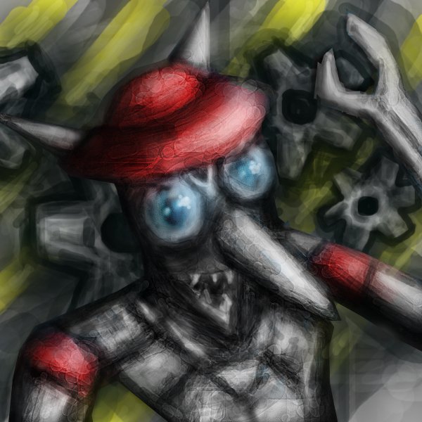
Updated 1: Changed the background for the more suitable, little changes with clockwerk
Updated 2: More lighten background, added some detail, bonus icon
Updated 3:
The background kills the whole Icon. Since this is a mechanical unit, you should consider of sharp and desaturated, grayish background. Also, it appears you use a LOT of smudge or blur tools - it's just wrong, if you aim for Warcraft III icon style - use sharp, defined, black edges. And, please, use the http://www.hiveworkshop.com/forums/tools-560/button-manager-v1-8-2-a-116280/ for creating borders.
The BTN icon is still the old one, but the improvement is amazing. Good job on this one! I would try out some sharper lines instead of fading brush, but this is well made enough.
The BTN icon is still the old one, but the improvement is amazing. Good job on this one! I would try out some sharper lines instead of fading brush, but this is well made enough.
This site uses cookies to help personalise content, tailor your experience and to keep you logged in if you register.
By continuing to use this site, you are consenting to our use of cookies.


 Approved
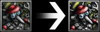


")