Moderator
M
Moderator
08:30, 27th Aug 2009
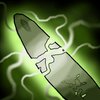
zombie2279: The idea would be good, but the execution is really lacking. The object doesn't really look like a sword, both shape and coloring-wise. Redo the shape to be sharp and to resemble a real sword, you can reference if that helps. The shading is really weirdly placed, I don't understand why the lightning is coming from the middle of the sword. Essecially, it makes the whole thing look way too flat. Re-design the highlights and shading while ignoring the spell effect in the middle, try placing the light source (invisible) to the upper right corner and shade according to that.
'Till updated.
enjoy: way to cartoonish and needs shading and details.


 Approved


