This review has taken a while to get out but hopefully I'll be able to power through a lot of the nice new skins that have been coming in to the section. Here we have another cool concept applied to a model which people don't often make skins for, so let's jump in and I think I'll use pictures to help illustrate my points:
The Good:
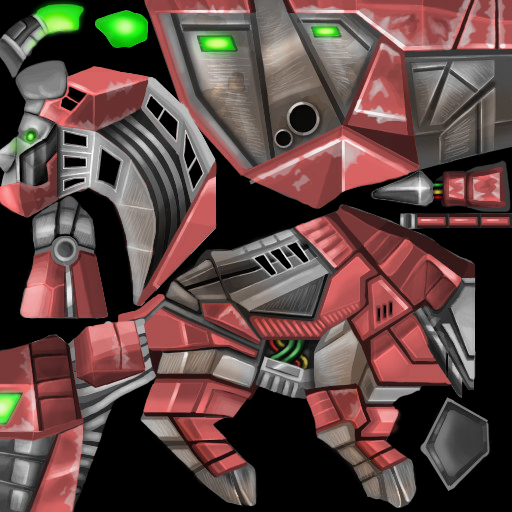
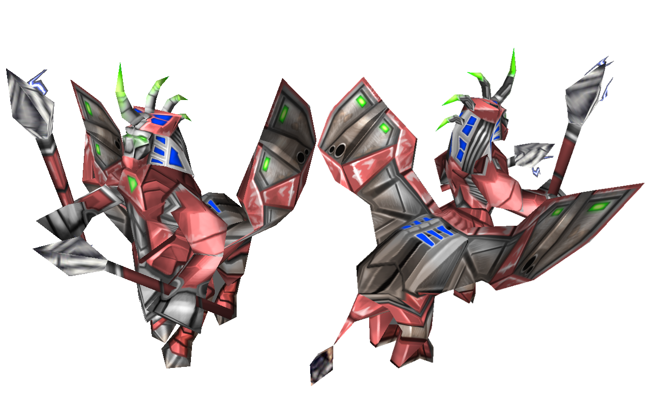
The first thing that really sets this apart from a lot of your previous skins Shido is the amount of detailing, there is a lot packed in here and I love. As we can see we have what I would nickname "coffee stains" on the metal showing that light rusting, in this picture we also see the circlular metal rings that have perfect shading on them. The scratched, tarnished metal effect is also really good and gives the skin that material look that has been missing in some of your other works.
We also still have the nice bold colourings and you've maintained that cartoony style of shading, there's some really good shading work here as shown below, we've got the shadows falling where they should and nice bright highlights where the light hits; it gives the metal that nice coloured/matte metal almost car body look. The shadows also help with the really well defined geometric and blocky shapes of the texture.
The face is also really good, the subtle glow of the eyes has been done really well and we've got good shading and detailing especially on the shin where again we've got that light fading/rusting on the pink metal which is done really well here. We also have subtle shading on the shape of the metal without drawing harsh lines.
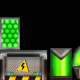
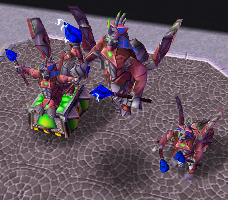
I also really like the base: you've got the painted look down again and the texture/material of the metal comes across really well. It's inventive and it's cool, so props on the base.
There's also the inventive use of the Team-colour that I really like. Overall we've got lots of great details all over this texture and I would love to see more of this going forward in your works. You've maintained your style but elevated the quality of the execution in this case.
Areas for Improvement:
This texture is very good, but I think there are parts you can still improve and ironically enough they are areas that you've already done better and just maybe need to go back and replicate that effort. I'm going to be very nitpicky but only because I know you'll take it on board and potentially improve it.
First of all these "holes"/areas are done well:
but these ones need to look more like it:
maybe the squares are just not as well defined or the metal borders aren't done as well but they look just like deep black "shapes".
The pink fading is done really really well here:
that effort needs to be replicated in areas like here:
and here:
(also the metal section here could use some improvement)
Thirdly, the quality of the glow is inconsistent. The eyes and chest are done really well, now you need to take how you've done it in those sections and re-create that look in areas like here:
and here:
Also whilst there are tons of great and cool details here, I also see areas/room to add more, in particular look at areas like this:
and I know you could add tons more cables or lights or wires or something more here to make use of every inch of this skin.
These points are all very nitpicky but I think they would allow this skin to be the best version it could be and it's just something to think about. I know when texturing it can be hard to maintain consistency (for example my ability to draw gold rims varies wildly) but you just need to take the quality in some parts of the texture and apply it to some other small areas.
Conclusion:
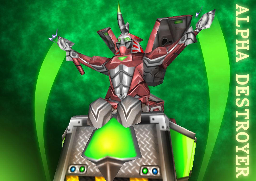
A really good texture Shido! Cool concept, cool model, cool design, cool execution. What more can I say? I like how far you've came and in this texture you've shown your ability to draw materials and make them look good whilst not sacrificing your style. I've left you a few points to think about if you ever want to revisit it but as it stands approved as High Quality!


 Approved
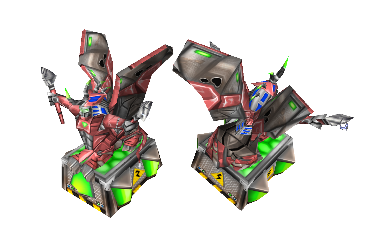


")
 If I overdo this, I no longer feel unique compare to him.