 Approved
- Joined
- Nov 9, 2006
- Messages
- 2,558

Nice looking map

just because you doesn't link the tile set doesn't mean that the map in unqualify. You are not the whole world itself.Review - Wet Darmok
(Version September 25th 2022)
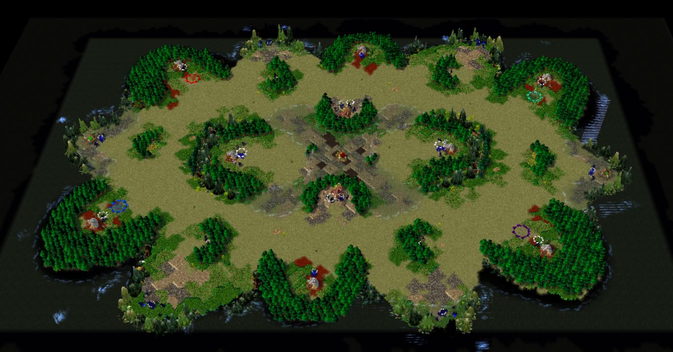
Description: Wet Darmok is a visually pleasing arena of war surrounded by a void. The visuals are pleasing and good visual clarity has been achieved. Abnormalities are present throughout the map, reminding the players of the otherwordly theme of the map.
Terrain: The terrain is very nice, although the tile usage could be improved and have more depth to it. The red Dirt gives a nice contrast to the other, more lush and vibrant hues of the ground, wish I saw it here and there more often, though it is good to not overuse it as an element. Visual clarity is very good, with a clear distinction between walkable and non-walkable areas. The pristine-looking City Scape tiles in the middle are a little weird to me - is there a reason behind them? I think the variants of Ruined Dalaran might be more fitting. The fact that the tileset is labeled as Black Citadel causes Gold Mines and other buildings to have their uberslats have red tint and grass on them, which looks very strange as most of the ground does not follow the same theme. Please See if you could change this (change the actual tileset to something else, but keep the tiles used the same).
Layout: The layout is open and straightforward which fits the small size of the map. The placement of Neutral Buildings seems very practical as well, good work. I do ask you to nudge the Mercenary Camps slightly though, so large units can walk around them (both have one spot with a small gap behind them), or make it visually more clear where units can walk and where not (Rock Spires are terribly pathed). I cannot see the connection to the Red Alert 2 map, but I am not familiar with it either - perhaps it's more of a concept-level connection.
Creeps: The creeps fit the map's theme very well and the camps are formed of logical combinations of creeps. The expansion gold mines on the edges could have slightly stronger creep camps guarding them, considering it is a 4-player map, but allowing the expansions to be taken fast can be a good thing as well.
Gameplay: The open layout and small size offer direct contact with the enemies quite early, further supported by the central placement of Tavern and early gold mine expansion options that are not clearly split between the two teams. The openness continues also in bases, making them rather vulnerable to attacks from any angle. Interesting drops such as Tome of Experience from second expansions force the teams to split rewards between the two players and also encourage them to contest the enemy side's objectives to deny a potential lead position.
Recommendations:
Nudge the Mercenary Camps farther away from the edges so units can better walk around them, or improve visual clarity of the rock spires around them (perhaps place something smaller to better indicate pathability). I'd also encourage you to change the factual Tileset of the map from Black Citadel to something else to avoid the issue with ubersplats (ground textures of buildings). Consider the feedback regarding the City Scape tiles in the center. The map filename should be written without space "(2)WetDarmok".
Overall very nice work.
I'd recommend keeping a more civil tone overall on Hive, generally towards everyone on here.just because you doesn't link the tile set doesn't mean that the map in unqualify. You are not the whole world itself.
You just made me sound like I have cross the line there. I'm not the god either, just set the map to substandard since that seem to be where it fit in both of our view. My mention above is only focus on the conversation you point out that mismatch color = to world end or some kind of unorthodox cult. I don't care about how many star you give me as a treat it's childish. My point of view stand at the same position like the time I talk with Deepstrasz, If it's in the wrong place of Hive community just set it to the substandard. I just doesn't like the fact where you point at. ¯\(ツ)/¯ no bad feeling toward you bro. best regard, ZucthI'd recommend keeping a more civil tone overall on Hive, generally towards everyone on here.
Please bear in mind that the mismatching tilesets were not the only downside mentioned in my Review, it's up to you if you do or don't want to improve the map based on the feedback you get - I can Approve this map and set it to 3/5. It's annoyingly close to a higher rating, so let me know if you do make the mentioned changed to it and I can see the rating again.
I don't think you crossed a line, but I just give a heads-up that it's not unheard of replies or comments on Hive can be interpreted in the wrong way, all good in that regard. The map is definitely not substandard, I could have approved it in the first place, but set it to Needs Fixing instead - what I should have done is just leave it Pending until you choose whether or not you want to make fixes on the map or not.You just made me sound like I have cross the line there. I'm not the god either, just set the map to substandard since that seem to be where it fit in both of our view. My mention above is only focus on the conversation you point out that mismatch color = to world end or some kind of unorthodox cult. I don't care about how many star you give me as a treat it's childish. My point of view stand at the same position like the time I talk with Deepstrasz, If it's in the wrong place of Hive community just set it to the substandard. I just doesn't like the fact where you point at. ¯\(ツ)/¯ no bad feeling toward you bro. best regard, Zucth
It is for newcomer, I back then might be move by those systems as well. As time passed, people way of thought have change...Ratings on Hive might seem childish, but for regular users, they are a means of differentiating between the quality of the maps.
It's not really secondary, If it's for 1v1 stuff. I understand that I might have a unique taste. Other or might be mostly mostly mapper/player seem to be take it more serious than me. Or maybe that's a way of mine to keep making mapping challenge to myself, keep me in this game away from boring.visual elements in melee are secondary

 tenor.com
Substandard as a state does not exist anymore on Hive.Now, now time to set it to substandard... Let me pressure you to dew it.
