- Joined
- Jul 27, 2004
- Messages
- 3,712


If you look closely at the picture, you can see that sigma-icarus actually butchered TDR's Cacodemon pic with crappy MS Paint lines.


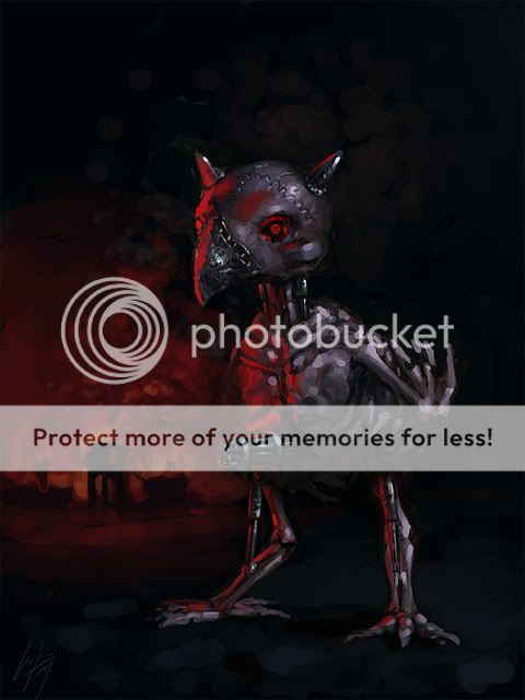
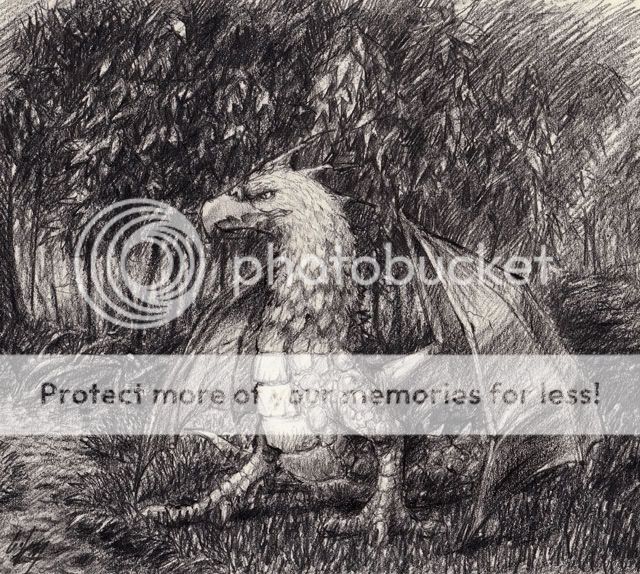
He IS making a pain elemental for modeling compo.

There may be disproportions, [lame excuse]it's a fast sketch after all[/lame excuse]
Here's another thing, a Pain Elemental that I made to have reference for the modeling comp:
it has? pics or it didn't happen.


I like the second one better. Looks cooler and the facial expression is cool too. You look like a mixture of Jesus Christ, Tom Cruise, and... some other guy that might happen to have a pony tail.


 Looks great . I have tried to make self portrait but I was very tired to hold my sketch book while drawing


