- Joined
- Jun 5, 2008
- Messages
- 1,767

Yes, well. I can't say I have much to say, so I'll make a long story short and just show ya what I am working on. If you have ideas, share em, if you want to help me graphically, go ahead. Though, ask first, because I think you'll need my file to work with.. or not, maybe you want compete with me at creating an interface. That's awesome as well, If you end up with a cooler looking interface than mine, I'll use yours instead.
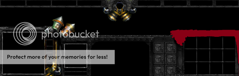
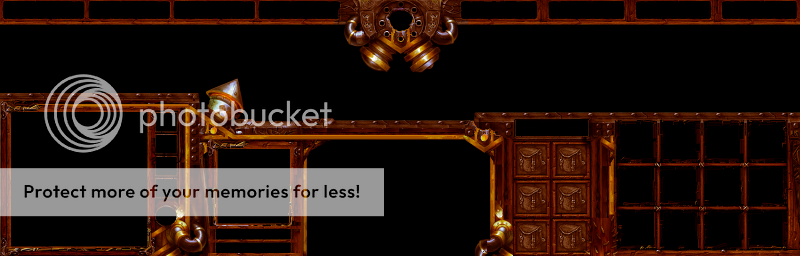
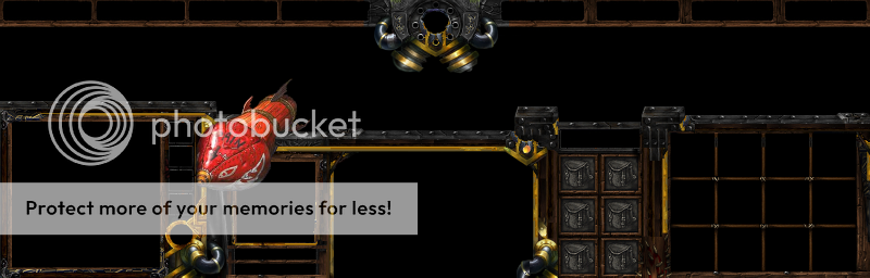
Planning to shove in some exhaust pipes at the edge to the left there. Once all parts of this is colored and done, it will be delivered to CRAZYRUSSIAN who will help me by throwing some sprinkles of magic for some final touches, unless he changes his mind, that is.
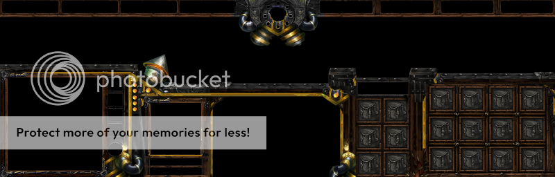
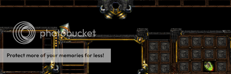
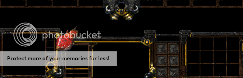
Anyway, here's what I got so far, excuse the small size, photoshop has a thing for shrinking stuff down. It's a work in progress, I think I need to point that out, usually people point and laugh at stuff that clearly is not done yet. Anyhow, I'll stop babbling and let the picture do the talking. A picture says more than a thousand words, eh? XD
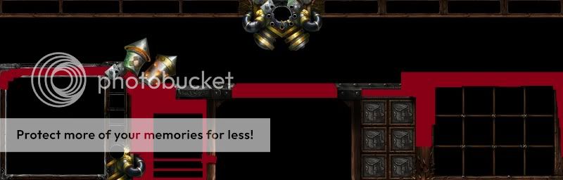
Anyhow one final thing, as I said before, If you have ideas, share em whenever. There are no stupid suggestions, although the stupidity might not be used, I'd be happy to know that there's an actual interest.
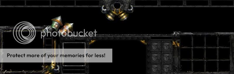
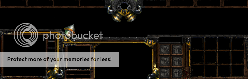
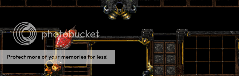
Planning to shove in some exhaust pipes at the edge to the left there. Once all parts of this is colored and done, it will be delivered to CRAZYRUSSIAN who will help me by throwing some sprinkles of magic for some final touches, unless he changes his mind, that is.
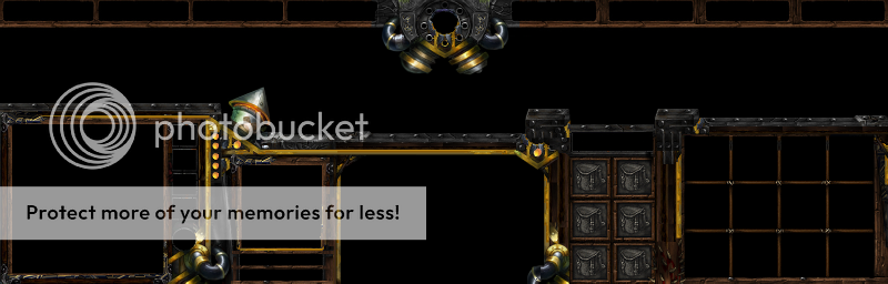
Anyway, here's what I got so far, excuse the small size, photoshop has a thing for shrinking stuff down. It's a work in progress, I think I need to point that out, usually people point and laugh at stuff that clearly is not done yet. Anyhow, I'll stop babbling and let the picture do the talking. A picture says more than a thousand words, eh? XD
Anyhow one final thing, as I said before, If you have ideas, share em whenever. There are no stupid suggestions, although the stupidity might not be used, I'd be happy to know that there's an actual interest.