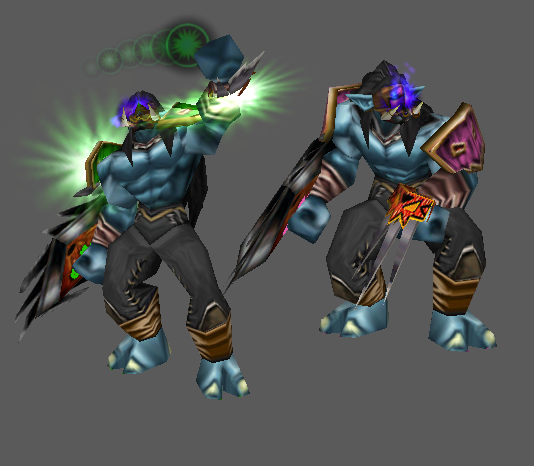
The animations are fine (although I'm missing a bit of that jumpiness trolls have while walking in the walk animation) and the concept is okay. The execution though... I don't know I just don't really get warm with it. There's a multitude of issues I have with this model.
The scale proportions (size of the mask in comparison to the shield for example) are somewhat off. Even if they are realisitc, they don't really fit wc3. The body of the troll is a little bit too bulky too and is not easily recognized as such (the small, non identifiable mask enhances that feeling). His claws are too small and paper thin. His shoulderguards are like.. so lame. I mean we've seen these at housand times already, give me something more <3
Next point are the textures:
- Their overall quality is lacking and there are many stretched parts. they are also pretty uncreatively chosen and seem pretty randomly thrown together. I'd have wished for more experimenting. The mask of the claws does not fit together with the other ones at all and looks like a toy. The shield is a blurry mess. You could have at least made the border go through seamlessly as a whole instead of making each square have it's "own wrap". And the face mask is just... blergh. The necklace is so unnoticable you could have left it out as a whole.
There's also a few wrap issues where you just were lazy and did not bother to fix the wrap, like the front of the leather above the ankles where it just stretches because of no "wrapping". Yes, it's not visible ingame most likely, but still a shame to see something from such a skilled modeler.
The particles seem over the top for me and don't really fit either IMO. And what the hell is going on in Spell Two?
The overall concept is fine but it needs heavy tweaking and something to make it stand out, as of right now it does not look like a hero (
@Kyrbi0 I call you, you love to criticise me for that).
That's about everything I recall wanting to say.


