- Joined
- Nov 26, 2006
- Messages
- 11,133


Texturing Contest #17
Buildings

Dan van Ohllus
Just_Spectating
l0w_kwaliti
M0rbid
Red Shift
Stanakin Skywalker
thisruoy
Shading and Highlights: | 4/5 | the roofs are well done and offer a good level of dimension; and most of the other details have a good level of shading as well. The walls seem a little lacking though, and could have probably used just a little more shading around the windows and were they meet under the roof. Most of the problems with shading seem to steam from the model and the way the UV's wrap to it, though the skin gives the impression that a little more could have been done. |
Originality and Creativity: | 4/5 | The overall design was relatively unique, though the most outstanding feature would be the weird chimneys, which makes this skin rather unique. |
Texture Detail: | 3.5/5 | the walls are rather similar shades, and when the game is on lower rendering settings the colors tend to be displayed as blotches of about 4 different shades. The bricks stand out as needing a little more as well, the lines separating them are rather thin and come close to blurring into nothingness from the regular game view. It would be nice if their was a little more work in differentiating the bricks, such as different brick colors and varying mortar width. The windows and roofs are rather well-detailed, and overall the skin seems relatively consistent. |
In-Game Dynamics: | 4/5 | the chimney's details seem to fade into a blur rather quickly, and the model has a few shading issues. Overall this skin works respectably well in game, and besides the above mentioned shortcomings there is not much to complain about here. As the portrait file for this is the entire structure, this category is essentially the same as your texture detail. In game this skin differs a bit from other warcraft skins, but is still close enough to blend in relatively well. |
total: | 14.5/20 |
Just_Spectating
Shading and Highlights: | 4.5/5 | Largely the shading is pretty good and well-applied throughout this skin. The only part that could really use more work is the crystal-elements under the face. |
Originality and Creativity: | 5/5 | Probably the single-best conversion skin of the group, this completely changes the temple of the damned into something completely unrelated, and this appears to be a hugely original idea as well. |
Texture Detail: | 4/5 | Overall the texture detail is rather high quality and several elements among the sides mimic the warcraft style very well. However, the shifts in the texture types themselves don't quite match up as well as they should. The bones, crystal, stone, and magnataur face all appear at slightly different qualities a sort of give the impression of a conglomeration of unrelated elements placed together. It would be nice if their was more of a sense of a solid motif between all the elements with detail and color style. |
In-Game Dynamics: | 3/5 | The ice looks pretty bad with in game lighting, and is pretty obvious from most views as well. The tonal range within the ice is so shallow that when the in-game lighting is applied on it it feels really flat and bland. If you changed the ice to bone to match the spires on the sides or changed the ice in general this skin should stand to benefit significantly from it, but the ice is sort of holding it back. |
total: | 16.5/20 |
l0w_kwaliti
Shading and Highlights: | 4.5/5 | Decent enough but they could stand to be perhaps a little stronger. The flat team color is rather distracting and could stand to have some sort of detail and shading on it though. |
Originality and Creativity: | 4/5 | Pretty good, if nothing else this was probably one of the most significant changes from the original texture. |
Texture Detail: | 4/5 | I like the little touches such as the stained-glass windows. The doors seem a little plane and I'm not sure the circular windows really suit them. The brickwork is at a nice level of consistency. |
In-Game Dynamics: | 4/5 | Looks pretty good in game, the detail level on this skin seems very close to that of other warcraft skins and this fits in pretty well with the alliance buildings. |
total: | 16.5/20 |
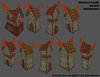
M0rbid
Shading and Highlights: | 3.5/5 | Decent enough to get by, though it would be nice if the windows themselves seemed to have more of a dynamic shadow associated with them, considering they all sit on the same band of shadow without it changing to light and dark makes the skin lack a bit in dimension. I like the gradual fade from light to dark from the top of the skin down though, it should fit in well when placed next to other buildings. |
Originality and Creativity: | 4.5/5 | Considering no buildings in warcraft 3 fit a skyscraper particularly well and the model choice was somewhat obscure this was a rather creative choice. The placement of windows and structural components was unique as well. |
Texture Detail: | 3/5 | This could have been better, the window panes seemed a little flat. The overall texture is made from repeating the same motif over and over as well. |
In-Game Dynamics: | 4/5 | Looks good in game. The detail level seems a little lower than most warcraft skins and textures but otherwise this could fit into a wide array of modern and futuristic settings. |
total: | 15/20 |
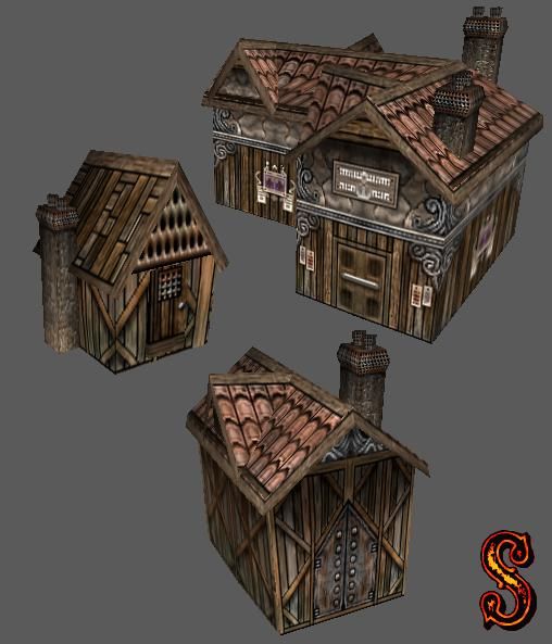
Red Shift
Shading and Highlights: | 5/5 | The rendering on this skin is very well done, even with lighting turned off this skin seem remarkably well-shaded, and each detail seems to pop out. I can't really imagine how the shading could be improved; excluding model edits for the portions of the model that no amount of work on the skin could solve. |
Originality and Creativity: | 3/5 | Changing houses into a more realistic medieval/port city version isn't terribly creative; though it is original enough for the purposes of this contest. It would be a little more original if you tried a less obvious model, but for the purposes of the skin this was a wise model choice. |
Texture Detail: | 5/5 | The detail is overall rather remarkable, though some sections are considerably more remarkable than others. The porthole window, cheese-grater texture, and to a lesser extent the larger doors could have been worked on a little more judging by the rest of the skin. That being said, the detail level on these is still pretty extensive. |
In-Game Dynamics: | 4/5 | The portrait files for the models this skin effects appear to be rather sub-par, and even with the amount of detail in your skins make them seem a tad blurry; especially for the horizontal house (so I'll largely ignore them as they seem rather hastily created). However, from the game-view this skin looks rather nice; and if anyone desired to use this skin for a model I'd strongly recommend to chose one of the diagonal versions, as the portrait for said model is most closely related to most other building portrait files. In any case this skin seems to stand out a bit in comparison to other warcraft skins; though considering it can be used to create an entire atmosphere this is mostly a minor issue. |
total: | 17/20 |
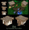
Stanakin Skywalker
Shading and Highlights: | 3/5 | Each piece does not seem to take into account the rest of the skin. There should be a distinct drop-shadow from the roof onto the walls. The wooden beams could use more shading as well, though given the wrapping job I'm not sure that was possible. |
Originality and Creativity: | 3.5/5 | Turning an anogomous tent-hut into a solid hut isn't terribly creative, though the differance is building style is creative enough. |
Texture Detail: | 4/5 | The walls are simple but work well. The thatched roofs seem a little blurry though, perhaps you should have used a larger skin size so this would not appear so fuzzy. |
In-Game Dynamics: | 3.5/5 | The wooden elements seem rather bland from the default game view, perhaps their details could use more contrast. The skin itself fits in relatively well with other warcraft skins and textures, and bares a similar style. |
total: | 14/20 |
thisruoy
Shading and Highlights: | 0/5 | This skin has absolutely no shading whatsoever. |
Originality and Creativity: | 3.5/5 | I've seen the same concept done in the last texturing contest, so I'm not sure exactly how creative doing this cube is. If nothing else; because this skin is rather different from most on this site it was granted a decent score in this category. |
Texture Detail: | 1/5 | Not much on here; though the shapes look at least well-made and with smooth edges. |
In-Game Dynamics: | 1/5 | The lack of shading really sticks out, and the glowing runes and crystal sort of distract from the skin as well. As their is no shading on this skin at all it really stands out when placed next to warcraft units, allowing those with no knowledge of warcraft resources to quickly recognize that this seems out of place. |
total: | 5.5/20 |
Haha, when I first looked at this all I could think of was, "Is this guy reading Dr. Suess while he skins?" Because this really looks like it could be somthing out of those books  . Shading and highlights, fantastic. Could they be better? I think so. Especially on the chimmneys and door. Its a bit too contrasted in those parts, but its otherwise very good. Creativity is quite fun, I like it, As I had said, something out of Dr. Seuss. I like it a lot. You definatley put in a whole lot of detail and every bit of it makes the skin look great. It could however, be made a tad darker and less contrasted to fit in game. I'm looking at it in game, and it seems too cartooney next to the other buildings. It may be the concept, or it may be the colour tones. But it doesn't fit perfectly in game. But overall, Very nice job.
Shading and Highlights: 3.8/5
Creativity and Originality: 4.6/5
Texture Detail: 4.2/5
In-Game Dynamics: 3.6/5
Total: 16.2/20
. Shading and highlights, fantastic. Could they be better? I think so. Especially on the chimmneys and door. Its a bit too contrasted in those parts, but its otherwise very good. Creativity is quite fun, I like it, As I had said, something out of Dr. Seuss. I like it a lot. You definatley put in a whole lot of detail and every bit of it makes the skin look great. It could however, be made a tad darker and less contrasted to fit in game. I'm looking at it in game, and it seems too cartooney next to the other buildings. It may be the concept, or it may be the colour tones. But it doesn't fit perfectly in game. But overall, Very nice job.Shading and Highlights: 3.8/5
Creativity and Originality: 4.6/5
Texture Detail: 4.2/5
In-Game Dynamics: 3.6/5
Total: 16.2/20
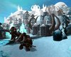
This one, was incredible. I loved the way you converted this and its absolutely a crazy idea. You nailed the highlights next to the crystals and the face there, making it look so crazy. Although it could be a bit darker in some parts, such as under the crystals. Creativity, love it. I have never been able to see a better idea for a model so complicated. Detail was good although the face could have been given a bit more love, and In game, it fits almost perfectly with the ice and snow environments. All I can say is, well done. Very well done.
Shading and Highlights: 4/5
Creativity and Originality: 5/5
Texture Detail: 4.6/5
In-Game Dynamics: 4.4/5
Total: 18/20
Shading and Highlights: 4/5
Creativity and Originality: 5/5
Texture Detail: 4.6/5
In-Game Dynamics: 4.4/5
Total: 18/20
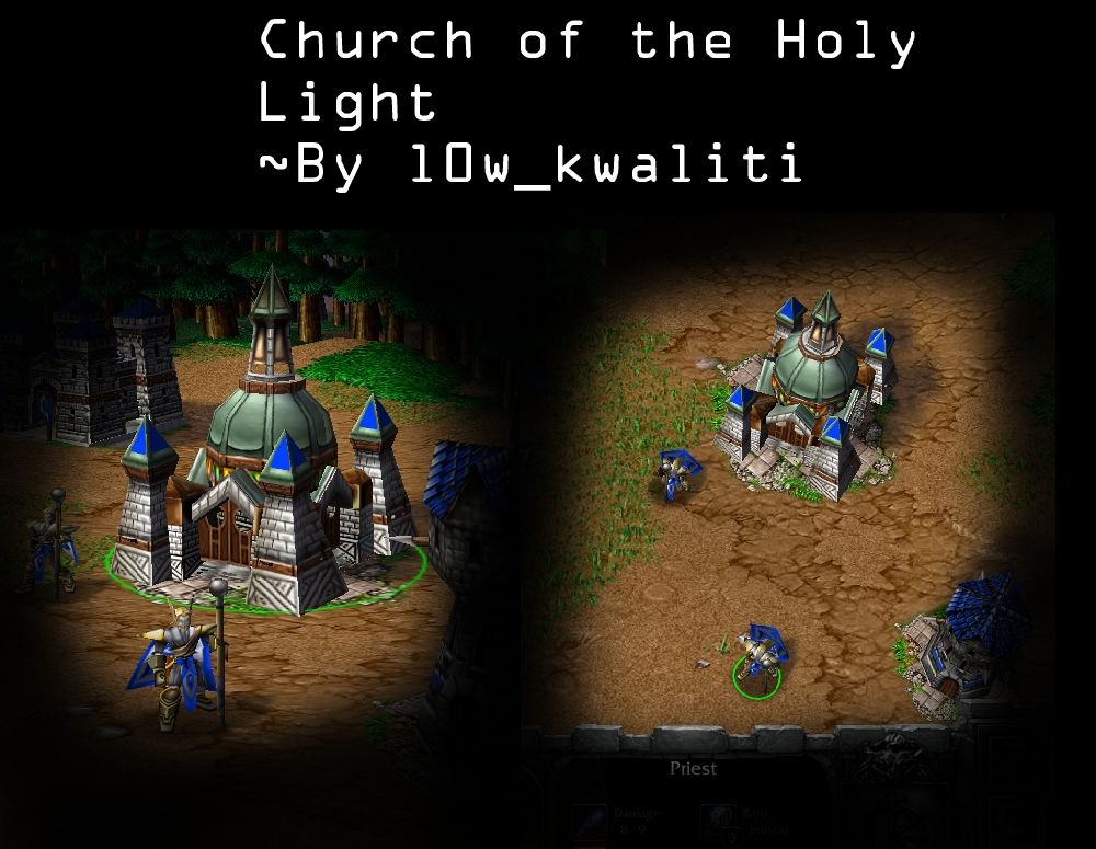
This was sweet. I was totally unexpecting of this to actually finish beacuse we didn't hear from you in a while after you posted the first WIP >:3. But its great to see it was finished. And as always, you prove us that your username certainly isnt the quality of your work. Shading and highlights, Fantastic, although i think you could have fancied up the TC a bit. It looks quite bland as it is. Detail, outstanding. So many people in this contest chose such cool and creative things to do with some of the most unsuspecting models  . In that, the Crypt is a very hard model to work with and its amazing that it turned out this way. And although a church is very generic, It was a creative choice to use this model. It fits in quite well, although i would have done stone tiles instead of that green to help it fit even better (if possible with this frustrating model ) But all in all, Its a great idea and a lovley concept.
Shading and Highlights: 4.2/5
Creativity and Originality: 4.2/5
Texture Detail: 4.4/5
In-Game Dynamics: 4.6/5
Total: 17.4/20
. In that, the Crypt is a very hard model to work with and its amazing that it turned out this way. And although a church is very generic, It was a creative choice to use this model. It fits in quite well, although i would have done stone tiles instead of that green to help it fit even better (if possible with this frustrating model ) But all in all, Its a great idea and a lovley concept.Shading and Highlights: 4.2/5
Creativity and Originality: 4.2/5
Texture Detail: 4.4/5
In-Game Dynamics: 4.6/5
Total: 17.4/20
Ah this one was quite well done. However, This really lacked in shading. The method you used gave the skin the illusion of depth and shading, and you had done some simple shading yourself, but really, its mostly solid straight line shading, which in itself looks good on the model, but it really stands out and looks cartooney and contrasted when compared to all of the other skins and models. The detail is good but there isnt really anything to it, just mostly squares. Not the most fantasic thing in the world. The idea however, is actually quite creative. The biggest problem I see is that, this really doesn't sit well next to other buildings. Its got a really low level of detail and has a lot of black lines and it ends up making the whole thing look particularily flat. But otherwise, its very good looking. It just... Lacks, a bit.
Shading and Highlights: 3.8/5
Creativity and Originality: 3.4/5
Texture Detail: 4/5
In-Game Dynamics: 3.8/5
Total: 15/20
Shading and Highlights: 3.8/5
Creativity and Originality: 3.4/5
Texture Detail: 4/5
In-Game Dynamics: 3.8/5
Total: 15/20
Fantastic as always Red. The shading and Texture detail is high high quality, every single aspect was looked at, and the end result has another fantastic skin of yours. As said though, those submarine windows arent the most attractive thing in the world. The only thing I really dislike, is the thick black lines on the wooden parts of the homes. It ends up making the model look a bit unrealistic and slightly cartoonish. The idea in itself isn't all too creative, but other than that, I can't think of anything else wrong with it. It fits well In Game and is simply fantastic. Nothing else needs to be said.
Shading and Highlights: 4.8/5
Creativity and Originality: 3.8/5
Texture Detail: 4.8/5
In-Game Dynamics: 4.6/5
Total: 18/20
The only thing I really dislike, is the thick black lines on the wooden parts of the homes. It ends up making the model look a bit unrealistic and slightly cartoonish. The idea in itself isn't all too creative, but other than that, I can't think of anything else wrong with it. It fits well In Game and is simply fantastic. Nothing else needs to be said.Shading and Highlights: 4.8/5
Creativity and Originality: 3.8/5
Texture Detail: 4.8/5
In-Game Dynamics: 4.6/5
Total: 18/20
Nice concept and a really wise choice of model, but, It seems almost unfinished. There is a lack of basic "real-life" shading such as shading under the beams and under the roof to give the appearance of depth and hight. Without this, it ends up looking like a solid bleh in game. And really, without this shading, almost all detail is lost in game. I can even see a lot of detail lost in the screenshots you've given. However the stone structure detail looks very good. Just try and make it stand out a bit more as, it is a little hard to see in game. When it comes to creativity, this isn't really the most creative thing, but the prehistoric feel to it gives it some points . Overall, this fits fairly well in game, save for the lack of shading, I think it would be a good fit. Its just one of those skins that needs a bit more love, thats all
Shading and Highlights: 3.4/5
Creativity and Originality: 3.2/5
Texture Detail: 4/5
In-Game Dynamics: 3.6/5
Total: 14.2/20
. Overall, this fits fairly well in game, save for the lack of shading, I think it would be a good fit. Its just one of those skins that needs a bit more love, thats all Shading and Highlights: 3.4/5
Creativity and Originality: 3.2/5
Texture Detail: 4/5
In-Game Dynamics: 3.6/5
Total: 14.2/20
No Shading, absolutley minimum detail. I can't say enough on how much you need to improve on this skin. And really, its really not at all creative anymore. You tried doing this same thing in the 15th Texturing Competition, and it gets old if you dont want to put the effort into it to make it look any better than your last attempt. So really, this doesn't fit at all well in game, and it really has a lack of effort.
Shading and Highlights: 0/5
Creativity and Originality: 1.4/5
Texture Detail: 2.8/5
In-Game Dynamics: 1.8/5
Total: 6/20
Shading and Highlights: 0/5
Creativity and Originality: 1.4/5
Texture Detail: 2.8/5
In-Game Dynamics: 1.8/5
Total: 6/20
((67chrome's judging + Dentothor's judging) * 2.5 * 0.75) + ((Votes / Total votes) * 25) = Total score
Dan van Ohllus: ((14.5 + 16.2) * 2.5 * 0.75) + ((12 / 267) * 25) = 58.6860955
Just_Spectating: ((16.5 + 18) * 2.5 * 0.75) + ((22 / 267) * 25) = 66.7474251
l0w_kwaliti: ((16.5 + 17.4) * 2.5 * 0.75) + ((58 / 267) * 25) = 68.9932116
M0rbid: ((15 + 15) * 2.5 * 0.75) + ((44 / 267) * 25) = 60.3698502
Red Shift: ((17 + 18) * 2.5 * 0.75) + ((99 / 267) * 25) = 74.8946629
Stanakin Skywalker: ((14 + 14.2) * 2.5 * 0.75) + ((22 / 267) * 25) = 54.9349251
thisuroy: ((5.5 + 6) * 2.5 * 0.75) + ((10 / 267) * 25) = 22.4988296

4th - M0rbid
5th - Dan van Ohllus
6th - Stanakin Skywalker
7th - thisuroy
5th - Dan van Ohllus
6th - Stanakin Skywalker
7th - thisuroy
Poll (links) | Contest


