fladdermasken
Off-Topic Moderator
- Joined
- Dec 27, 2006
- Messages
- 3,689


Fictional World Wonder
[Rainbow]Feats of extraordinary engineering or aesthetic skill; participants are to design a fictional structure that is quite literally wondrous to behold[/Rainbow]

Rankings:
fladdermasken: 55/65
Azurot: 45/65
johannesr: 42/65
Alagremm: 39/65
elredir: 39/65
L2love: 37/65
Oziris: 37/65
KayS: 34/65
fallast: 28/65
BloodRaven: 23/65
Empire Jackal: 17/65
Brambleclaw: 12/65
eubz: 12/65
fladdermasken
Overall: 55/65
Alagremm
Overall: 39/65
johannesr
Overall: 42/65
fallast
Overall: 28/65
Oziris
Overall: 37/65
KayS
Overall: 34/65
elredir
Overall: 39/65
L2love
Overall: 37/65
Azurot
Overall: 45/65
BloodRaven
Overall: 23/65
Empire Jackal
Overall: 17/65
eubz
Overall: 12/65
Brambleclaw
Overall: 12/65
fladdermasken: 55/65
Azurot: 45/65
johannesr: 42/65
Alagremm: 39/65
elredir: 39/65
L2love: 37/65
Oziris: 37/65
KayS: 34/65
fallast: 28/65
BloodRaven: 23/65
Empire Jackal: 17/65
Brambleclaw: 12/65
eubz: 12/65
fladdermasken
Creativity | A research center, could be a good fictional world wonder, however yours is missing the epicness a bit in my opinion. While the complex looks really good and everything it's not all that stunning. However it's still creative. | 10/15 |
Detail | There are fancy details throughout the whole terrain, really a good work. You could have spent a bit more time on the background though, especially the hills, which could have been touched up quite a bit. | 13/15 |
Technique | Your doodad work is great and you use it perfectly to create a scifi ambience, for me your technique is the big plus of this terrain, any objections? Look at THAT sky. One of the best of all time and definatelly the best in this contest. Hell you nailed it. | 15/15 |
Aesthetic | The composition of this work is nice and overall the landscape looks coherent. Some minor composition details bother me, like the fence in the foreground and the strange looking shore linesw within the water. You als missed a shore at the rock sides. In my opinion, the terrain is overexposed at some points, but the sky is just too great to not make you a winner in my book. | 17/20 |
Overall: 55/65
Alagremm
Creativity | I honestly like the idea, but for me, it's hard to pull out what exactly the world wonder is in here, is it the city within the cave or the main column? Or both? For me, the main column should not be there that significant and the focus should be on the town instead. Could have been way more awesome. | 9/15 |
Detail | Seeing the amount of doodads, I would think it's very detailed, unfortunatelly quite a few things look rushed or not carefully enough placed to get a good feel of detail.The city itself consists of randomly placed buildings, no vatiation nothing. Take a look at johannesr's entry for inspiration on how you could have improved your cities look. The rocks are not exactly detailed either (but more about those later) However the vegetation detail is a positive thing here, saving you a rather good score. | 9/15 |
Technique | While your doodad and import choose was great (apart from... the houses) the way you used those doodads was not entirely good. I am not only referring to the house spam, that you could have used more time on, but also on how ugly edges and texture stretches the rocks display. It is a major downrate for a potentially brilliant terrain. | 8/15 |
Aesthetic | As already mentioned I don't like the center of focus in this terrain, I would have preferred a well done town, that's for sure. I love how the city fades out into the cave in the end part and I like the basic composition, as pointed out, there are a few things that keep this terrain from getting a way higher score. | 13/20 |
Overall: 39/65
johannesr
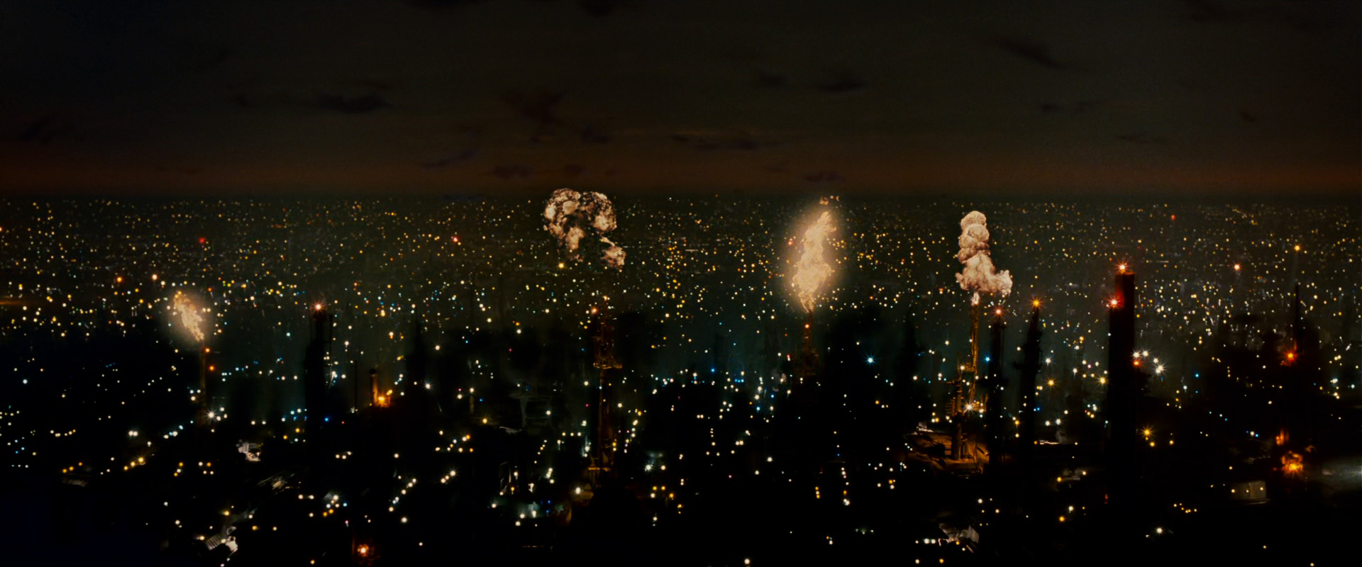
Creativity | I find it hard to figure out what it is exactly, for me it looks like a crashed spaceship, what I would not exactly consider a worldwonder, even though the construction looks complicated. Still the ambience is rather creative | 8/15 |
Detail | The details that you putted into your cyberpunk/scifi town are really great, but I think tons of glows that represent lights of the buildings could have polished the look of the town even more. Some things look rather random though, for example the tree on the right, aswell as the spaceship construction, which I will deal with later. | 11/15 |
Technique | While showing me that you have a very good terrain technique in general, your terrain lacks a few things that I would have loved to see in here and that are downrating it for me. The sky appears rather random for me, I would have loved to see the city fading out way better giving a feel of epic distance to the terrain, this is what I miss most, but also the (ghost) planets bother me, because yeah, they look like white ghosts. | 9/15 |
Aesthetic | Again, I am split here. One one hand, this terrain has many pros, but the cons destroy what could have been a really fancy terrain. The spaceship looks really ugly to me, with the lotr towers stiking out of it, appears random aswell. Why did you not add more flames like the one on the right, would have been awesome. (Blade Runner's intro). Also, the things I already mentioned above. Apart from those, a solid and good looking terrain | 14/20 |
Overall: 42/65
fallast
Creativity | A temple or gate is not exactly creative, but fits the theme, even though I do not consider it one of the most impressive world wonder interpretations of this contest. It reminds me of the Titty Twister from "From Dusk Till Dawn", now I am not sure wether that is a positive thing in this context or not. | 5/15 |
Detail | The temple itself has quite a good amount of detaisls, however not all look coherent, spcaemarine, coughcough... There is a hard contrast to the surrounding, because that has no detail whatsoever except from random rocks and lava cracks. | 7/15 |
Technique | You showed some solid technique use in here, I especially like how you scaled and crafted a nice complex out of different doodads ( a gate/temple) without stretching all to many doodads way to much. Apart from that, the background and surrounding is not exactly advanced terraining, for example the lava could have been done way better. I suggest some more tutorials on that. | 6/15 |
Aesthetic | While the composition of your terrain inside your camera view is solid, the angle of the screen is just not good enough to upgrade your terrain. It takes away a lot. Also the background looks just way to random, the doodad choose for it could be better aswell. Just too generic here. | 10/20 |
Overall: 28/65
Oziris
Creativity | A spectacular landscape that you portrait here, but unfortunatelly there is nothing in it what would make me call it WORLD WONDER, nothing is really catching my attention, the pyramids are not at all impressive, maybe because the trees on them seem to be the impressive thing here. To sum it up, I cannot see a real wunder here, it's missing the epicness. | 7/15 |
Detail | Solid execution detail wise, except from the pyramids, which are boring to look at. I have seen way more complex stuff of you though. | 9/15 |
Technique | The atmosphere shows that you are a capable terrainer, but you ruin it yourself, the line (mountains I think) in the back looks really unnatural, the nature looks random and the trees look strange because the have such huge variations in their scaling and are only one or two models. Variation and actually GROUPS of trees could have been the key here. | 8/15 |
Aesthetic | The whole terrain just does not show what your name as a terrainer promises. It misses a lot of what you showed in the past. Especially does not look coherent but all to random, the skeleton seems to lay there, but yeah, nothing more. The waterfall comes out of one little stony hill. Nothing else there, aswell. Overall just not your quality unfortunatelly. | 13/20 |
Overall: 37/65
KayS
Creativity | A complec building that reminds me of works of M.C. Escher. It seems to nearly cause optical illusions aswell, I really like the idea of it. Actually it can be called World Wonder with a solid reasoning behind it. | 10/15 |
Detail | There are so many details in here that it is starting to look messy, some details aren't exactly fitting asewll. Stretched Texture details are visible in the back, overall solid, but sometimes more is less. | 7/15 |
Technique | The doodad choose really is not the best. Many doodads lack in quality, are stretched, or could use some tinting. Neither the sky nore the lightray add a good atmosphere to it. But on the other hand you certainly nailed the architecture aspect of a World Wonder in a good manner. | 6/15 |
Aesthetic | As already mentioned, the terrain is too messy overall and with the lack of atmosphere of the surrounding sky it does not use the full potential of your basic architecture. You should take more time to choose fitting models for your terrains to get a more coherent look to it. Search for imports, tint, etc. The layout is rather promising. At least not generic, that is what I like. | 11/20 |
Overall: 34/65
elredir
Creativity | A cave with a temple or city in it does totally fit within the theme. And this arabic style of yours is something very indiviual in this contest. The idea looks so good, it could be my favourite idea of all entries | 13/15 |
Detail | There is a great amount of details put into the town/temple creation. Really great, however the rest of the terrain is sooo undetailed - even for a desert. This contrast downrates the entire terrain for me. I would like to see you putting more effort into the other areas and updating this terrain later. | 6/15 |
Technique | You proof that you are capable of very solid terrain techniques, the moon looks totally beautiful up there in the sky and the city is well executed - not only detail wise. The rock placement in the front is lacking though. Overall you really need to improve your rock placement to make it more natural and not look like an artificial wall. | 8/15 |
Aesthetic | I really really love the layout of this and it does look pleasing in its execution during the first view. But it just does not seem finished enough for me. The rocks in the front that take up quite a bit of the whole image are badly placed, there is a lack of detail. Overall it is just not finished. | 12/20 |
Overall: 39/65
L2love
Creativity | It is a World Wonder certainly and does have its very own flair, but on the other hand, there I have seen several terrains with such a concept already, it could have been more creative. However you did elaborate the concept quite well. | 9/15 |
Detail | A lot of details can be spotted here. However you are missing to finish the details up. I would like to point this out for the trees: The forest surrounding your complex looks well shaped, however you missed to add a few tree-variations to it, making it look like one relatively boring mass. Same goes for the mountains in the back, but I will talk about that later. Overall you kinda ruined a bit of your detail work yourself. A lot of details are still nice though | 10/15 |
Technique | Let me be honest, the sky looks horrifying - at least for me. The colour is to bright and unnatural for such a nice layout. The round clouds are a nice try, but do even underline the unnatural effect which stands contrary to the realistic approach of the environment. The work on the floating wonder looks like good work though. | 7/15 |
Aesthetic | There is a strong quality contrast within this terrain, as portraied earlier. This and the fact that you missed out to add more of those really beautiful mountains do not give an as pleasing outcome as it could have been. More mountain lines in the back next time, please. The composition is average. | 11/20 |
Overall: 37/65
Azurot
Creativity | I am open minded, and I will count this as a World Wonder of a different sort, but note that it could be counted differently aswell. It certainly has a different approach to it. I kinda like it for sure. | 12/15 |
Detail | The World Wonder itself is not detailed.(If I could capitalize a dot, I would do so, instead take a "period"). But yeah, it's not really visible after all anyways. What is detailed are the rays coming out of it. Halleluja, that is stunning. The rest is averagely detailed and you go well with this. | 10/15 |
Technique | I actually think this is more one of your test works than a totally finished terrain, but I must admit the creative way you worked on the atmosphere is just to good to really hate you for not taking more effort at other places. | 9/15 |
Aesthetic | It looks somewhat generic in the foreground, but I love the atmosphere work. On the other hand this is not enough to get a full score here for sure. I guess you will understand that this won't do it for winning a contest, but be sure that I personally really like the way you took this contest. | 14/20 |
Overall: 45/65
BloodRaven
Creativity | Actually, I could just write something similar as in L2Love's review, but you did not manage to get the concept across. It's a rock in the middle of nowhere with a structure on it, I do not want to sound harsh, but it is just not elaborated as a concept, however it fits the theme. | 5/15 |
Detail | It's a rather simple designed structure, because the angle does not support more, the amount of details is acceptable though they look a bit messy still. My major concern is that it is looking too random. | 6/15 |
Technique | A long way to go here, but certainly you proofed that you have the potential to go it. Nice experiments with angles and a few doodads, but it misses one thing and one thing mostly, the doodad choose. All those standard wc3 models do look really ugly applied to a terrain. Not exactly what you want for an aritistical screenshot. Try choosing better doodads. Never use the sun rays like that please, it looks to unreal, I suggest reading fladdermaskens tutorial for a training sky work, since it is rather generic in its current state. The rock- building transition is flawed at some states aswell. Just pointin those things out so you can learn from those in your further tries. | 6/15 |
Aesthetic | As pointed out, this is a terrain with typical flaws that only experience can eleminate and I hope I do motivate you with this review to really keep working on your skills. | 6/20 |
Overall: 23/65
Empire Jackal
Creativity | If a castle was considered a world wonder, middle europe would be the visited by aliens constantly that would like to take a look at castle world wonders. However a castle is certainly not ENOUGH. Apart from that it looks like the generic B²M starting terrain. | 4/15 |
Detail | Details are solid, but yeah, nothing fancy after all. You missed on adding depth. | 5/15 |
Technique | Of course the imports you used look nice and this is a plus, but you missed to do anything extraordinary with them. The terrain looks like it is ending behind the castle wall, a bad effect in this case. Overall the nice models cannot hide the fact, that you need to work on your techniques. | 4/15 |
Aesthetic | The first look on this is a rather good one because of the models, but many smaller flaws and the fact, that it misses every kind of epicness downgrade this terrain a lot. A clearer and better elaborated concept could do wonders though. | 4/20 |
Overall: 17/65
eubz
Creativity | I do not understand the concept behind this. It does not at all look like a world wonder, but a bunker with people having a talk in front of it. Strangely there are random elements to it, and a random lighting seems to be attracted to this bunker. In all honesty, this is way to random, a good concept is important for a contest and for an artwork mostly aswell. | 2/15 |
Detail | The details displayer are either lacking in quality or occur random or even both mostly. This is caused by the missing concept again. | 3/15 |
Technique | It misses the exact techniques a beginner's terrain misses, so I am trying to point them out for your for further orientation in the future: When placing doodads at a hill, make sure that half of them is not floating by moving the models up and in this case mostly down. Make sure that textures do not look to stretched, especially when scaling models, here to see at the bunker's rood and walls. Try to avoid to use wc3 standard doodads whatsoever, but mostly units. Try looking for imports. | 3/15 |
Aesthetic | The angle you choosed is okay so to say, it could have been better though, I really hope you take this review and try to improve upon it and use the Terrain Board to get the help you need. Every start is a hard start after all. | 4/20 |
Overall: 12/65
Brambleclaw
Creativity | I tried my best, but with all good will I was not able to find a world wonder in here. The silo-like looking structure on the right could be one, but only a small part of it is included within the shot and this part looks like, yes, a silo. | 1/15 |
Detail | Two magic runes at the door do not make this silo a world wonder though and this terrain does not deliver many more details unfortunatelly. The isle at the right could have been better executed to polish this up, just to give an example. | 3/15 |
Technique | The background work shows that you are capable of some terraining techniques, but they are used to unconsistant to give a good impression of them. After all, except of the planet, there is not much of fancy work to spectate. | 5/15 |
Aesthetic | The composition is not working like this. You need to focus more on what you want to portrait. The colour variation is okay, but it is overall just to empty and needs definition. | 3/20 |
Overall: 12/65
Fladdermasken: Obviously one of the better terrain in terms of appearance. I really like the fog in the background. The reflection of the mountain isn't completely accurate, but it too small of a detail to take away from the terrain. Pretty cool idea of a hydro-power institution as your world wonder. This is not counted against your terrain at all, but I am getting a little tired of those same rocks all the time. I wish we had other high res rocks like them. A few impurities but nothing really worth poining out. An over all great looking terrain.
Score
Creativity: 11/15
Detail: 12/15
Technique: 13/15
Aesthetic: 16/20
Total: 52/65
__________________________________________________________________________________________
Alagremm: First of all, congratz on your first contest. The greatest aspect of your terrain is definitely the background. The fog is just perfect. I like the concept of the rock pillars but I am not a huge fan of the model choice. The rocks are just too pointy in some spots. You also need to work a little on making those rocks blend in together. You shouldn't be able to clearly see where one doodad ends and the other one starts. The houses look very cluttered. A little more time organizing the city would have improved this terrain quite a bit. A reflection of the temple in that water would have also really improved the professionalism of the terrain alot. This does give the sense of a world wonder but I would expect a much more detailed execution on your wonder. A couple of pillars just doesn't quite cut it. Over all a decent terrain. Good job on this.
Score
Creativity: 12/15
Detail: 8/15
Technique: 10/15
Aesthetic: 12/20
Total: 42/65
__________________________________________________________________________________________
johannesr: Very well done on the whole futuristic metropolitan city feeling. Even though most of those buildings are only single doodads, it was still placed in an appealing manner. Good variation of buildings. I like the silhouetted buildings in the background. In most cases, having low res models like those, so close to the camera looks bad. However due to the dark tone of your terrain, your foreground doesn't actually look that bad. The things that I really dislike about this terrain is the sky along with those cloud boxes and the towers coming out of the ship. The ship itself is pretty cool. Over all a great terrain.
Score
Creativity: 12/15
Detail: 11/15
Technique: 12/15
Aesthetic: 15/20
Total: 50/65
__________________________________________________________________________________________
fallast: Mass spam of lava cracks on a silhouetted background is a huge no. In fact, I highly recommend not using those lava crack doodads at all. There are others ways to making some pretty epic lava. There is a tutorial on this site about that. Also a tip: other than fog and a very few selection of other models, try to avoid adding in flashy doodads like the fire. It distracts the viewer from the restof the terrain. The temple looks pretty cool but it does not portray the characteristics of a "world wonder."
Score
Creativity: 8/15
Detail: 7/15
Technique: 6/15
Aesthetic: 9/20
Total: 30/65
__________________________________________________________________________________________
Oziris: The lighting in this terrain is very well done. Probably my favorite part of this terrain. The pyramids and trees looks great and the roots are well placed. Not too fond of some of the rock placement and the water fall could have been better placed. There is one coming out of a rock. I also don't really like those buildings on the right. Other than that, great job on this. A very beautiful piece.
Score
Creativity: 12/15
Detail: 12/15
Technique: 12/15
Aesthetic: 17/20
Total: 53/65
__________________________________________________________________________________________
KayS: This would make for a really cool playable terrain. It definitely gives more of a map SS than an artistic terrain. First of all there is no focal point. There is just way too much going on. The level design aspect of this looks great. However for an art terrain, I would have chosen some diffent doodads and tilesets. For a no import terrain: good job. Unfortunately, "no imports" doesn't give you bonus points is these contests.
Score
Creativity: 10/15
Detail: 7/15
Technique: 9/15
Aesthetic: 9/20
Total: 35/65
__________________________________________________________________________________________
elredir: Wow, that temple looks awesome. Great level of detail in the construction of your world wonder. I think that your main down fall here is the sky and the large amount of empty space. I also really dislike the rock mountain in the back ground. Fewer but larger rocks would have been better. A few flaws in the constructions of the cave but looks great regardless. Good job on it.
Score
Creativity: 12/15
Detail: 12/15
Technique: 11/15
Aesthetic: 15/20
Total: 50/65
__________________________________________________________________________________________
L2love: Great concept and good execution. The rocks could have been placed with a bit more care but the construction on top and on the ground are pretty well made. The trees could have used a bit of color variation. A few different shades of green would do. My biggest complaint here is about the sky. In order to present a contest winning piece in a contest you will need a bit more than a couple sky box models. Very good job on the silhouetted mounains. They look great. An over all well made terrain.
Score
Creativity: 12/15
Detail: 10/15
Technique: 11/15
Aesthetic: 13/20
Total: 46/65
__________________________________________________________________________________________
Azurot: There really isn't that much to say about this. It's a pretty average looking nature scene. The burst of light, what ever that may be looks pretty cool. There isn't really any flaws but that is just because there isn't that much detail. A couple dozen trees, rocks, and shrubs. Aswell as a couple of mushrooms and a big shinning light. A very smexy shiny light. The terrain as a whole looks pretty good.
Score
Creativity: 8/15
Detail: 9/15
Technique: 10/15
Aesthetic: 12/20
Total: 39/65
__________________________________________________________________________________________
Blood Raven: Interesting concept, not the greatest execution. Rocks are horribly placed on the bottom and a poor choice of rock models for that matter. Lights are way too bright. Conflicting model choices and not the greatest construction job.
Score
Creativity: 7/15
Detail: 7/15
Technique: 9/15
Aesthetic: 8/20
Total: 31/65
__________________________________________________________________________________________
Empire Jackal: Well regardless of which of the two pics in your post you are actually using, the review is still the same. In any art terrain no custom sky is a big loss. Another thing is: always try to construct something using doodads. Simply placing already finished wall, gate and tower models just doesn't look that great. Bad tile variation and horrible shrub placement also look pretty bad.
Score
Creativity: 6/15
Detail: 5/15
Technique: 8/15
Aesthetic: 9/20
Total: 28/65
__________________________________________________________________________________________
Brambleclaw: This terrain almost looks unfinished. A tip: Stay away from green for your fog, sky, and water. A good looking green based terrain can be achieved but is very difficult. The color of this terrain just doesn't work. Also that big green sky box is not needed at all. You should have put a lot more time into that silhouetted city in the back ground. It should have been much higher and much more detailed. Try to avoid making half of your terrain empty water. You should have definitely chosen better models for your main structure in the foreground.
Score
Creativity: 8/15
Detail: 7/15
Technique: 9/15
Aesthetic: 8/20
Total: 32/65
__________________________________________________________________________________________
eubz: The first thing I will say is: try to avoid any WE particle model such as the lightning doodad. They look bad in almost any terrain. Same goes for th sun wells. Other flaws such as the "end of the world" effect, cutting off trees in the background, and floating doodads bring down the marks of the terrain alot.
Score
Creativity: 7/15
Detail: 5/15
Technique: 6/15
Aesthetic: 6/20
Total: 24/65
Score
Creativity: 11/15
Detail: 12/15
Technique: 13/15
Aesthetic: 16/20
Total: 52/65
__________________________________________________________________________________________
Alagremm: First of all, congratz on your first contest. The greatest aspect of your terrain is definitely the background. The fog is just perfect. I like the concept of the rock pillars but I am not a huge fan of the model choice. The rocks are just too pointy in some spots. You also need to work a little on making those rocks blend in together. You shouldn't be able to clearly see where one doodad ends and the other one starts. The houses look very cluttered. A little more time organizing the city would have improved this terrain quite a bit. A reflection of the temple in that water would have also really improved the professionalism of the terrain alot. This does give the sense of a world wonder but I would expect a much more detailed execution on your wonder. A couple of pillars just doesn't quite cut it. Over all a decent terrain. Good job on this.
Score
Creativity: 12/15
Detail: 8/15
Technique: 10/15
Aesthetic: 12/20
Total: 42/65
__________________________________________________________________________________________
johannesr: Very well done on the whole futuristic metropolitan city feeling. Even though most of those buildings are only single doodads, it was still placed in an appealing manner. Good variation of buildings. I like the silhouetted buildings in the background. In most cases, having low res models like those, so close to the camera looks bad. However due to the dark tone of your terrain, your foreground doesn't actually look that bad. The things that I really dislike about this terrain is the sky along with those cloud boxes and the towers coming out of the ship. The ship itself is pretty cool. Over all a great terrain.
Score
Creativity: 12/15
Detail: 11/15
Technique: 12/15
Aesthetic: 15/20
Total: 50/65
__________________________________________________________________________________________
fallast: Mass spam of lava cracks on a silhouetted background is a huge no. In fact, I highly recommend not using those lava crack doodads at all. There are others ways to making some pretty epic lava. There is a tutorial on this site about that. Also a tip: other than fog and a very few selection of other models, try to avoid adding in flashy doodads like the fire. It distracts the viewer from the restof the terrain. The temple looks pretty cool but it does not portray the characteristics of a "world wonder."
Score
Creativity: 8/15
Detail: 7/15
Technique: 6/15
Aesthetic: 9/20
Total: 30/65
__________________________________________________________________________________________
Oziris: The lighting in this terrain is very well done. Probably my favorite part of this terrain. The pyramids and trees looks great and the roots are well placed. Not too fond of some of the rock placement and the water fall could have been better placed. There is one coming out of a rock. I also don't really like those buildings on the right. Other than that, great job on this. A very beautiful piece.
Score
Creativity: 12/15
Detail: 12/15
Technique: 12/15
Aesthetic: 17/20
Total: 53/65
__________________________________________________________________________________________
KayS: This would make for a really cool playable terrain. It definitely gives more of a map SS than an artistic terrain. First of all there is no focal point. There is just way too much going on. The level design aspect of this looks great. However for an art terrain, I would have chosen some diffent doodads and tilesets. For a no import terrain: good job. Unfortunately, "no imports" doesn't give you bonus points is these contests.
Score
Creativity: 10/15
Detail: 7/15
Technique: 9/15
Aesthetic: 9/20
Total: 35/65
__________________________________________________________________________________________
elredir: Wow, that temple looks awesome. Great level of detail in the construction of your world wonder. I think that your main down fall here is the sky and the large amount of empty space. I also really dislike the rock mountain in the back ground. Fewer but larger rocks would have been better. A few flaws in the constructions of the cave but looks great regardless. Good job on it.
Score
Creativity: 12/15
Detail: 12/15
Technique: 11/15
Aesthetic: 15/20
Total: 50/65
__________________________________________________________________________________________
L2love: Great concept and good execution. The rocks could have been placed with a bit more care but the construction on top and on the ground are pretty well made. The trees could have used a bit of color variation. A few different shades of green would do. My biggest complaint here is about the sky. In order to present a contest winning piece in a contest you will need a bit more than a couple sky box models. Very good job on the silhouetted mounains. They look great. An over all well made terrain.
Score
Creativity: 12/15
Detail: 10/15
Technique: 11/15
Aesthetic: 13/20
Total: 46/65
__________________________________________________________________________________________
Azurot: There really isn't that much to say about this. It's a pretty average looking nature scene. The burst of light, what ever that may be looks pretty cool. There isn't really any flaws but that is just because there isn't that much detail. A couple dozen trees, rocks, and shrubs. Aswell as a couple of mushrooms and a big shinning light. A very smexy shiny light. The terrain as a whole looks pretty good.
Score
Creativity: 8/15
Detail: 9/15
Technique: 10/15
Aesthetic: 12/20
Total: 39/65
__________________________________________________________________________________________
Blood Raven: Interesting concept, not the greatest execution. Rocks are horribly placed on the bottom and a poor choice of rock models for that matter. Lights are way too bright. Conflicting model choices and not the greatest construction job.
Score
Creativity: 7/15
Detail: 7/15
Technique: 9/15
Aesthetic: 8/20
Total: 31/65
__________________________________________________________________________________________
Empire Jackal: Well regardless of which of the two pics in your post you are actually using, the review is still the same. In any art terrain no custom sky is a big loss. Another thing is: always try to construct something using doodads. Simply placing already finished wall, gate and tower models just doesn't look that great. Bad tile variation and horrible shrub placement also look pretty bad.
Score
Creativity: 6/15
Detail: 5/15
Technique: 8/15
Aesthetic: 9/20
Total: 28/65
__________________________________________________________________________________________
Brambleclaw: This terrain almost looks unfinished. A tip: Stay away from green for your fog, sky, and water. A good looking green based terrain can be achieved but is very difficult. The color of this terrain just doesn't work. Also that big green sky box is not needed at all. You should have put a lot more time into that silhouetted city in the back ground. It should have been much higher and much more detailed. Try to avoid making half of your terrain empty water. You should have definitely chosen better models for your main structure in the foreground.
Score
Creativity: 8/15
Detail: 7/15
Technique: 9/15
Aesthetic: 8/20
Total: 32/65
__________________________________________________________________________________________
eubz: The first thing I will say is: try to avoid any WE particle model such as the lightning doodad. They look bad in almost any terrain. Same goes for th sun wells. Other flaws such as the "end of the world" effect, cutting off trees in the background, and floating doodads bring down the marks of the terrain alot.
Score
Creativity: 7/15
Detail: 5/15
Technique: 6/15
Aesthetic: 6/20
Total: 24/65
Final Score = (Judge's Score)*75 + (votes/92)*25 = (score)
fladdermasken: [(55+52)/130]*75 + (22/92)*25 = 61.730 + 5.978 = 67.708
Azurot: [(45+39)/130]*75 + (1/92)*25 = 48.462 + 0.272 = 48.734
johannesr: [(42+50)/130]*75 + (20/92)*25 = 53.077 + 5.435 = 58.512
Alagremm: [(39+42)/130]*75 + (7/92)*25 = 46.731 + 1.902 = 48.633
elredir: [(39+50)/130]*75 + (4/92)*25 = 51.346 + 1.087 = 52.433
L2love: [(37+46)/130]*75 + (8/92)*25 = 47.885 + 2.174 = 50.059
Oziris: [(37+53)/130]*75 + (18/92)*25 = 51.923 + 4.891 = 56.814
KayS: [(34+35)/130]*75 + (3/92)*25 = 39.808 + 0.815 = 40.623
fallast: [(28+30)/130]*75 + (1/92)*25 = 33.462 + 0.272 = 33.734
BloodRaven: [(23+31)/130]*75 + (6/92)*25 = 31.154 + 1.630 = 32.784
Empire Jackal: [(17+28)/130]*75 + (1/92)*25 = 25.962 + 0.272 = 26.234
Brambleclaw: [(12+31)/130]*75 + (0/92)*25 = 24.808 + 0.000 = 24.808
eubz: [(12+24)/130]*75 + (1/92)*25 = 20.769 + 0.272 = 21.041
- fladdermasken
- johannesr
- Oziris
- elredir
- L2love
- Azurot
- Alagremm
- KayS
- fallast
- BloodRaven
- Empire Jackal
- Brambleclaw
- eubz

Poll|Contest
-----
Thanks to Chaos. and M0rbid for making two fine judges, respect.


")