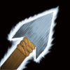
There is a lot of distracting black in that icon, and the glow is eating away the spear, which should be more important imo. Make the glow a bit bigger and more transluscent. And you should try to avoid that saw-ish looking aura, they don't look verry good imo.
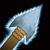
The spear also looks like it's completely unaffected by the glow light, adding a few blue tones in there would make it look prettier.
The spear blade looks kinda plain too.