- Joined
- Nov 2, 2004
- Messages
- 1,995

In this tutorial, I will show you my simple process in four easy steps for creating a screenshot icon that doesn't look (too much) like a screenshot icon.
This tutorial uses and assumes basic knowledge of GIMP and Magos' Model Editor.
Other tools will probably work just as well (just don't use MdlVis because it doesn't display particles).
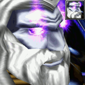
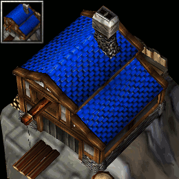
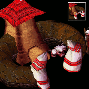
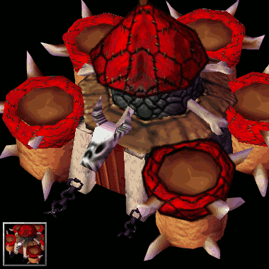
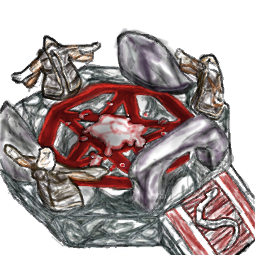
Step 1: The Screenshot
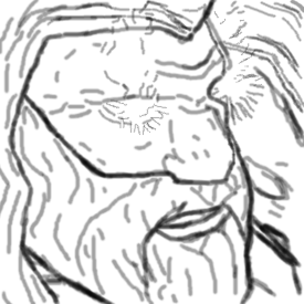
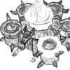
Step 2: Trace the image
Simply trace the entire image with the Paintbrush Tool.

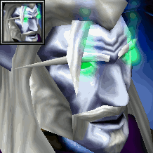
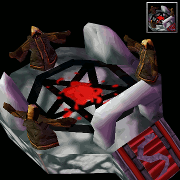
Step 3: Go crazy with Smudge
Use smudge to make the image smoother and more natural.
If you've used a separate layer for the tracing, make sure to create a new layer with "New from Visible" so you're working on the combination of the screenshot and tracing. Also make sure the black background isn't visible in it if you've already added it.

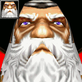
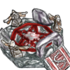
Step 4: Color correction
Finally, play around with brightness/contrast and saturation/lightness until it looks more like a WC3 icon.

Create your icon!
Finally, turn it into an icon. Make sure you add a black background, resize to 64x64, export to .tga and use ButtonManager to generate icons!

More examples (pastebin)


This tutorial uses and assumes basic knowledge of GIMP and Magos' Model Editor.
Other tools will probably work just as well (just don't use MdlVis because it doesn't display particles).
Step 1: The Screenshot
- Open the model in Magos' Model Editor. Leave the window at its default size. Use a portrait animation and the portrait camera, and adjust as desired.
- The screenshot shouldn't be too big, that would only give us more work for no gain.
- It's best if you hide the portrait background. The fastest way is to go through the material list until you find the right one and then set the texture to (None). Make sure you don't save the model afterwards.
- Crop the image to a square. Most WC3 icons are pretty zoomed in. Use the Fuzzy Select Tool to select and delete the grey background (if applicable).
Step 2: Trace the image
Simply trace the entire image with the Paintbrush Tool.
- Set Opacity somewhere between 35 to 45.
- Set Size to 2, 4, 6 and 8 depending on the level of detail.
- Add some shading and other details here and there.
- Try to already make straight edges and corners more round.
Step 3: Go crazy with Smudge
Use smudge to make the image smoother and more natural.
If you've used a separate layer for the tracing, make sure to create a new layer with "New from Visible" so you're working on the combination of the screenshot and tracing. Also make sure the black background isn't visible in it if you've already added it.
- Like in Step 2, use a Size of 2, 4, 6 and 8 depending on the level of detail.
- Smudge the tracing from Step 2. Make it mesh better with the screenshot and make straight lines and edges rounder.
- Also smudge away any seems, aliasing, straight lines and edges from the screenshot itself.
- The lines added in Step 2 for shading should be almost indistinguishable.
- Hair is a little more tricky. Smudge a little across the lines; also add small strands of hair by smudging away from the hair. Hopefully this explanation is somewhat clear.
Step 4: Color correction
Finally, play around with brightness/contrast and saturation/lightness until it looks more like a WC3 icon.
- WC3 icons' colors are usually low in contrast, while shading/lighting is highly contrasted.
- Compare your image to a similar icon from WC3 until the colors look somewhat the same
- A small difference can go a long way
- Or do whatever you like; it's your icon!
Create your icon!
Finally, turn it into an icon. Make sure you add a black background, resize to 64x64, export to .tga and use ButtonManager to generate icons!
More examples (pastebin)
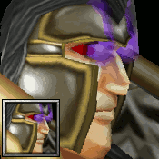
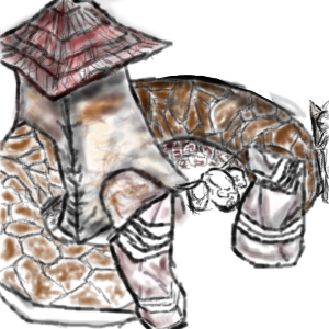
Elf Death Knight
Antonidas
Evil Marwyn
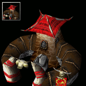
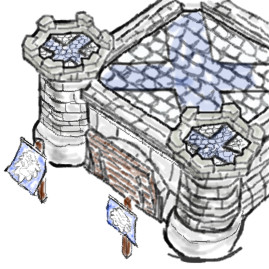
WC2 Great Hall v2
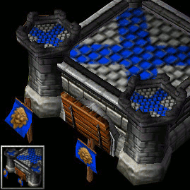
WC2 Town Hall
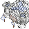
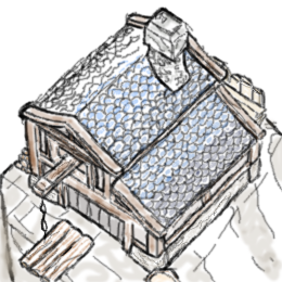
WC1 Human Barracks
WC1 Human Mill
WC2 Great Hall
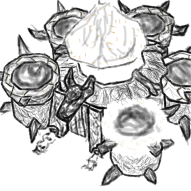
WC2 Orc Barracks
WC2 Altar of Storms

Last edited:


