• Listen to a special audio message from Bill Roper to the Hive Workshop community (Bill is a former Vice President of Blizzard Entertainment, Producer, Designer, Musician, Voice Actor) 🔗Click here to hear his message!
  • Read Evilhog's interview with Gregory Alper, the original composer of the music for WarCraft: Orcs & Humans 🔗Click here to read the full interview.

Scratch Elfrogue Model/Skin!

Status
Not open for further replies.
Level 18
Joined
Sep 2, 2005
Messages
1,029
I'm making a BE ElfRogue Model based on the Pathfinder Rogue design http://paizo.com/image/content/RiseOfTheRunelords/Pathfinder3_Rogue.jpg

I'm starting with the skin, then I'll make the model to fit it.

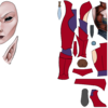
I'm doing all of the graphics in a japanese art program called Painttool Sai, which is kindof like photoshop, but has alot better tools for drawing things from scratch.

I figure I'll show my progress on this endeavor as I work on it in this thread. Feel free to comment.

As you can see, I work in really High res and then I'll shrink it later.
All of the black lines are vector lines on separate layers, so I can scale them, change line weight, or remove them, without any negative effect.

I also prefer a more elfy look on my elves than the standard Warcraft ones.

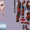
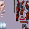
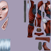
This is the Skin in Progress.
53918d1241647072-scratch-elfrogue-model-skin-elfrogue-skin.png
 

Attachments

  • Elfrogue Skin.png
    Elfrogue Skin.png
    313.8 KB · Views: 302
Level 18
Joined
Sep 2, 2005
Messages
1,029
hmm. I could do it that way, I don't see it making much difference though. It's not like I'll be using someone else's model, so whether I base my model on the texture or my texture on the model shouldn't make that big of a difference.

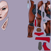
[Edit: Here is the current part I have finished.]
 

Attachments

  • Elfrogue Skin.png
    Elfrogue Skin.png
    411.1 KB · Views: 239
Last edited:
Level 18
Joined
Sep 2, 2005
Messages
1,029
Hmm True enough. The elves in warcraft are thin humans with huge arms and long ears. They don't really have elven looking faces. Oh, and they have funny long eyebrows.

If I get an ugly unwrap stretch it should be pretty fixable. All my lines are vectorized lines, as I mentioned, so I would have to move a line, and redraw the colored part inside that got cut off or stretched. It may be an issue, but i dont think it will.

I'm aware the detail is alot higher than on a wc3 skin as well, but I can always shrink it to 256x256 later. Besides, this way I should be able to port it to another game to use if I want, and that would be pretty nifty too.

As for knowing what I'm doing, I've never done anything like this before. It's always beed take someone else's model, change all the proportions, delete and add things until it looks different, then maybe change the original skin, or uvwrap it to another skin. Making a model from sscratch? nope, I've never done that at all. lol. But I can think of a workable clothing pattern in my head and know what the pieces need to be shaped like, and it seems like this is similar but less complicated.

Here's the next update. Not alot has changed, but there's a few things I've done.
 

Attachments

  • Elfrogue Skin.png
    Elfrogue Skin.png
    458 KB · Views: 130
Level 18
Joined
Sep 2, 2005
Messages
1,029
If youre thinking about the loss of detail, after resizing you can touch things up fairly easily. I'll have to test it first though. More Contrast? Really? On the whole thing or just the clothes, or what?

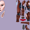
Here is is at 256, for example. what needs so much fixing.

also here is one with more contrast. Contrast adjustments aren't a feature in Sai though, so ill have to do it in photoshop. this is at +22, and only used for lightening. (so i remember how i got it). If you think it needs more contrast, etc, point it out to me and ill give it a shot.
 

Attachments

  • Elfrogue Skin256.png
    Elfrogue Skin256.png
    55.4 KB · Views: 111
  • Elfrogue Skin contrast.png
    Elfrogue Skin contrast.png
    461.5 KB · Views: 167
It looks very good, but in my opinion the unwrap is too real, it should be 'fatter'. When you wrap this I think it will strech a little on many parts...
also the butt doesn't look like a butt.
After u apply symmetry these cloth folds will look V shaped.
Removing these black lines it will look way too smooth.
The back fold is exxagerated.

overall it is good.
 
Level 18
Joined
Sep 2, 2005
Messages
1,029
Butt? There is no butt. That's v-shaped on putpose because it's the front. I haven't done the back yet.

When you say the fold on the back is too exaggerated fd o you mean the shirt? because it's a corset, so the back will have laces. That's not a fold, it's a pleat which will be being pulled by laces.


The eyes should be staying black, and the hair is now done. I intend to keep the colors like the concept, unless I add teamcolor. So Black Eyes, White Hair.

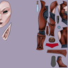
Here's what I have now.

The belt still needs alot of work, and I still haven't drawn a buckle.
 

Attachments

  • Elfrogue Skin.png
    Elfrogue Skin.png
    523.8 KB · Views: 174
Level 18
Joined
Sep 2, 2005
Messages
1,029
its an elf, not a bloodelf. hence the elf-like face and eye shape, etc. I'm going to add a neck, and cheeks, etc. I just haven't done it yet. as for wrapping it on a model, would wrapping it on some random model really help? the model i use wont have the same mesh as the model i make from scratch.

why cant you people look at my reference image to see why it doesnt look like a BE. o.o

It's mostly based on this, slightly just my own style, and slightly on another appearance type of elves, where the hairline comes from. Bloodelves dont look like elves anyways.

Also, no idea where youre getting slate blue from. Those are all just shades of gray on top of black.

attachment.php
 
Last edited:
Level 18
Joined
Sep 2, 2005
Messages
1,029
I'll go fix the images, I guess I'm too used to my 1mbps connection.
I can appreciate people thinkins about wc3 lore, but I said I was basing it on this drawing more than once, and then everyone starts asking me weird questions about why it looks like the drawing. lol

OK, none of my attachments are loading so i cant fix a damn thing right now.

Here is most of what I'm basing it on. If it looks unlike a bloodelf because it looks like this, that's because it's intentional.
54095d1241898520-scratch-elfrogue-model-skin-pathfinder3_rogue.jpg
 

Attachments

  • Pathfinder3_Rogue.jpg
    Pathfinder3_Rogue.jpg
    251.3 KB · Views: 626
Last edited:
Level 5
Joined
Jan 23, 2009
Messages
217
I have 54mbps. I just don't like scrolling the length of 3 screens to look at the next post. I just realised what was wrong. It's eyes seem too far apart.
 
Level 5
Joined
Aug 25, 2007
Messages
44
I would suggest blending your shadows in how you want them first, then lay your highlights over the top. The way you're working now, you mark out fine lines of highlight and shadow then blend it all together resulting in a lot of gray. Also I would use a higher saturation of color around the edges of the highlight to keep the intensity of "light".
 

A.R.

Skin Reviewer
Level 25
Joined
Mar 12, 2008
Messages
347
The texture looks great, shrinks well too :)

Honestly though, I think you're causing more trouble for yourself than strictly necessary.
Unless you crank an obscene amount of polygons (or use NURBS) into the mesh, there's
no way you'll get the full detail of all those curves you've drawn. By all means, do it this
way if it appeals to you, but speaking from experience, it is *much* easier to model and
unwrap first, then texture afterwards.
 
Level 18
Joined
Sep 2, 2005
Messages
1,029
Expresso: The way I tend to place the colors, both the shadows and highlights end up getting mixed with the midtones, not with eachother. Though if the shadows and highlights are right next to eachother, then I often do whta you just mentioned.

A.R.: I may use this skin for more than a wc3 model. I make a higher res poly model and just keep the model in 3ds max. I'll keep in mind that its easier to do the model first next time, but I've alreay started this one, and my skin is already like 70% finished.

Gyrosphinx: Yeah, Wayne Reynolds rocks. Not my *Favorite* artist, but probably my favorite artist who does RPG stuff. He kicks ass.

[Edit: Higher Res Model. silly me.]
 
Level 5
Joined
Aug 25, 2007
Messages
44
Looking at it again I see it's not so much the highlights and shadows mixing, but your choice of a highlight color which is very muddy. Are you color picking from the source image you posted? The overall contrast in that picture is much higher, so the gray highlight at least stands out more because it is used sparingly, whereas on your texture you're blending it all over and making a big soft mass. I'm sorry if I am sounding negative, I just want to explain what I think needs fixing.
 
Level 5
Joined
Aug 25, 2007
Messages
44
One way to keep the contrast but also have more color instead of just the black with thin bands of red midtone/highlight is to introduce a faked "ambient" color, usually a soft purple works well. I'm at work now so I can't sketch up a fig to look at but if you're interested I'll try to illustrate my point.
 
Level 18
Joined
Sep 2, 2005
Messages
1,029
Thanks frostwhisper. Yeah, I'm back, but it's looking like i need to do a PC format, so my work will be slowed for a few days.

As for the ambient color, I may do that, but if I do it it won't be until the end, because I don't know what color I would want to use. I would likely do it by having an ambient color layer, which I would overlay over the whole image.

The Colors for this model will come from the original artwork, so I gotta work on making the contrast with what's there, because I want it quite similar to the original.

No progress right now, as I left town for almost a week.
 
Status
Not open for further replies.
Top