• Listen to a special audio message from Bill Roper to the Hive Workshop community (Bill is a former Vice President of Blizzard Entertainment, Producer, Designer, Musician, Voice Actor) 🔗Click here to hear his message!
  • Read Evilhog's interview with Gregory Alper, the original composer of the music for WarCraft: Orcs & Humans 🔗Click here to read the full interview.

Power Orb

Status
Not open for further replies.

fladdermasken

Off-Topic Moderator
Level 39
Joined
Dec 27, 2006
Messages
3,690
My challenge with Keiji is on hold temporarily because his PC ate the seed of evil.

So instead I bring you something old I've left lying in my terraining folder.
 

Attachments

  • Eggs.png
    Eggs.png
    2.1 MB · Views: 291
Level 37
Joined
Nov 24, 2007
Messages
4,420
My challenge with Keiji is on hold temporarily because his PC ate the seed of evil.

The fuck are you talking about? <3

-

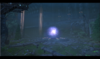
This is really cool, though, doodad and construction-wise. However, I feel that it's
lacking in atmosphere, it doesn't have that "fladdermasken" loom to it. Part of that,
I think, comes from the fact that I sort of think, for the sake of making this terrain
stand out more, the "power orb" should emit more lighting across the screen, some
slight purple hue extending from it and covering the screen outwards could look cool.

I also think the tiles sort of look a little out of place with the rest of the terrain,
it could work if you added some slimy green bile or something (using water plane
doodads) to the ground, some small puddles here and there or something.

Hmm, waterplane + green lava cracks + green glow or the green dungeon fog could
make for a cool looking toxic waste sort of thing. I think I may have to use that.
 

fladdermasken

Off-Topic Moderator
Level 39
Joined
Dec 27, 2006
Messages
3,690
The fuck are you talking about? <3
:^)

Gave the cross-screen lightning idea a quick whirl before I posted it actually, and I couldn't get it right. Guess it's mainly because there are no suitable lightning models that can be scaled up well without either losing the effect or making it look fat and cartoony.

I like the tiles in that they give it a touch of overgrowth. The contrast between the Blizz tiles and the fog gradient just looks right from where I'm sitting. Toxic waste is not a bad idea, but I'll probably look for a way to not cut off too much from the colour scheme. Guess I could try the blue cracks and a purple glow.
 
Level 37
Joined
Nov 24, 2007
Messages
4,420
Yeah, trying to do lighting with lightning is rather a bitch.
- Have you tried using the glow doodad instead? :p

Jokes aside, "couldn't get it right" is a poor excuse. You know as well as me that
when the lighting behaves like a whore that won't accept visa it's all because you
didn't spend enough time cuddling up with h--- It. I advice you to give it another
spin, it doesn't have to be immense or wholesome, just a slight hue to "quicker"
draw the attention inward toward the globe as the eye-catcher.
 

fladdermasken

Off-Topic Moderator
Level 39
Joined
Dec 27, 2006
Messages
3,690
Level 34
Joined
Sep 6, 2006
Messages
8,873
I read lightning too. : (

I love aspects of this, but something feels off. I've looked at it twice now trying to put my finger on it and the best I can come up with is that the foreground and background don't mesh well.

The foreground has this awesome ruined-sci-fi-overgrown feel, while the background just looks like awesome sci-fi (I like the background a lot). The transition between the two seems abrupt and I think that might be what is bothering me.

Also Keiji is spot on with the lighting. That might also be the reason I am confused by this piece.
 
Level 28
Joined
Nov 12, 2007
Messages
2,340
Looks horrible. Just kidding, I actually enjoyed this scene a lot. But after reading Keiji's comments I realised it didn't make me stand in awe too much as you usually do with your epic atmospheres.

As the central piece of the terrain is a light-emmitting orb, I think it might look good if you put more contrast on the terrain, making the central piece + reflections brighter while the rest of the scene darker. You usually do that kind of dramatic contrast.

Too bad when doing that contrast I suggested we tend to lose some cool visual information, like details on the walls/floor or tile variation.
 
Status
Not open for further replies.
Top