• 🏆 Texturing Contest #33 is OPEN! Contestants must re-texture a SD unit model found in-game (Warcraft 3 Classic), recreating the unit into a peaceful NPC version. 🔗Click here to enter!
  • It's time for the first HD Modeling Contest of 2024. Join the theme discussion for Hive's HD Modeling Contest #6! Click here to post your idea!

Orc Warlord

This bundle is marked as useful / simple. Simplicity is bliss, low effort and/or may contain minor bugs.
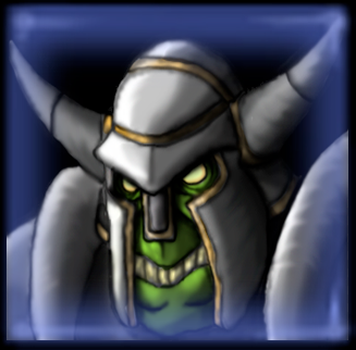
A quick icon of the Orc Warlord of Stefan.K.
Thanks to Scias for the blue border of the second icon.
------------------------------------------------------------------
[/ SPOILER]
Orc Warlord (versión Blue Border)
------------------------------------------------------------------
Hj8nzUb4S9mRFBb6Gj-nTg.png
[/ SPOILER] [/ SPOILER] [/ SPOILER]
Contents

Orc Warlord (Icon)

Orc Warlord (BlueBorder) (Icon)

Reviews
Murlocologist
Height and width don't share the same number. When you convert such image into 64 x 64 pixels image, it gets distorted. Avoid using such dark shadows that blend into background, they create too much contrast. Additional lightsource coming from right...
The Panda
Sent to Awaiting Update.
San
San
To substandard as author is not providing any update. Refer to Murlocologist's review if wish for fixes and improvement.
Level 37
Joined
Jul 22, 2015
Messages
3,485
Thanks to Scias for the blue border of the second icon.
Oh no. It's going to be everywhere now.


Anyway, the icon looks great in the big picture, but the icon looks rather plain when scaled down. I'd personally draw the attention more to the orc rather than his armor. The big picture does a great job on that, but at the scaled down version, the "green" of the orc is lost. It's still slightly blurry like the rest of your icons, but there is a noticeable difference in sharpness with this one, so keep it up.
 
Level 22
Joined
Jan 6, 2017
Messages
307
Oh no. It's going to be everywhere now.

Hey what do you have against blue border! :D

I think the icon could benefit from more zoom in on the character, to push the portrait of the character more in the focal point.
Also the blue border one looks better in large scale, for some reason when scaled down the blue is quite saturated.. Idk if you wanna bother but I think it would look better with a bit of a hue shift towards teal.

The icon looks great though, really liking how you've done the helmet and the shoulder pieces (shoulders especially look good when scaled down)
 
Last edited:
Level 50
Joined
Mar 22, 2016
Messages
588
Height and width don't share the same number. When you convert such image into 64 x 64 pixels image, it gets distorted.

Avoid using such dark shadows that blend into background, they create too much contrast. Additional lightsource coming from right would introduce some balance, as your current lighsource position is not the best option for unit icons. Image gets light parts contrasted to dark ones, creating unnecessary imbalance. You can as well add background effect or outline to detach foreground from background. Golden parts on helmet could easily cover greater area, to be present in icon size too, because they seem fitting to composition on larger image. It makes image less monotone.
 
Top