• 🏆 Texturing Contest #33 is OPEN! Contestants must re-texture a SD unit model found in-game (Warcraft 3 Classic), recreating the unit into a peaceful NPC version. 🔗Click here to enter!
  • It's time for the first HD Modeling Contest of 2024. Join the theme discussion for Hive's HD Modeling Contest #6! Click here to post your idea!

New Time Indicators

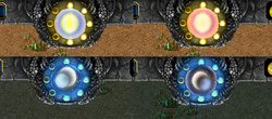
Something which always bugged me is that, in the books, it's established that Azeroth and Draenor/Outland both have two moons, yet we only see one present in the time indicator. I decided to throw together a new, more lore-accurate time indicator together to remedy this and decided to also make an Outland specific one while I was at it.

Definitely not my greatest texturing work but, hey, most of the detail is lost in-game anyways so I decided not to strain myself, haha.

Note: The import path, despite designating "human" specifically, replaces it for all races. No need to import it more than once.

Update 1: First versions were poorly received. Reworked from the ground up. Hopefully the skies no longer look like crumpled paper and the definition has been improved. xP
Previews
Contents

Azeroth Time Indicator (Texture)

Outland Time Indicator (Texture)

Reviews
Footman16
This is a great piece of UI work that makes the time indicator even lore friendly which is an amazing detail! It's free-hand which is even better and the quality of said freehand is very good. If I had one slightly criticism it's that the sun looks...
I am sorry but i do actually agree with that guy, i got excited at first because we can finally have a custom time indicator, until i tried it and realized that the original is still better. I am not a fan of it because first of all it's so pixelated/blurry you can already see it here, i like the night moons though, but the transition and the sun is where the pixelation/blur is more obvious.
 
Last edited:
I am sorry but i do actually agree with that guy, i got excited at first because we can finally have a custom time indicator, until i tried it and realized that the original is still better. I am not a fan of it because first of all it's so pixelated/blurry you can already see it here, i like the night moons though, but the transition and the sun is where the pixelation/blur is more obvious.
See, @Shakral? Now that's constructive criticism I can actually work with, haha.

@Strydhaizer I appreciate the feedback. Like I mentioned in the description, it seemed most of the detail would get lost in-game when I tried to make it more detailed, but I'll give it another go and see if I can't get it to work. Expect an update (hopefully) later today.

Just to be clear, do you think the purple/green colorations to indicate twilight/early dawn are causing any issues, or is it just a matter of blurriness?
 
you can even look for pictures of the sky and Outland sky, since the original uses a picture too as background (only the sun was drawed)
I think that would qualify as CnP if I directly used images of the skies like that, but I'll certainly look at my references again. Think I'm going to start from scratch with this, as I'm not having much luck just editing it as it is.
 
Definitely an improvement, but the sun looks like a vertical eye right now because of the white parts of the sun, i hope you can fix that. Try not to mirror the sun's left part to the sun's right part because that's what making it looks like an eye, and make the sun look round.
The original sun has similar white streaks through it and I can barely make it out in-game when using my textures. I might tweak it some more later, but I really don't think it's much of an issue rn.

you are very creative, I made one of these. once. only one. all I did was make it a copy paste version of a realistic moon. and I made the sun have a happy face. it looked awful.

these look really nice well done.
Haha, we all have to start somewhere! My first textures were pretty horrible too.
 
This is a great piece of UI work that makes the time indicator even lore friendly which is an amazing detail! It's free-hand which is even better and the quality of said freehand is very good. If I had one slightly criticism it's that the sun looks too oval-y and needs flattening at the top and bottom to make it rounder. Other than that, a great addition to the section, Approved as recommended!
 
Top