- Joined
- May 7, 2016
- Messages
- 2,175


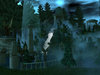
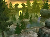
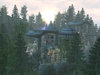
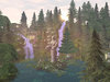
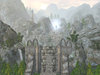
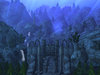
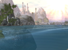
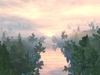
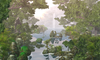
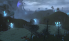
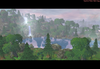
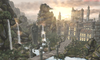
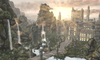
Hello guys and terrainers! Wanted to share my terraining pictures to get your opinions and suggestions to improve my terraining skills.
I hope you like them.
I hope you like them.
Attachments
-
 PYTerrain01.jpg929.8 KB · Views: 344
 -
 PYTerrain02.jpg957.9 KB · Views: 328
 -
 2017.jpg35.4 KB · Views: 289
 -
 PYTerrain03.jpg917.2 KB · Views: 311
 -
 PYTerrain04.jpg985.8 KB · Views: 295
 -
 PYTerrain05.jpg885.2 KB · Views: 300
 -
 PYTerrain05Update.jpg807.5 KB · Views: 261
 -
 PYTerrain06.png1.3 MB · Views: 298
 -
 PYTerrain07.png1.3 MB · Views: 289
 -
 PYTerrain08a.png2.9 MB · Views: 290
 -
 PYTerrain09.png2.1 MB · Views: 210
 -
 PYTerrain10.png1.1 MB · Views: 221
 -
 Castle-Update.png2.2 MB · Views: 363
 -
 Nature.png2 MB · Views: 458
 -
 Castle-Update-2.png2.3 MB · Views: 439
Last edited:
")


