- Joined
- May 21, 2009
- Messages
- 994
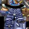
Hello! This is my first skin. If it is good enough and don't suck too much then I'm going to upload it. Take a look.

Keep in mind that I only edited the 2 legs until now. And the 2 arcs on the chest ain't done aswell. I just don't have time right now. Also edited alot on the left side of the leg. Feel free to comment.
I don't know what to call it but I was inspired by this:

I also got an in-game screenshot here:
 - I don't know why the cape is black and not red. Maybe I screwed tc?
Please, come with constructive critism.
Do you think I got a future for skinning in Warcraft 3?
Also this will be updated as I make more.
Keep in mind that I only edited the 2 legs until now. And the 2 arcs on the chest ain't done aswell. I just don't have time right now. Also edited alot on the left side of the leg. Feel free to comment.
I don't know what to call it but I was inspired by this:
I also got an in-game screenshot here:
- I don't know why the cape is black and not red. Maybe I screwed tc?Please, come with constructive critism.
Do you think I got a future for skinning in Warcraft 3?
Also this will be updated as I make more.
Last edited:


")