• Listen to a special audio message from Bill Roper to the Hive Workshop community (Bill is a former Vice President of Blizzard Entertainment, Producer, Designer, Musician, Voice Actor) 🔗Click here to hear his message!
  • Read Evilhog's interview with Gregory Alper, the original composer of the music for WarCraft: Orcs & Humans 🔗Click here to read the full interview.

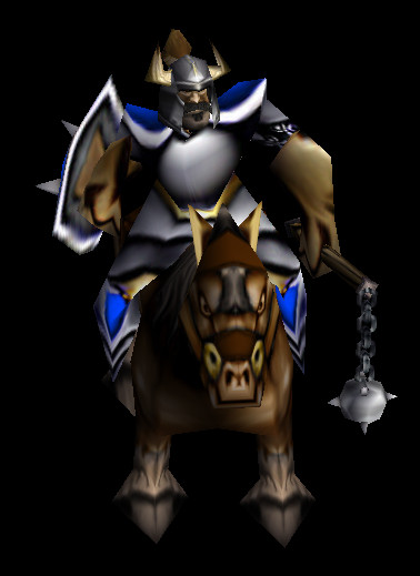
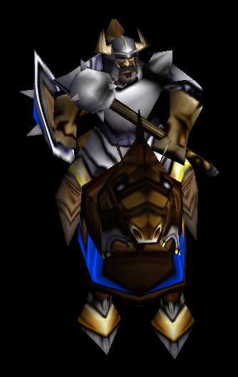
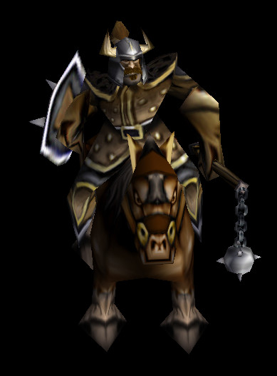
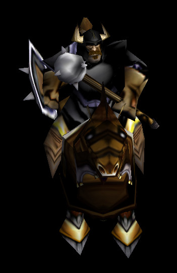
Knight & Bandit Lord (WC1)

Knight

Bandit Lord


105193-7046bd5a987041710f7adb311011d5aa.jpg
WC1PKnight.gif
WC1Knight.gif
- Edited: Knight (Optimized) by Ujimasa Hojo

170143-e959fca5daa9ffb3cd327f9987f1c0fd.jpg
- Edited: Knight (Optimized) by Ujimasa Hojo
Previews
Contents

BTNBanditLordWC1 (Icon)

BTNKnightWC1 (Icon)

Reviews
14:36, 4th Feb 2014 Kimbo: I think you need to do more freehand than just draw a helmet on him, and as stated it is blurry. Try to add some highlights/shine to the helmet to help solve this? Sin'dorei300: The helmet needs improvement, as proper...

Moderator

M

Moderator

14:36, 4th Feb 2014
Kimbo: I think you need to do more freehand than just draw a helmet on him, and as stated it is blurry. Try to add some highlights/shine to the helmet to help solve this?

Sin'dorei300: The helmet needs improvement, as proper shading\highlights and blurriness reduction.

17:22, 8th Mar 2014
Sin'dorei300: Improve the shading on the helmet to look like metal and make the icon clearer, and we'll see.

09:29, 22nd Mar 2014
Sin'dorei300: The helmet needs stronger highlights and the horns are too dark.

12:04, 27th Mar 2014
Sin'dorei300: U colored white the whole helmet instead of adding stronger highlights where it's needed. Google some helmets and metal textures to see how to shade properly.

08:54, 30th Mar 2014
Sin'dorei300: It's a bit better but it still doesn't look like metal. Look up to some tutorials on how to draw metal textures.


20:30, 30th Mar 2014
Sin'dorei300: Approved, although there's space for improvement.
 
Level 24
Joined
Jul 9, 2009
Messages
4,097
The blurriness definitely needs working, right now it's just the WarCraft III icon with with a low quality helmet.
 
Level 10
Joined
Sep 1, 2013
Messages
773
It looks better now, could also be used as a warcry icon.
But, I have another suggestion. Maybe lighten the horns and the helmet a bit? I took a look at your model and it had a more silver-ish tone than what you have in mind in this icon.
 
Level 6
Joined
Mar 30, 2014
Messages
230
I take view icon in the game
This what I can say the icon seems work pretty fine in wc3 and the graphic I's normal makes perfect for a melee map and seems this Icon can be approved by moderators and pretty impressive for making this kind of ideas bringing back wc1 icon back to life one's again you got a chance of approval by moderators I request ralle for approval.

Nice your icon is approved

Loktar don't worry I review first before I request
And keep up a good work
 
Last edited:
Top