
Moderator
M
Moderator
18:39 July 1 2010
Nice job, the cape change completes it, the eyes look better 2, nice work
Nice job, the cape change completes it, the eyes look better 2, nice work
Follow along with the video below to see how to install our site as a web app on your home screen.
Note: This feature may not be available in some browsers.

(6 ratings)
 Approved


 Malygos doesnt have like anything to do with this what you said. Also Malygos doesnt have orange eyes in his elf form (He has blue ones). <.>


It's great, but I do believe the brown color ruins it. If the cape was teamcolored, or blue like the rest, it would have had a set color scheme, and in general would look a lot less messy, and nice. I do believe that the Aspect of Malygos would have a more royal and decorated looking armor; runes, diamonds and perhaps some "blue gold" of some sorts would improve this skin greatly. The cloak especially looks a bit too "rugged" and "simple" for such a royal wizard, plus a DRAGON aspect.
Besides, a black reptile-like "eye pupil" would help improve the simple look of the eyes.

 D).
D).
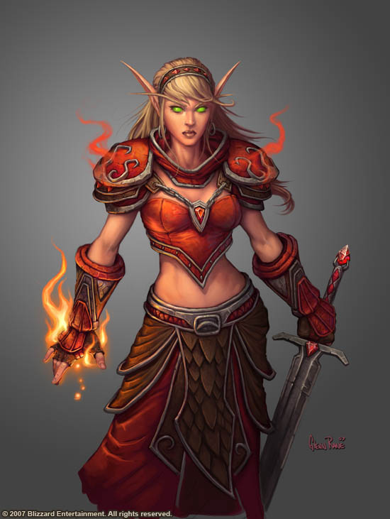


What the hell has this girl anything with dragons to do?
Say what ? 

She is a human aspect of a blue dragon, servant of Malygos.

