 Approved


Footman16
Skin Moderator
- Joined
- Jul 14, 2012
- Messages
- 3,403


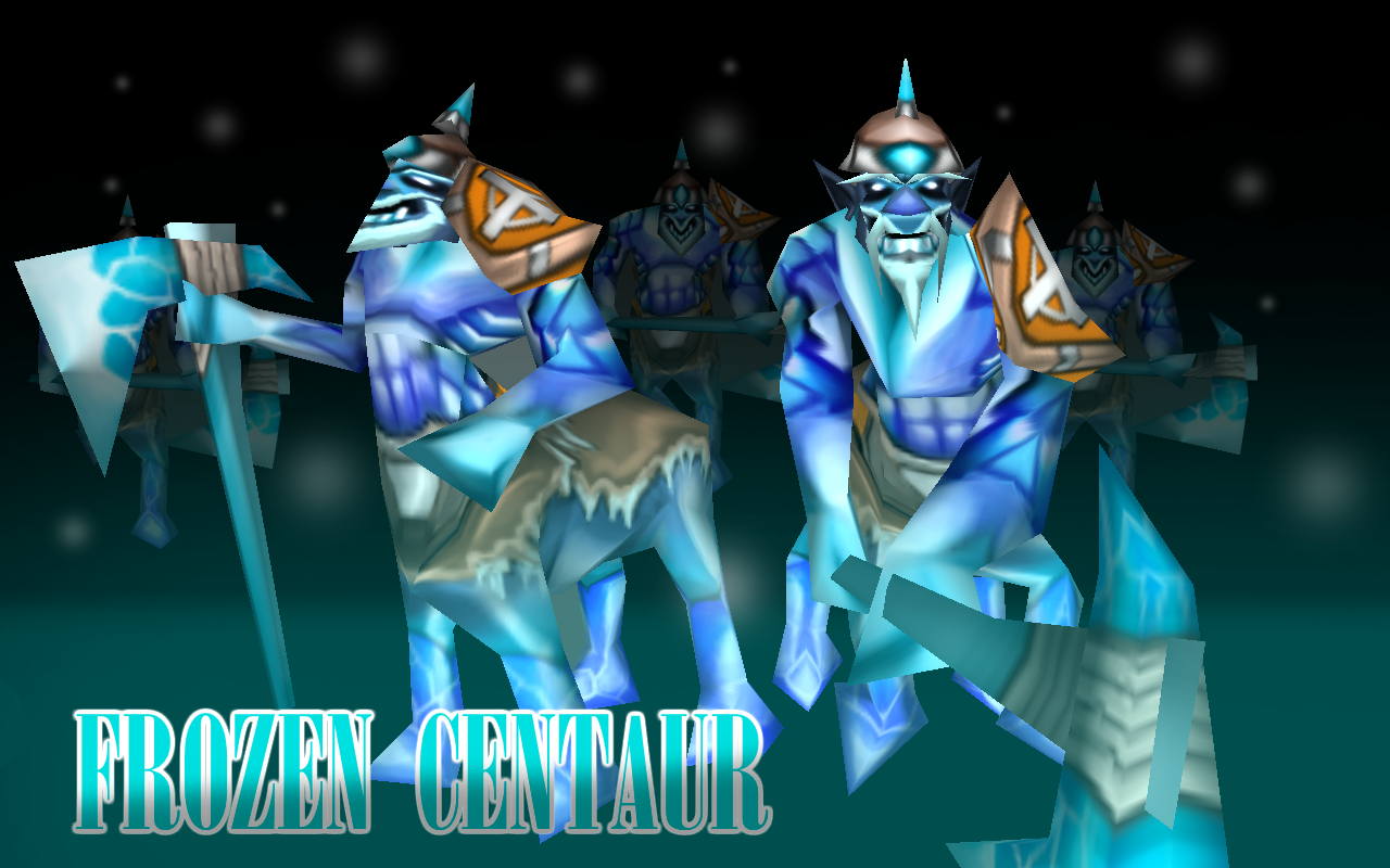
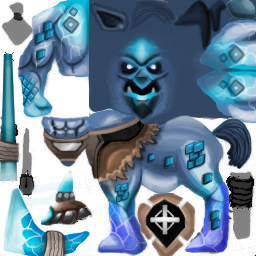
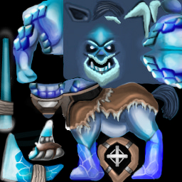
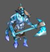
Let me allow myself to be the first to review the skin. So I want to start off by saying that I really like the skin, it's unique, it's cool and it's for a model that AFAIK doesn't often have skins made for it so props on all front. Indeed the quality of the texture is really high and if I'm not mistaken it is all free-hand?
I like the cartoonish of the whole skin from the bold white and blue of the axe to the cloth and blue gems that really fit in quite nicely with a lot of Warcraft 3's texture style. Since I know you have a lot of talent when it comes to drawing I'm going to list a few things that I think could be improved; don't take these as me being harsh/nitpicky but rather just my thoughts on what I personally think could improve the skin since I know you're capable of making such good textures and I'd like to see one get DC hopefully hence some of the criticisms might seem trivial or small I think they're all worth mentioning.
Overall a lovely skin which shows off an impressive ability to create textures of a high quality and cool, cartoon aesthetic which I really like. Therefore I give it a 4/5 and if the things I've said are taken on board I'd be happy to give it a 5/5") Very well done.
Very well done.
I like the cartoonish of the whole skin from the bold white and blue of the axe to the cloth and blue gems that really fit in quite nicely with a lot of Warcraft 3's texture style. Since I know you have a lot of talent when it comes to drawing I'm going to list a few things that I think could be improved; don't take these as me being harsh/nitpicky but rather just my thoughts on what I personally think could improve the skin since I know you're capable of making such good textures and I'd like to see one get DC hopefully hence some of the criticisms might seem trivial or small I think they're all worth mentioning.
- some of the shadows could be a bit darker/more pronounced. Whilst the skin is cartoony and you've got the hard part of the skin done i.e. making it look good with a nice aesthetic I think the darkest recesses like the abs and curves of the muscles could be darker/blacker as right now they're a bit grey.
- I appreciate the face wrap is... very poor on the model but I think the face is the area that needs the most work, I don't know exactly what needs done but just the level of detail combined with the poor wrap means that I think you're definitely capable of making it look better.
- So I can tell that for some bits you've drawn them and then copied and pasted them on, which is smart and not a bad thing to do but when blending and merging parts together you should perhaps redraw over where they join on so that the transition looks more natural like the diamond pattern on his fore arm with the rest of his arm.
- The only other criticism would be that maybe the horse body and shoulder pad could use a little more detail imo, however this is purely my own opinion and it's up to you whether you take it on board.
Overall a lovely skin which shows off an impressive ability to create textures of a high quality and cool, cartoon aesthetic which I really like. Therefore I give it a 4/5 and if the things I've said are taken on board I'd be happy to give it a 5/5
Very well done.


 .
.


