Moderator
M
Moderator
23:44, 4th Nov 2011
M0rbid:
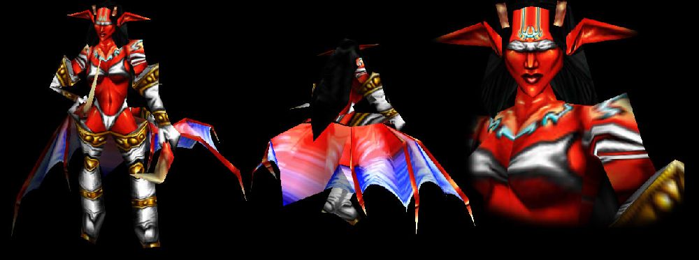
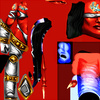
Technically definatelly a good level as always, the lousy wrap is handled extremely well, for example on the face and stomach part which look really good wrapped.
The shading is constant and does the job.
Overall it seems a lot like you were trying to copy Blizzard's typical artstyle and you did this successfully.
The concept fits with the Wc3 Demoness approach quite well, many detail elements remind of already existing Units.
However - and that might be a personal thing - I find the red to be a bit too bright and overintense. While testing it ingame it stuck out a bit too much. I also don't feel the colour pattern to be perfectly coherent. The blue and red on the wings could work out fine, but combined with the turquoise colour of the runes/chain, they are quite clashing. Same goes for the white of the clothes and the turquoise.
I would like you to fiddle around a bit with Hue and Saturation here, apart from that, good job.


 Approved


