• Listen to a special audio message from Bill Roper to the Hive Workshop community (Bill is a former Vice President of Blizzard Entertainment, Producer, Designer, Musician, Voice Actor) 🔗Click here to hear his message!
  • Read Evilhog's interview with Gregory Alper, the original composer of the music for WarCraft: Orcs & Humans 🔗Click here to read the full interview.

Dead City

Twilight's
Dead City

Description

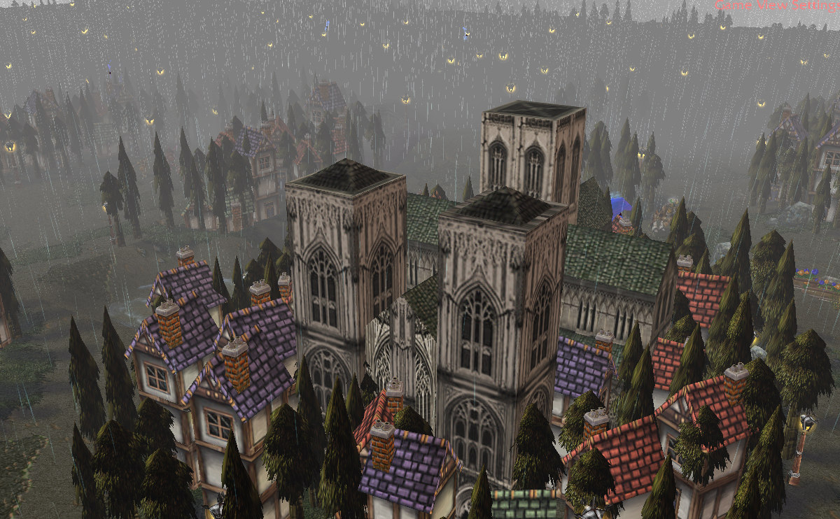
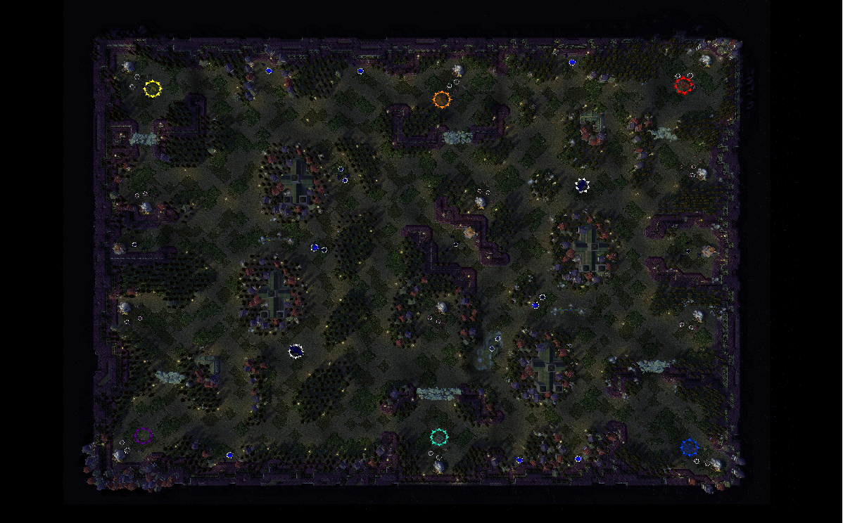
A human capital that is now destroyed, sometimes people battle here.

Map Info

Map hase:
-12 Goldmines
-3 Goblin Laboratory


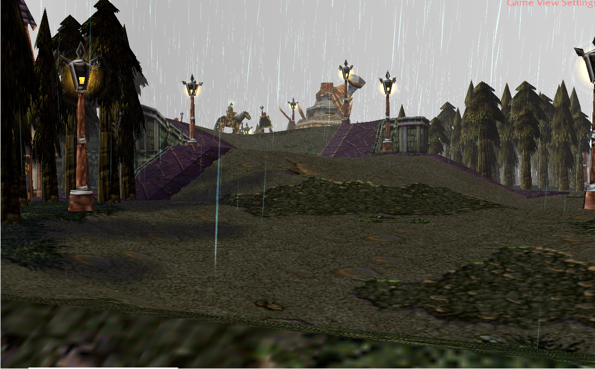
Screenshots

221980-albums6555-picture84430.png


221980-albums6555-picture84429.png


221980-albums6555-picture84428.png


Whats New
v1.0
-Uploaded to the hive
v1.1
-Improved terrain
-removed the version number
v1.2
-Improved terrain
-Starting location base size now bigger
-Removed rock chunks
v1.3
-Improved terrain a bit
-Some creep camps have been moved
v1.4
-Terrain Improved
-New creep camps

221980-albums6555-picture84669.png

221980-albums6555-picture84668.png


Special thanks to:


-You for downloading. Hope you like my map, comment or report if there is any bug during playing, Have fun.

Keywords:
Melee
Contents

Dead City (Map)

Reviews
19:08, 14th Jun 2014 Orcnet: Creep difficulty as well on resource routes through expansion to neutral buildings is fit for the player room, can be conditionally a team battle. I don't find the difficulty to be a problem, much less is the terrain...

Moderator

M

Moderator

19:08, 14th Jun 2014
Orcnet: Creep difficulty as well on resource routes through expansion to neutral buildings is fit for the player room, can be conditionally a team battle.

I don't find the difficulty to be a problem, much less is the terrain where it is full of doodads and much organized and decorated view which is nice, the magical runes on the middle though looks very messy I guess they are only useful for the magical lantern doodad or placed in the Fountain of Mana.

Overall, map is set for recommended use and guaranteed play-value to friends or co-op online.
 

Remixer

Map Reviewer
Level 33
Joined
Feb 19, 2011
Messages
2,068
Remixer's Quality Control
Terrain
Terrain overall seems rushed: the decorative doodads you used seems randomly placed and that you have not given much idea where to place them: buildings on the edges of the city cliffs, buildings in the middle of forests. You used buildings as a secondary cliff, which should be avoided. They look ugly. The bases in my opinion are also too small. Also, why did you block some passages with the Rock Chunks? I don't think it's so great idea as AI won't break those which reduces amount of passages that are already very small at some points. Not to mention that some of the creeps are placed really oddly: granite golem in the middle of the passage.


Neutrals
As mentioned above some of the creeps are placed oddly, also the creeps guarding the gold mines in the middle (and on the sides) are not set on "camp" is bad idea in my opinion, as the map is very tight. Also the expansion gold mines seem to be pretty, even too close to the base. Other than that I can see nothing superiorly wrong with the creeps other than f.e. the granite golem drop is too bad. Level 3 Item? Also if I were you I'd check the creeps facing directions, some of they face rather strange points...


Summary
Overall the map is manageable, however the building forests, small bases and overall tightness of the map really reduces your score. I like that you know how to use height variation and weather, however still the decoration side is not that great. You could try to use statues or something like that instead of placing houses/buildings everywhere. A tavern could also be a nice bonus to the map (maybe replace the Goblin Laboratory at the center).

Scores:
Terrain: 2/5
Comment: Terrain does not seem plain, instead doodads are placed wrongly. Fix their positions and use more variety. Worth to mention that the water area (South from the middle) you should not use the "shallow water" tool alone. Instead use the "shallow water" tool to a bit larger area, then go to "Advanced>Enforce Water Height Limits" unmark the EWHL field and use the "same level" tool on the water area to make it ground again. Then use "lower" tool on the area that you placed water before to make water to the same level, instead of changing cliff level.

Neutrals: 3/5
Comment: Creeps seem fine, however there is some odd drops and facing directions within the camps. Also the expansion gold mines are pretty close to base (not sure if wanted). The base gold mines might also have too much gold, since the expansions are so easy to conquer.

Generally: 2/5
Comment: Generally the map seems rushed and it's too narrow for enjoyable gameplay. There could be more tile variation (grass) especially under the forests. The city cliffs look strange as the "Square Tile" edge of them shows up next to plain dirt.

Rating: 7/15 (Bronze)
No matter the rating, I would set this "Needs Fix".
 
Level 13
Joined
Sep 14, 2012
Messages
437
Remixer's Quality Control
Terrain
Terrain overall seems rushed: the decorative doodads you used seems randomly placed and that you have not given much idea where to place them: buildings on the edges of the city cliffs, buildings in the middle of forests. You used buildings as a secondary cliff, which should be avoided. They look ugly. The bases in my opinion are also too small. Also, why did you block some passages with the Rock Chunks? I don't think it's so great idea as AI won't break those which reduces amount of passages that are already very small at some points. Not to mention that some of the creeps are placed really oddly: granite golem in the middle of the passage.


Neutrals
As mentioned above some of the creeps are placed oddly, also the creeps guarding the gold mines in the middle (and on the sides) are not set on "camp" is bad idea in my opinion, as the map is very tight. Also the expansion gold mines seem to be pretty, even too close to the base. Other than that I can see nothing superiorly wrong with the creeps other than f.e. the granite golem drop is too bad. Level 3 Item? Also if I were you I'd check the creeps facing directions, some of they face rather strange points...


Summary
Overall the map is manageable, however the building forests, small bases and overall tightness of the map really reduces your score. I like that you know how to use height variation and weather, however still the decoration side is not that great. You could try to use statues or something like that instead of placing houses/buildings everywhere. A tavern could also be a nice bonus to the map (maybe replace the Goblin Laboratory at the center).

Scores:
Terrain: 2/5
Comment: Terrain does not seem plain, instead doodads are placed wrongly. Fix their positions and use more variety. Worth to mention that the water area (South from the middle) you should not use the "shallow water" tool alone. Instead use the "shallow water" tool to a bit larger area, then go to "Advanced>Enforce Water Height Limits" unmark the EWHL field and use the "same level" tool on the water area to make it ground again. Then use "lower" tool on the area that you placed water before to make water to the same level, instead of changing cliff level.

Neutrals: 3/5
Comment: Creeps seem fine, however there is some odd drops and facing directions within the camps. Also the expansion gold mines are pretty close to base (not sure if wanted). The base gold mines might also have too much gold, since the expansions are so easy to conquer.

Generally: 2/5
Comment: Generally the map seems rushed and it's too narrow for enjoyable gameplay. There could be more tile variation (grass) especially under the forests. The city cliffs look strange as the "Square Tile" edge of them shows up next to plain dirt.

Rating: 7/15 (Bronze)
No matter the rating, I would set this "Needs Fix".
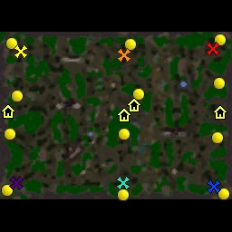

OK, so I rely need to work on the terrain, improve the base space a bit, remove the rock chucks (BTW, i had the idea like starcraft distructuble rocks, something like that, trying to create new strategies for warcraft, kinda mix it up a bit) and reduce gold on starter goldmines, tnx for review +rep ;)
 

Remixer

Map Reviewer
Level 33
Joined
Feb 19, 2011
Messages
2,068
Remixer's Quality Control
Terrain
Terrain overall seems rushed: the decorative doodads you used seems randomly placed and that you have not given much idea where to place them: buildings on the edges of the city cliffs, buildings in the middle of forests. You used buildings as a secondary cliff, which should be avoided. They look ugly. The bases in my opinion are also too small. Also, why did you block some passages with the Rock Chunks? I don't think it's so great idea as AI won't break those which reduces amount of passages that are already very small at some points. Not to mention that some of the creeps are placed really oddly: granite golem in the middle of the passage.


Neutrals
As mentioned above some of the creeps are placed oddly, also the creeps guarding the gold mines in the middle (and on the sides) are not set on "camp" is bad idea in my opinion, as the map is very tight. Also the expansion gold mines seem to be pretty, even too close to the base. Other than that I can see nothing superiorly wrong with the creeps other than f.e. the granite golem drop is too bad. Level 3 Item? Also if I were you I'd check the creeps facing directions, some of they face rather strange points...


Summary
Overall the map is manageable, however the building forests, small bases and overall tightness of the map really reduces your score. I like that you know how to use height variation and weather, however still the decoration side is not that great. You could try to use statues or something like that instead of placing houses/buildings everywhere. A tavern could also be a nice bonus to the map (maybe replace the Goblin Laboratory at the center).

Scores:
Terrain: 2/5
Comment: Terrain does not seem plain, instead doodads are placed wrongly. Fix their positions and use more variety. Worth to mention that the water area (South from the middle) you should not use the "shallow water" tool alone. Instead use the "shallow water" tool to a bit larger area, then go to "Advanced>Enforce Water Height Limits" unmark the EWHL field and use the "same level" tool on the water area to make it ground again. Then use "lower" tool on the area that you placed water before to make water to the same level, instead of changing cliff level.

Neutrals: 3/5
Comment: Creeps seem fine, however there is some odd drops and facing directions within the camps. Also the expansion gold mines are pretty close to base (not sure if wanted). The base gold mines might also have too much gold, since the expansions are so easy to conquer.

Generally: 2/5
Comment: Generally the map seems rushed and it's too narrow for enjoyable gameplay. There could be more tile variation (grass) especially under the forests. The city cliffs look strange as the "Square Tile" edge of them shows up next to plain dirt.

Rating: 7/15 (Bronze)
No matter the rating, I would set this "Needs Fix".


Remixer's Quality Control
Terrain
I cannot really see much improvement in the terrain. There are still houses colliding with trees (and a lot of them). Did you add more rocks? If you did it is not the solution. You must take a part of the map at a time and place every and each rock/building exactly well (I place every single rock and doodad that has a collision one at a time in my maps). It does not help that the rocks and buildings seem to be spammed all around the map with the thought of "well there is some of them". If you allow me I could make you a 2 picture Before/After screenshot? What you say? (of one area (forest)). As I mentioned earlier the cliffs look very plain without any decoration on them (buildings on their edges look odd). Tile using could be better especially around the cliffs since there is that "Square Tile"-tile. However you made the bases smaller (though I can't really see a great improvement) they are still too small in my opinion. (Try to place all the buildings of certain races to one of the bases and see how much they take up space). I think you have to expand the base, not remove the trees since the amount of trees could be a bit higher, since they provide important resource. Good job on removing the rocks though. Oh, and to add, it is bad idea to add too many rocks on the edges/inside the forests since after you cut off the trees you realize you did not get any more building space, which is often wanted.


Neutrals
Neutrals remain unchanged so I do not change my comment.


Summary
Overall the map has improved a little, however bigger improvement is needed.

Scores:
Terrain: 2/5
Comment: I would not really call adding more rocks improvement in terrain. You must correc the mistakes you have made earlier (remove the buildings from the forests and move them to the edges maybe, also remove the buildings from the cliffs and replace them with statues and place them nicely with CTRL+PageUp/Down.

Neutrals: 2/5
Comment: Changed (reduced by 1) rating after re-valuating the score system.

Generally: 2/5
Comment: Generally the map still needs improvement in order to get better rating. However since you removed the rock chunks I increase General score by 1. Reduced the score by 1 after re-valuating the score system.

Rating: 7/15 (Silver)
 

Attachments

  • DeadCityImage1.png
    DeadCityImage1.png
    817.5 KB · Views: 144
  • DeadCityImage2.png
    DeadCityImage2.png
    752.6 KB · Views: 182
Last edited:
Level 13
Joined
Sep 14, 2012
Messages
437
Remixer's Quality Control
Terrain
Terrain overall seems rushed: the decorative doodads you used seems randomly placed and that you have not given much idea where to place them: buildings on the edges of the city cliffs, buildings in the middle of forests. You used buildings as a secondary cliff, which should be avoided. They look ugly. The bases in my opinion are also too small. Also, why did you block some passages with the Rock Chunks? I don't think it's so great idea as AI won't break those which reduces amount of passages that are already very small at some points. Not to mention that some of the creeps are placed really oddly: granite golem in the middle of the passage.


Neutrals
As mentioned above some of the creeps are placed oddly, also the creeps guarding the gold mines in the middle (and on the sides) are not set on "camp" is bad idea in my opinion, as the map is very tight. Also the expansion gold mines seem to be pretty, even too close to the base. Other than that I can see nothing superiorly wrong with the creeps other than f.e. the granite golem drop is too bad. Level 3 Item? Also if I were you I'd check the creeps facing directions, some of they face rather strange points...


Summary
Overall the map is manageable, however the building forests, small bases and overall tightness of the map really reduces your score. I like that you know how to use height variation and weather, however still the decoration side is not that great. You could try to use statues or something like that instead of placing houses/buildings everywhere. A tavern could also be a nice bonus to the map (maybe replace the Goblin Laboratory at the center).

Scores:
Terrain: 2/5
Comment: Terrain does not seem plain, instead doodads are placed wrongly. Fix their positions and use more variety. Worth to mention that the water area (South from the middle) you should not use the "shallow water" tool alone. Instead use the "shallow water" tool to a bit larger area, then go to "Advanced>Enforce Water Height Limits" unmark the EWHL field and use the "same level" tool on the water area to make it ground again. Then use "lower" tool on the area that you placed water before to make water to the same level, instead of changing cliff level.

Neutrals: 3/5
Comment: Creeps seem fine, however there is some odd drops and facing directions within the camps. Also the expansion gold mines are pretty close to base (not sure if wanted). The base gold mines might also have too much gold, since the expansions are so easy to conquer.

Generally: 2/5
Comment: Generally the map seems rushed and it's too narrow for enjoyable gameplay. There could be more tile variation (grass) especially under the forests. The city cliffs look strange as the "Square Tile" edge of them shows up next to plain dirt.

Rating: 7/15 (Bronze)
No matter the rating, I would set this "Needs Fix".


Remixer's Quality Control
Terrain
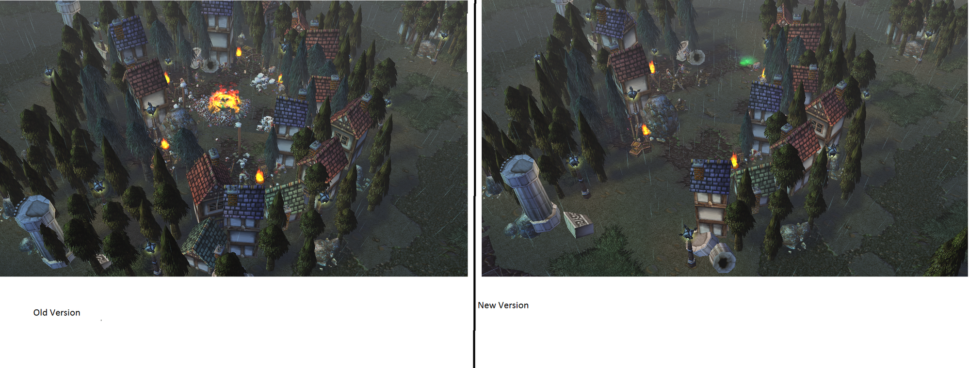
I cannot really see much improvement in the terrain. There are still houses colliding with trees (and a lot of them). Did you add more rocks? If you did it is not the solution. You must take a part of the map at a time and place every and each rock/building exactly well (I place every single rock and doodad that has a collision one at a time in my maps). It does not help that the rocks and buildings seem to be spammed all around the map with the thought of "well there is some of them". If you allow me I could make you a 2 picture Before/After screenshot? What you say? (of one area (forest)). As I mentioned earlier the cliffs look very plain without any decoration on them (buildings on their edges look odd). Tile using could be better especially around the cliffs since there is that "Square Tile"-tile. However you made the bases smaller (though I can't really see a great improvement) they are still too small in my opinion. (Try to place all the buildings of certain races to one of the bases and see how much they take up space). I think you have to expand the base, not remove the trees since the amount of trees could be a bit higher, since they provide important resource. Good job on removing the rocks though. Oh, and to add, it is bad idea to add too many rocks on the edges/inside the forests since after you cut off the trees you realize you did not get any more building space, which is often wanted.


Neutrals
Neutrals remain unchanged so I do not change my comment.


Summary
Overall the map has improved a little, however bigger improvement is needed.

Scores:
Terrain: 2/5
Comment: I would not really call adding more rocks improvement in terrain. You must correc the mistakes you have made earlier (remove the buildings from the forests and move them to the edges maybe, also remove the buildings from the cliffs and replace them with statues and place them nicely with CTRL+PageUp/Down.

Neutrals: 2/5
Comment: Changed (reduced by 1) rating after re-valuating the score system.

Generally: 2/5
Comment: Generally the map still needs improvement in order to get better rating. However since you removed the rock chunks I increase General score by 1. Reduced the score by 1 after re-valuating the score system.

Rating: 7/15 (Silver)


OK, tnx, I see I have some problems with the terrain, OK so I will fix it and see what I can do, TNX a lot, helped me a lot, tnx for your support

___________________________________________________________________________
Edit

Updated, OK hopefully this time I did the right thing. Hopefully
 
Last edited:

Remixer

Map Reviewer
Level 33
Joined
Feb 19, 2011
Messages
2,068
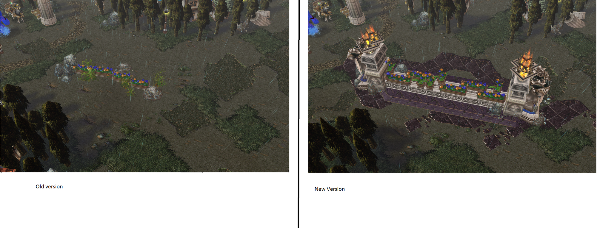
I see you updated your map again, it's getting better however there is still houses colliding with trees. Also I noticed you used the walls from my images, however they do not fit each other very well. If you use them, put a long line of them in a flat area and hold down Ctrl and the press Page Up (to raise) or Page Down (to lower) (these keys above arrow keys). That way they won't reset their height when you move them and there wont be huge holes between the walls. (Let the image show you what I mean).

Good job on moving the creeps, very nice. What I do not like though, is 2 neutral buildings in the middle... uuh not good. However it's up to you.

Edit:I noticed I edited terrain a bit before taking the first screenie (so I suggest you to check the map and see the area yourself).
 

Attachments

  • DeadCityImage1.png
    DeadCityImage1.png
    688 KB · Views: 142
  • DeadCityImage2.png
    DeadCityImage2.png
    704.5 KB · Views: 149
Level 13
Joined
Sep 14, 2012
Messages
437
I see you updated your map again, it's getting better however there is still houses colliding with trees. Also I noticed you used the walls from my images, however they do not fit each other very well. If you use them, put a long line of them in a flat area and hold down Ctrl and the press Page Up (to raise) or Page Down (to lower) (these keys above arrow keys). That way they won't reset their height when you move them and there wont be huge holes between the walls. (Let the image show you what I mean).

Good job on moving the creeps, very nice. What I do not like though, is 2 neutral buildings in the middle... uuh not good. However it's up to you.

Edit:I noticed I edited terrain a bit before taking the first screenie (so I suggest you to check the map and see the area yourself).


OK, still trying to update the terrain, and update the neutral positions, again thanks +rep (give me time to spread)
 
Level 30
Joined
Nov 29, 2012
Messages
6,637
Short Review emerges!

I have played your melee map and I must say it has an interesting layout and offers some good things. I would first start off in the terrain, it actually looks decent but I must agree on what Remixer's note about doodads being placed randomly and to add, it looks messy at points like the runes in the middle part of the map. I would suggest lessen those and much better to use Glowing Runes which offers much colors that blue. Using Building cliff placed together with dirt looks unusual as well, I think it's much better to use the dirt cliff or change all the dirt tiles and natural tiles to manmade ones. Not much of a big deal but those are the things I would point out at the terrain.

As for the map being melee, it has an interesting layout but I think it's not that symmetric (my personal opinion though). But it seems everything looks fine. Good amount of creep camps, decent amount of neutral buildings, neutrals have proper item drops ad etc but I think you could add 2 more gold mines maybe?

Overall, this is a good melee map with a good layout. Rated 4/5.
 
Level 13
Joined
Sep 14, 2012
Messages
437
Short Review emerges!

I have played your melee map and I must say it has an interesting layout and offers some good things. I would first start off in the terrain, it actually looks decent but I must agree on what Remixer's note about doodads being placed randomly and to add, it looks messy at points like the runes in the middle part of the map. I would suggest lessen those and much better to use Glowing Runes which offers much colors that blue. Using Building cliff placed together with dirt looks unusual as well, I think it's much better to use the dirt cliff or change all the dirt tiles and natural tiles to manmade ones. Not much of a big deal but those are the things I would point out at the terrain.

As for the map being melee, it has an interesting layout but I think it's not that symmetric (my personal opinion though). But it seems everything looks fine. Good amount of creep camps, decent amount of neutral buildings, neutrals have proper item drops ad etc but I think you could add 2 more gold mines maybe?

Overall, this is a good melee map with a good layout. Rated 4/5.

Tnx for review, I see that the terrain is not the best but still looking for leaks or bugs in it. 2 More gold mines not a bad idea, but where to put :) anyway tnx for review +rep
 
Level 2
Joined
Nov 27, 2017
Messages
7
Ooh! I like this one. It's a good thing I've found this... even though, just by searching with the keyword 'city'... But I digress. A decent melee map to play with.
 
Top