• Listen to a special audio message from Bill Roper to the Hive Workshop community (Bill is a former Vice President of Blizzard Entertainment, Producer, Designer, Musician, Voice Actor) 🔗Click here to hear his message!
  • Read Evilhog's interview with Gregory Alper, the original composer of the music for WarCraft: Orcs & Humans 🔗Click here to read the full interview.

CryptFiend (2).blp

This bundle is marked as useful / simple. Simplicity is bliss, low effort and/or may contain minor bugs.
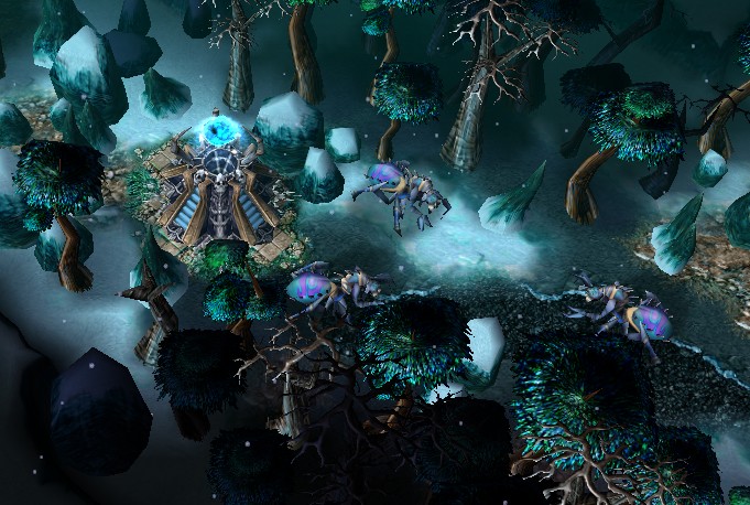
Yes, another ice-spider like skin ;) . I hope you will like it, it's an alive crypt fiend :)

path :
- units\Undead\CryptFiend\CryptFiend.blp
- Textures\CryptFiend.blp

I'll make an icon.

239559-albums7779-picture101238.bmp

give credit if you use it :D


upload : ---
uptade 1 : Tried to make it less blurry, I added a mark on his back, and sharpened it a bit. I think It's better now!
uptade 2 : Reinforced the shadows and highlights.
uptade 3 : I think I made what Misha said, and I think it's really better now!


Keywords:
Nerubian, alive, crypt, guard, ice, blue, azjol'nerub, northrend, snow, spider.
Contents

Crypt Guard - Blue version (Texture)

Reviews
10:22, 23rd Aug 2015 Misha: let's see more crispiness, definition between the various pieces of the skin, and sharpness on this one, shall we? :) Needs more definition like it has on the head and that small bit of neck after the head, the shadows...

Moderator

M

Moderator

10:22, 23rd Aug 2015
Misha: let's see more crispiness, definition between the various pieces of the skin, and sharpness on this one, shall we? :)

Needs more definition like it has on the head and that small bit of neck after the head, the shadows and highlights shouldn't be done black/white, but in an overlay layer, so they go well and contrast well with the chosen colors.. and add back the TC instead of that purple color on the abdomen. that'll make it even more nice and sharper
 

Ardenian

A

Ardenian

Nice, matches a crypt lord skin we have here.

I think you could make the highlights stronger, especially for the shell and the golden parts.
Colour variation is fine, but the use of the smudge tool was a bit too excessive, in my opinion. Try to sharpen it a bit, even if it is not visible in-game, you will be surprised how much it changes.

Sharpening it is also good to train your skills, as you won't draw always skins and icons that are heavily re-sized after finishing.
 

Ardenian

A

Ardenian

Nice update!

One thing, about the shell: As you can see in the preview compilation, the shell top part of the skin is also the top of the actual skin.

Therefore, there is no shadow, as you draw it, but a highlight, as a light source directly shines on it.
 

Ardenian

A

Ardenian

Hard brushes means you draw with.. hard brushes.
I'd also want to give advice on choosing brushes as well. I assume that the glow tool in GIMP probably are using a pretty soft edged brush but if you can find a sharp brush to erase edges or if you are going to draw a flat surface. Soft brushes are really great to draw values (shadows & lights) on round surfaces, like pipes.
He also made an example there.
It looks as if your skin is only drawn with the left brush shown in the image, but you should rather draw majorly with the right brush shown in the example and use the soft one for special occasions and things.
 
Nice, nice, definitely a step in a good direction :)
but the main body still appears less crispy than the head. you see the way how you did the eyes? and how the rest of the head has those smaller highlights and shadows? and especially how they are on the neck bit. that is the crispy effect you should be trying to add in on the whole skin., also sharpening might help, but don't overdo it, as it really can mess up a texture

and last thing, the beige 'rim' on the abdomen could use being less thick, not too much, but i think that would accent the upper part better if it had that lill bit more blue
 
Level 19
Joined
Jul 28, 2014
Messages
1,080
but the main body still appears less crispy than the head. you see the way how you did the eyes? and how the rest of the head has those smaller highlights and shadows? and especially how they are on the neck bit. that is the crispy effect you should be trying to add in on the whole skin., also sharpening might help, but don't overdo it, as it really can mess up a texture

I think I can said that's done :)

and last thing, the beige 'rim' on the abdomen could use being less thick, not too much, but i think that would accent the upper part better if it had that lill bit more blue

You're right, it looks better, I made an "Arrow" form in it.
 
more sharpness, more contrast on the body..
I mean.. look at other approved textures here, they're all unified in some way, at least

edit: and also.. you could simply alpha out those hanging bandage bits.. they don't fit and look bad

he can't alpha them out, those bandages are part of the model. They do not have transparency turned on in the actual model. So it would look all black.
 
Initially at first sight I thought this was a furry cute pet :xxd:
To cancel this impression, you may consider darkening some colours and creating more contrast. Usually undead have dark colours, not vivid cheerful ones which normally give a happy feeling.

This is not Undead, it's a Nerubian. Undead crypt fiends were mummified Nerubians. This skin tries to represent one of the variations for Nerubians that are alive.
 
Top