- Joined
- Nov 26, 2006
- Messages
- 11,136


Mythology
Contestants were to create a concept for something mythological. This can be a creature, a person, an environment, etc. It can be taken from real myths or it can be made up.

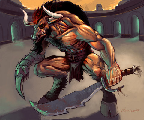
67Chrome
Clarifying:
I wish there was a backstory to this, but that's fine. I think anatomically it really looks like a skeleton of a dog, and the perspective seems right too, except for the tail. Concept wise, I've never seen the cerberus portrayed as a ghostly skeleton figure, which makes it a lot more interesting. I think it fits the theme well too. The effects are a bit overpowering, but the details are still visible.
____
Kimberly
Clarifying:
The anatomy is very good. Muscles and everything. It's build is pretty normal, so therefor the
anatomy would work. The concept isn't that creative, since chimeras are pretty known, and
many people have pictured them. However, usually the front part of it is a lion, the tail a snake,
and the hind part is goat or dragon or so. You have made the front part a dragon it seems, and
it seems the hind part is a wolf and the tail is a dragons aswell, so it seems you only mixed 2
animals, but you made it work really well, and it looks very nice. You haven't made any discription
of it, which it kinda sad. But the style works well for a concept.
____
Shiik
Clarifying:
The overall concept looks really good. But the anatomy is a bit off. I firstly don't see why he has
the body of the lobster, when he also have the human torso. Then he has double as many organs
inside him. Also, his head is pretty huge, and I don't see why he would need such a big head. I
think you maybe should have used more time on editing your concept, making it better, and less
time on the drawing/coloring, cause the shading and so on does not count as much when doing
a concept. The theme is nice. You read the discription of the character you made, so that is nice.
___
Mr.Goblin
Clarifying:
The anatomy does not make a whole lot of sense. There is tentacles on the front, on the back, and
then there is also fins on the middle. Tentacles are used for grabbing things, but also to swim. I don't
see any need for that much tentacles, and no need for fins as well. The tentacles on the head has
no purpose at all. The kraken is pictures many different ways, but still your concept of it is creative,
so you managed that well. You haven't written an discription of your concept either, which is sad.
I think that you should have defined it more, since it is concept, so it is very important to be able to
see the details properly, and if it is not defined well enough, it all sometimes blend in to eachother,
which I think is a bit of the case here.
___
Dionesiist
Clarifying:
Okay this one was pretty hard to judge the anatomy on. The toes are like on a dear, but it has 3 on
each foot. The front like kinda seems like an elephants? And the belly looks huge. I don't know if
that is just due to really long fur there, but okay. I doubt that a creature like this would ever get born,
since I don't think it would be able to run very fast, so it couldn't flee and it would not be good at
catching anything as food. And it really doesn't have anything to defend itself. It is really creative,
I haven't seen anything like it before. But it lacks a story in the discription, cause I would like to know
something about it.
___
Tails96
Clarifying:
Ofcourse the anatomy is 15 here. It's like a normal squid, just giant. Not very creative. You have just
drawn a big squid. It does state in discriptions from norwegian mythology of the kraken that it has
tentacles, like a squid. But it also states that it has horns and many heads. But yours is just a giant squid.
I don't think it fits into mythology very well, since mythological creatures are mostly unlike any creature
on earth, or it is a mix of 2 or more creatures. You haven't written a discription of it, nor linked any
discription for it. So you mostly score points on the correctness.
___
Elainiel
Clarifying:
Kinda looks like smoke with a dress on, and then it has a head. but what are these things made of? Plasma
or so? I don't know, so I don't really know how well I would say the anatomy is. It isn't very creative. It
looks like ghosts from all japanese or chinese horror movies, like the grudge. They all look pretty much the
same to me. You used way too much time on making a background, instead of focusing on your actual
concept. It lacks difinition and details. It's face is almost entirely covered by hair so it's hard to really see it.
And it could have been useful with a discription for this.
___
Dead-Man-Walking
Clarifying:
This isn't really that creative, because it really looks like Gyarados from pokemon. The body down to the tail look almost the same design. The head is really the only thing that seems to be partially creative. The head looks a bit out of proportion to the body, and where the body seems to bend the proportion looks a bit off. The style is a bit random, and there's actually no real shading or highlights. There just seems to be darker spots to distinguish a change in color on the drawing.
___
Jaret
Clarifying:
The anatomy has a few issues. The left side of his body for some reason is proportionally smaller than the right side. The muscles themselves aren't portrayed in a realistic fashion. The abdominal muscles are much smaller than they should be, for example. The joints you have (kneecaps, elbows etc.) all seem to be tiny compared to everything else. You didn't really add any creativity to the concept of Zeus because you portrayed him like he usually is portrayed. You really should've added more definition to the lines, and spent more time on the face. You attempted to add shadows/highlights in certain places, but others are lacking them.
___
Kola
Clarifying:
The perspective seems a bit off. Certain parts of the body seem like they're facing directions they shouldn't be. The muscles seem really unrealistic, the chest and legs seems to be the smallest part of the body. The legs seem be awkwardly place too. The arms are gigantic, but the shoulder seem way smaller than they should be. The concept of cyclops you used seems to be more like a ogre magi, and isn't really creative. The addition of the magical hammer seems to be the only new thing added to the concept.
___
Deepblade
Clarifying:
I like the idea of a craving onto a stone scroll. The drawing itself has clearly defined lines, which is good. The center the Beast seems hard to distinguish, though. The different types of claws and talons make the concept interesting. I'm still not sure what's on the end of what I think is a tail. It's hard to tell what exactly you're trying to portray there. Proportion wise, it seems like the majority of the beasts length is in the center of it's body, but like I mentioned earlier it's a bit crowded. The head seems sort of awkwardly placed, and overall it's a very 2D drawing.
___
Stefanstan
Clarifying:
Well, it's another Zeus concept, but it seems to be a bit different. The head is a bit too large for the body, but overall the porportions aren't too bad. The chest would be a tad bit higher normally, and his legs/robe seem a bit too long and skinny. His right arm seems a bit smaller than it should be. You really seem to have put more attention to the face than any other part because the rest seems to be blurred, so there isn't much detail in it. You didn't taken much liberty in trying to make a different concept of Zeus than he's usually portrayed.
___
04gusigo
Clarifying:
Well, everything is definitely aesthetically pleasing, and in proportion. The effects look neat, and the concept itself is well portrayed. It's a really creative concept, but the main issue is that it's hard to decide whether it fits the theme. In a sense it does, because it's a mythical sun that freezes objects. But, there really isn't any back story or anything to it.
___
-Berz-
Clarifying:
The only real issue I have with proportions, and perspective of the arms. The muscles aren't realistically portrayed in them. Everything else seems to have an okay perspective. I did a bit of a search, and while some of the results looked similar to your's, you did have some creativity with Odin.
___
Wimbo
Clarifying:
The concept isn't very creative, it looks a lot like a predator from the movies. It has a really awkward and unrealistic pose. The anatomy is off and isn't really realistic either. The legs are really thick, as well as the neck, which doesn't seem to fit with the rest of it. Overall, it's a very plain concept, and doesn't really have many details. It sort of fits with the theme of mythology.
___
Krl70
Clarifying:
For the concept it kinda seems like just a miner mining a wall underground. It's hard to grasp that it's actually a dwarf as there really isn't many details. You should've focused more on the dwarf, rather than the environment. His torso is much longer than the rest of his body which throws the proportions off. While dwarves are mythological, they are very common place and you didn't really take any creativity with depicting one.
___
PyramidHe@d
Clarifying:
Well, it certainly is a creative concept, with a backstory to support it. Proportions wise, it's a bit hard to judge as it seems a very oddly shaped creature. The arms and legs are skinny like bones and the head and torso is much thicker and meatier. It kinda gives it a sickly appearance, which is what I think your were aiming for. The glow you added seems to blur some of the details, but you can still see the transparent insides of the creature. I think the spear could've had a more creative design to match the rest of it.
___
GhostThruster
Clarifying:
This one kinda looks like gyrados too, and even has similar color scheme. It isn't really that creative, even though it doesn't fit the normal concept of the loch ness monster. The perspective seems off on the legs and arms, as well as the head. The chest seems like it should be naturally thicker and wider, but it actually seems to get skinnier compared to the rest of it. Concept wise, it's also weird that an underwater mythical being would also have giant wings.
"Correct"ness | 14/15 |
Creativity | 12/15 |
Theme | 13/15 |
Style | 5/5 |
Total | 44/50 |
I wish there was a backstory to this, but that's fine. I think anatomically it really looks like a skeleton of a dog, and the perspective seems right too, except for the tail. Concept wise, I've never seen the cerberus portrayed as a ghostly skeleton figure, which makes it a lot more interesting. I think it fits the theme well too. The effects are a bit overpowering, but the details are still visible.
____
Kimberly
"Correct"ness | 15/15 |
Creativity | 10/15 |
Theme | 15/15 |
Style | 2/5 |
Total | 42/50 |
The anatomy is very good. Muscles and everything. It's build is pretty normal, so therefor the
anatomy would work. The concept isn't that creative, since chimeras are pretty known, and
many people have pictured them. However, usually the front part of it is a lion, the tail a snake,
and the hind part is goat or dragon or so. You have made the front part a dragon it seems, and
it seems the hind part is a wolf and the tail is a dragons aswell, so it seems you only mixed 2
animals, but you made it work really well, and it looks very nice. You haven't made any discription
of it, which it kinda sad. But the style works well for a concept.
____
Shiik
"Correct"ness | 5/15 |
Creativity | 15/15 |
Theme | 15/15 |
Style | 3/5 |
Total | 38/50 |
The overall concept looks really good. But the anatomy is a bit off. I firstly don't see why he has
the body of the lobster, when he also have the human torso. Then he has double as many organs
inside him. Also, his head is pretty huge, and I don't see why he would need such a big head. I
think you maybe should have used more time on editing your concept, making it better, and less
time on the drawing/coloring, cause the shading and so on does not count as much when doing
a concept. The theme is nice. You read the discription of the character you made, so that is nice.
___
Mr.Goblin
"Correct"ness | 5/15 |
Creativity | 15/15 |
Theme | 15/15 |
Style | 3/5 |
Total | 38/50 |
The anatomy does not make a whole lot of sense. There is tentacles on the front, on the back, and
then there is also fins on the middle. Tentacles are used for grabbing things, but also to swim. I don't
see any need for that much tentacles, and no need for fins as well. The tentacles on the head has
no purpose at all. The kraken is pictures many different ways, but still your concept of it is creative,
so you managed that well. You haven't written an discription of your concept either, which is sad.
I think that you should have defined it more, since it is concept, so it is very important to be able to
see the details properly, and if it is not defined well enough, it all sometimes blend in to eachother,
which I think is a bit of the case here.
___
Dionesiist
"Correct"ness | 1/15 |
Creativity | 15/15 |
Theme | 10/15 |
Style | 3/5 |
Total | 29/50 |
Okay this one was pretty hard to judge the anatomy on. The toes are like on a dear, but it has 3 on
each foot. The front like kinda seems like an elephants? And the belly looks huge. I don't know if
that is just due to really long fur there, but okay. I doubt that a creature like this would ever get born,
since I don't think it would be able to run very fast, so it couldn't flee and it would not be good at
catching anything as food. And it really doesn't have anything to defend itself. It is really creative,
I haven't seen anything like it before. But it lacks a story in the discription, cause I would like to know
something about it.
___
Tails96
"Correct"ness | 15/15 |
Creativity | 3/15 |
Theme | 3/15 |
Style | 1/5 |
Total | 22/50 |
Ofcourse the anatomy is 15 here. It's like a normal squid, just giant. Not very creative. You have just
drawn a big squid. It does state in discriptions from norwegian mythology of the kraken that it has
tentacles, like a squid. But it also states that it has horns and many heads. But yours is just a giant squid.
I don't think it fits into mythology very well, since mythological creatures are mostly unlike any creature
on earth, or it is a mix of 2 or more creatures. You haven't written a discription of it, nor linked any
discription for it. So you mostly score points on the correctness.
___
Elainiel
"Correct"ness | 3/15 |
Creativity | 1/15 |
Theme | 10/15 |
Style | 1/5 |
Total | 15/50 |
Kinda looks like smoke with a dress on, and then it has a head. but what are these things made of? Plasma
or so? I don't know, so I don't really know how well I would say the anatomy is. It isn't very creative. It
looks like ghosts from all japanese or chinese horror movies, like the grudge. They all look pretty much the
same to me. You used way too much time on making a background, instead of focusing on your actual
concept. It lacks difinition and details. It's face is almost entirely covered by hair so it's hard to really see it.
And it could have been useful with a discription for this.
___
Dead-Man-Walking
"Correct"ness | 2/15 |
Creativity | 2/15 |
Theme | 11/15 |
Style | 1/5 |
Total | 16/50 |
This isn't really that creative, because it really looks like Gyarados from pokemon. The body down to the tail look almost the same design. The head is really the only thing that seems to be partially creative. The head looks a bit out of proportion to the body, and where the body seems to bend the proportion looks a bit off. The style is a bit random, and there's actually no real shading or highlights. There just seems to be darker spots to distinguish a change in color on the drawing.
___
Jaret
"Correct"ness | 3/15 |
Creativity | 1/15 |
Theme | 12/15 |
Style | 2/5 |
Total | 18/50 |
The anatomy has a few issues. The left side of his body for some reason is proportionally smaller than the right side. The muscles themselves aren't portrayed in a realistic fashion. The abdominal muscles are much smaller than they should be, for example. The joints you have (kneecaps, elbows etc.) all seem to be tiny compared to everything else. You didn't really add any creativity to the concept of Zeus because you portrayed him like he usually is portrayed. You really should've added more definition to the lines, and spent more time on the face. You attempted to add shadows/highlights in certain places, but others are lacking them.
___
Kola
"Correct"ness | 2/15 |
Creativity | 1/15 |
Theme | 11/15 |
Style | 2/5 |
Total | 17/50 |
The perspective seems a bit off. Certain parts of the body seem like they're facing directions they shouldn't be. The muscles seem really unrealistic, the chest and legs seems to be the smallest part of the body. The legs seem be awkwardly place too. The arms are gigantic, but the shoulder seem way smaller than they should be. The concept of cyclops you used seems to be more like a ogre magi, and isn't really creative. The addition of the magical hammer seems to be the only new thing added to the concept.
___
Deepblade
"Correct"ness | 3/15 |
Creativity | 6/15 |
Theme | 12/15 |
Style | 3/5 |
Total | 24/50 |
I like the idea of a craving onto a stone scroll. The drawing itself has clearly defined lines, which is good. The center the Beast seems hard to distinguish, though. The different types of claws and talons make the concept interesting. I'm still not sure what's on the end of what I think is a tail. It's hard to tell what exactly you're trying to portray there. Proportion wise, it seems like the majority of the beasts length is in the center of it's body, but like I mentioned earlier it's a bit crowded. The head seems sort of awkwardly placed, and overall it's a very 2D drawing.
___
Stefanstan
"Correct"ness | 4/15 |
Creativity | 1/15 |
Theme | 12/15 |
Style | 2/5 |
Total | 19/50 |
Well, it's another Zeus concept, but it seems to be a bit different. The head is a bit too large for the body, but overall the porportions aren't too bad. The chest would be a tad bit higher normally, and his legs/robe seem a bit too long and skinny. His right arm seems a bit smaller than it should be. You really seem to have put more attention to the face than any other part because the rest seems to be blurred, so there isn't much detail in it. You didn't taken much liberty in trying to make a different concept of Zeus than he's usually portrayed.
___
04gusigo
"Correct"ness | 10/15 |
Creativity | 8/15 |
Theme | 5/15 |
Style | 4/5 |
Total | 27/50 |
Well, everything is definitely aesthetically pleasing, and in proportion. The effects look neat, and the concept itself is well portrayed. It's a really creative concept, but the main issue is that it's hard to decide whether it fits the theme. In a sense it does, because it's a mythical sun that freezes objects. But, there really isn't any back story or anything to it.
___
-Berz-
"Correct"ness | 8/15 |
Creativity | 5/15 |
Theme | 11/15 |
Style | 3/5 |
Total | 27/50 |
The only real issue I have with proportions, and perspective of the arms. The muscles aren't realistically portrayed in them. Everything else seems to have an okay perspective. I did a bit of a search, and while some of the results looked similar to your's, you did have some creativity with Odin.
___
Wimbo
"Correct"ness | 2/15 |
Creativity | 1/15 |
Theme | 10/15 |
Style | 1/5 |
Total | 14/50 |
The concept isn't very creative, it looks a lot like a predator from the movies. It has a really awkward and unrealistic pose. The anatomy is off and isn't really realistic either. The legs are really thick, as well as the neck, which doesn't seem to fit with the rest of it. Overall, it's a very plain concept, and doesn't really have many details. It sort of fits with the theme of mythology.
___
Krl70
"Correct"ness | 1/15 |
Creativity | 1/15 |
Theme | 10/15 |
Style | 1/5 |
Total | 13/50 |
For the concept it kinda seems like just a miner mining a wall underground. It's hard to grasp that it's actually a dwarf as there really isn't many details. You should've focused more on the dwarf, rather than the environment. His torso is much longer than the rest of his body which throws the proportions off. While dwarves are mythological, they are very common place and you didn't really take any creativity with depicting one.
___
PyramidHe@d
"Correct"ness | 8/15 |
Creativity | 15/15 |
Theme | 13/15 |
Style | 3/5 |
Total | 39/50 |
Well, it certainly is a creative concept, with a backstory to support it. Proportions wise, it's a bit hard to judge as it seems a very oddly shaped creature. The arms and legs are skinny like bones and the head and torso is much thicker and meatier. It kinda gives it a sickly appearance, which is what I think your were aiming for. The glow you added seems to blur some of the details, but you can still see the transparent insides of the creature. I think the spear could've had a more creative design to match the rest of it.
___
GhostThruster
"Correct"ness | 5/15 |
Creativity | 1/15 |
Theme | 11/15 |
Style | 1/5 |
Total | 17/50 |
This one kinda looks like gyrados too, and even has similar color scheme. It isn't really that creative, even though it doesn't fit the normal concept of the loch ness monster. The perspective seems off on the legs and arms, as well as the head. The chest seems like it should be naturally thicker and wider, but it actually seems to get skinnier compared to the rest of it. Concept wise, it's also weird that an underwater mythical being would also have giant wings.
(enjoy's judging * 1.5) + ((Votes / Total Votes) * 25) = Final Score
67Chrome: (44 * 1.5) + ((34/135) * 25) = 72.2962963
Kimberly: (42 * 1.5) + ((11/135) * 25) = 65.037037
Shiik: (38 * 1.5) + ((7/135) * 25) = 58.2962963
Mr.Goblin: (38 * 1.5) + ((29/135) * 25) = 62.3703704
Dionesiist: (29 * 1.5) + ((5/135) * 25) = 44.4259259
Tails96: (22 * 1.5) + ((18/135) * 25) = 36.3333333
Elainiel: (15 * 1.5) + ((3/135) * 25) = 23.0555556
dead-man-walking: (16 * 1.5) + ((2/135) * 25) = 24.3703704
Jaret: (18 * 1.5) + ((0/135) * 25) = 27.0000000
Kola: (17 * 1.5) + ((0/135) * 25) = 25.5000000
Deepblade: (24 * 1.5) + ((1/135) * 25) = 36.1851852
Stefanstan95: (19 * 1.5) + ((1/135) * 25) = 28.6851852
04gusigo: (27 * 1.5) + ((7/135) * 25) = 41.7962963
-BerZ-: (27 * 1.5) + ((4/135) * 25) = 41.2407407
Wimbo125: (14 * 1.5) + ((1/135) * 25) = 21.1851852
Krl70: (13 * 1.5) + ((0/135) * 25) = 19.5000000
Pyramidhe@d: (39 * 1.5) + ((11/135) * 25) = 60.537037
GhostThruster: (17 * 1.5) + ((1/135) * 25) = 25.6851852
4th - Pyramidhe@d
5th - Shiik
6th - Dionesiist
7th - 04gusigo
8th - -BerZ-
9th - Tails96
10th - Deepblade
11th - Stefanstan95
12th - Jaret
13th - GhostThruster
14th - Kola
15th - dead-man-walking
16th - Elainiel
17th - Wimbo125
18th - Krl70
5th - Shiik
6th - Dionesiist
7th - 04gusigo
8th - -BerZ-
9th - Tails96
10th - Deepblade
11th - Stefanstan95
12th - Jaret
13th - GhostThruster
14th - Kola
15th - dead-man-walking
16th - Elainiel
17th - Wimbo125
18th - Krl70
Poll | Contest


