 Approved
Moderator
M
Moderator
14:59, 5th Mar 2015
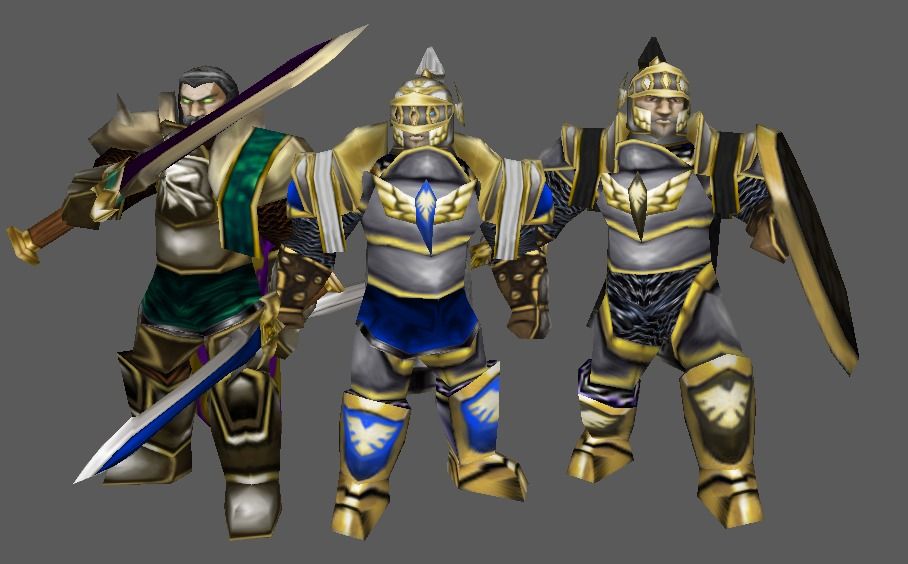
Deolrin: This model is beautiful. Truly one of your finest works thus far. However, there are a few things that I would like you to change, and I hope you don't take them the wrong way. Feel free to message me if you disagree about something.
Anyhow, the changes I would like to see are as follows:
")
13:02, 6th Feb 2016
HappyCockroach:
Well, this is one hell of a model, and you improved it after Deolrin's feedback.
I agree with most of the points Deolrin puts up. But honestly, I don't agree using the campaign hi-res textures is a good idea. It is a texture that isn't meant to the wc3 in-game environment. Tends to look out of place, as it does in your model. There should be a more cartoonish ring mail in the MPQ for you to use here. This is a suggestion of mine, but not necessarily you shall change it, even because in your model the chain mail doesn't look too bad.
Apart from that, I don't have much to say, except that your two models here are of a 'high-qualitiness' we don't usually see. Great animation variety, and a very detailed and careful wrap, with creative use of in-game textures.
As a sidenote, I believe the community would appreciate that sword as an attachment.
Deolrin: This model is beautiful. Truly one of your finest works thus far. However, there are a few things that I would like you to change, and I hope you don't take them the wrong way. Feel free to message me if you disagree about something.
Anyhow, the changes I would like to see are as follows:
- The underside of the feet has a bad texture wrap. Please fix it. It's nothing too big, but it is quite visible when the unit is walking.
- The chainmail wrap is terrible. I don't know why you opted to go for that texture, but it is extremely low resolution and counteracts all the fine wrapwork on the rest of the model. I recommend using the Human Campaign menu screen chainmail, or perhaps the Undead screen one, but at any rate you should change the texture or the wrap so it will look less stretched and low-resolution.
- And perhaps most importantly... The face. Although I appreciate what you've done with being more creative in your choice of face texture, there are a couple of things I think you should work on to really bring the model's quality up a bit. First of all, there are a few gray spots on his cheeks. They look a little bit like Native American warpaint or something like that, though it's obvious they are simple wrapping\texture errors. If it's possible at all, try to get rid of them or minimalize them. Secondly, the inside of his mouth. The villager's mouth looks quite awful. If you could nick the texture from one of the more standard units for the inside of his mouth, the quality of the portrait will increase drastically. And finally - the eyes. Again, I appreciate your creative work with the peasant, but that sort of drawn-in eye texture looks terrible in-game. I suggest you cut out the eyes and give them simple white wrap, and then add 2D plane pupils, similar to other in-game models (look at Arthas for a simple example). This is because he is a hero unit, and therefore him having those bad quality drawn eyes is not fitting.
13:02, 6th Feb 2016
HappyCockroach:
Well, this is one hell of a model, and you improved it after Deolrin's feedback.
I agree with most of the points Deolrin puts up. But honestly, I don't agree using the campaign hi-res textures is a good idea. It is a texture that isn't meant to the wc3 in-game environment. Tends to look out of place, as it does in your model. There should be a more cartoonish ring mail in the MPQ for you to use here. This is a suggestion of mine, but not necessarily you shall change it, even because in your model the chain mail doesn't look too bad.
Apart from that, I don't have much to say, except that your two models here are of a 'high-qualitiness' we don't usually see. Great animation variety, and a very detailed and careful wrap, with creative use of in-game textures.
As a sidenote, I believe the community would appreciate that sword as an attachment.


