Hmm... I know what you have to do to improve this:
Overall hints:
1)Look around at the this board and see how we do for terraining. But pay attention to details, they change the overall look of your terrain a lot.
2)While in the World Editor, press "v" key to see the game-view. The purple cubes will not be shown.
3)This is not about the terrain itself, but it is going to help you in some ways: Choose better points to take your screenshot. The elements of the screen are too close to the camera, so it is hardf to see the background, then This is only acceptable if you want to put in evidence one element, but thats not what you meant there.
4)Practice.
About the terrain:
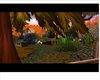
1)As I said above, the elements are too close to the camera, so its hard to see the background. Like, the main element of the first screen isn't that rock and skulls, right? lol. So move the camera beside the rock, then we can better analyze it.
2)Add more shrubs! They'll give a better look to it.
3)Its Lordaeron Fall, right? So you have to tint the shrubs to a color that fix good with the tileset. They're too green, and the grass is orange, and thats weird.
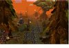
4) Nice use of fog. More practice and you'll find a way to fix it better.
5)I liked the wall at the background in the first pic. Good work!
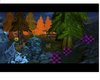
6)At the second picture, it is night.... so what the hell is that orange fog doing there? Look, you have to choose what do you want: a day or night map. If you want a day map, you choosed the right fog. If you want a night-themed map, you'll need a dark blue fog.
________________________________________________
Remember I'm here only to help.
Good luck with the campaign!
")