• Listen to a special audio message from Bill Roper to the Hive Workshop community (Bill is a former Vice President of Blizzard Entertainment, Producer, Designer, Musician, Voice Actor) 🔗Click here to hear his message!
  • Read Evilhog's interview with Gregory Alper, the original composer of the music for WarCraft: Orcs & Humans 🔗Click here to read the full interview.

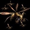
BTNSwarmMentality

This bundle is marked as useful / simple. Simplicity is bliss, low effort and/or may contain minor bugs.
A swarm of flying Silithids/Nerubians. This is my first icon.

V2- Used wings instead of whole insects and reduced size

V3- Made a larger insect in the center of the icon

Keywords:
swarm, insect, fly, nerubian, silithid, group, locust
Contents

BTNSwarmMentality (Icon)

Reviews
10:25, 29th May 2013 enjoy: Provide me with Work in progress or big pictures of this, before I moderate it. 16:22, 6th june 2013 enjoy: Not enough freehand work. Rejected.

Moderator

M

Moderator

10:25, 29th May 2013
enjoy: Provide me with Work in progress or big pictures of this, before I moderate it.

16:22, 6th june 2013
enjoy: Not enough freehand work. Rejected.
 

Roland

R

Roland

The image is kinda confusing and looks like a brizzle brazzle That I don't know, I think it's just CnP But you should show the proof of the image, Amigo.
 
Level 30
Joined
Nov 29, 2012
Messages
6,637
I suggest just remove the BG and make that black. Right now it looks so random, far from being understand on what the icon tries to convey, not enough detailing and also please give a WiP! =)

EDIT: WiP given.... XD
 
Last edited:
Level 50
Joined
Jan 12, 2010
Messages
1,770
ABOUT UPDATED ICON.

Dude, i can really understand, when guys make a icons from a models faceshots, but when you try make an actual icon for spell by manipulations with model? U are kidding us?
This does not works in that way, cause icon is an piece of handmade art, which has really hard specifications, and such as tricks will no work, when u making an piece of art sized by 64*64.

Voting for rejection cause of two reasons:
1. Icon has no freehand work (generally). Whoknows it this model made by author? If no - CNP\Stealing.
2. Icon looks really bad, generally. Unacceptable quality.
 
Level 28
Joined
Aug 7, 2011
Messages
1,638
Peekay you're wrong, icon looks really good as quality.

However, I suggest to make it with like 2-3 bugs, focusing on the head of one of them in, say, the down right corner and the other 2 flies behind the head, showing some wings and stuff. This way you will provide the head of an insect giving the assumption that these 2 paints behind are insects too! Plus, the wing will further prove that these figures are insects. The smoke in this icon, btw, is pretty awesome, you can add it to such an image (with the 3bugs) - this way you will give feeling and swarmness...swarmness. Hmm. Swarm. To the icon, which will complete it. You can use some green colors if you want them to look infected.


Other than that,this icon looks amazing as quality, the only problem is the focus. (btw, this version is a lot better than the old one)
 
Level 3
Joined
May 25, 2013
Messages
20
Peekay you're wrong, icon looks really good as quality.

However, I suggest to make it with like 2-3 bugs, focusing on the head of one of them in, say, the down right corner and the other 2 flies behind the head, showing some wings and stuff. This way you will provide the head of an insect giving the assumption that these 2 paints behind are insects too! Plus, the wing will further prove that these figures are insects. The smoke in this icon, btw, is pretty awesome, you can add it to such an image (with the 3bugs) - this way you will give feeling and swarmness...swarmness. Hmm. Swarm. To the icon, which will complete it. You can use some green colors if you want them to look infected.


Other than that,this icon looks amazing as quality, the only problem is the focus. (btw, this version is a lot better than the old one)

Thanks all ways to improve it are appreciated I will try to do that later.
 
Top