• Listen to a special audio message from Bill Roper to the Hive Workshop community (Bill is a former Vice President of Blizzard Entertainment, Producer, Designer, Musician, Voice Actor) 🔗Click here to hear his message!
  • Read Evilhog's interview with Gregory Alper, the original composer of the music for WarCraft: Orcs & Humans 🔗Click here to read the full interview.

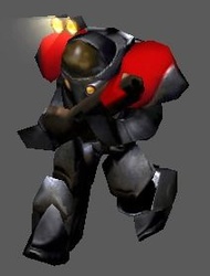
BTNMarine

This bundle is marked as useful / simple. Simplicity is bliss, low effort and/or may contain minor bugs.
  • Like
Reactions: Moises08x
SC 1 Marine Icon Enjoy It!.
Credits:Snow Flake
If You have Suggestion Please Comment!.

Keywords:
Starcraft,Star Craft,SC 1 Marine,Starcraft Marine
Contents

BTNMarine (Icon)

Reviews
20:36, 10th Dec 2013 enjoy: The model needs fix, but the icon needs a complete makeover. I am setting it to awaiting update. The icon (as it looks now) is unacceptable.

Moderator

M

Moderator

20:36, 10th Dec 2013
enjoy: The model needs fix, but the icon needs a complete makeover. I am setting it to awaiting update. The icon (as it looks now) is unacceptable.
 

Roland

R

Roland

I really disgust CnP Icons as well, but I really like Handmade icons.
 
Sir I think this icon needs editing and probably a rework for the following reasons:
-No color variation; your only using "gold" as a color
-Lack of details; Due to the poor coloring and shading plus the undefined edges
-Incorrect Borders; You need to have original WCIII borders on your icon. use this tool next time.
-Incorrect Scale; it appears to be that you worked on this icon in a smaller size than 64X64 then scaled it up which caused all these pixels to be visible.

Due to all the reason above I rate this Icon as Poor and would ask you to make a proper remake.
 
Level 19
Joined
Aug 8, 2007
Messages
2,765
Sir I think this icon needs editing and probably a rework for the following reasons:
-No color variation; your only using "gold" as a color
-Lack of details; Due to the poor coloring and shading plus the undefined edges
-Incorrect Borders; You need to have original WCIII borders on your icon. use this tool next time.
-Incorrect Scale; it appears to be that you worked on this icon in a smaller size than 64X64 then scaled it up which caused all these pixels to be visible.

Due to all the reason above I rate this Icon as Poor and would ask you to make a proper remake.

He didn't make it, its the marine icon from sc1 :O
 
Level 3
Joined
Nov 27, 2013
Messages
10
Sir I think this icon needs editing and probably a rework for the following reasons:
-No color variation; your only using "gold" as a color
-Lack of details; Due to the poor coloring and shading plus the undefined edges
-Incorrect Borders; You need to have original WCIII borders on your icon. use this tool next time.
-Incorrect Scale; it appears to be that you worked on this icon in a smaller size than 64X64 then scaled it up which caused all these pixels to be visible.

Due to all the reason above I rate this Icon as Poor and would ask you to make a proper remake.

It's Originally SC 1 Marine Icon
 
Top