• Listen to a special audio message from Bill Roper to the Hive Workshop community (Bill is a former Vice President of Blizzard Entertainment, Producer, Designer, Musician, Voice Actor) 🔗Click here to hear his message!
  • Read Evilhog's interview with Gregory Alper, the original composer of the music for WarCraft: Orcs & Humans 🔗Click here to read the full interview.

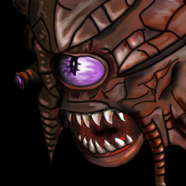
BTNBeholder

I was not satisfied with the cnp I was using and decided to try my hand at making a replacement. darkdeathknight was kind enough to show me how to implement some shading techniques.

100% freehand.

It's meant to go with this model by SuPa- : http://www.hiveworkshop.com/forums/models-530/beholder-217410/?prev=search%3Dbeholder%26d%3Dlist%26r%3D20

112771-albums7150-picture80519.jpg


Update: Reworked mouth, and eyes. Heinvers provided specific suggestions. I am aware that the crown of the skull overlaps the eye somewhat on the model but I want the eye to be the centerpiece of the icon.
Update 2: Reverted eye. Some shading changes.
Update 3: Some more shading and redid the eye-tentacle again.
Update 4: Reworked around the eye. It's not as good as the examples but it looks better.
Update 5: Made the eye brighter, did some shading on the teeth and left of mouth.
Update 6: Shading on teeth, and sharpening after scaling down.

Keywords:
Beholder, Undead, Evil
Contents

BTNBeholder (Icon)

Reviews
20:07, 25th Feb 2014 Sin'dorei300: Nice surprise! The eye needs to stand out more and we'll see. Sin'dorei300: Make the eye brighter and i approve. Sin'dorei300: Changes made.

Moderator

M

Moderator

20:07, 25th Feb 2014
Sin'dorei300: Nice surprise!
The eye needs to stand out more and we'll see.

Sin'dorei300: Make the eye brighter and i approve.


Sin'dorei300: Changes made.
 
What the hell did you do to his eye?! It was perfect before! Change it back, change it back! It's so horrible now! Seriously, that color does not fit at all! It needs to be white, or green, or yellow, or red... pretty much ANYTHING OTHER THAN SUCH A BRIGHT BLUE OR PURPLE!

You had a perfect icon before you updated it.

Edit: I'm glad you faded it a bit; it was just way too bright after that first update. It looks good now.
 
Last edited:
How would you fix it? I thought it stands out more now.

To make it stand out, u need to add proper shading around the eye.
And change the eye to the old one, cuz the current one looks awful and doesn't stands out at all, it's darker and the hue of the color clashes with the rest.
 
Top