• 🏆 Texturing Contest #33 is OPEN! Contestants must re-texture a SD unit model found in-game (Warcraft 3 Classic), recreating the unit into a peaceful NPC version. 🔗Click here to enter!
  • ✅ The POLL for Hive's Texturing Contest #33 is OPEN! Vote for the TOP 3 SKINS! 🔗Click here to cast your vote!

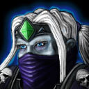
Baron Rivendare


An icon I made for the Baron Rivendare model by attempting to follow this little tutorial: https://www.hiveworkshop.com/threads/general-icon-process-tutorial.243593/

There are two versions, one with the blue death knight eye glow and one without. I'm hoping to get some critical feedback on this one as I feel it could use some improvement and I'm hoping to continue making icons in the future.

Update: Tried to give the face more highlights which worked wondrously, while it may now feel a little bright; the face certainly has more shape as a result and I for one certainly have a better idea of what I'm looking at compared to how it was before. Also added a bruised look under the eyes that death knight icons tend to have. Eye glow has been removed as it did indeed blend too deeply with the surrounding aura but perhaps I'll revisit it at a later time. Thank you @The Panda for the feedback, it was super helpful!
Previews
Contents

Rivendare (Icon)

Reviews
The Panda
Changes made, Approved.

The Panda

Icon Reviewer
Level 58
Joined
Jun 2, 2008
Messages
9,023
Some things i see from first glance,
  • The face seems a bit too dark, add some highlights here and there to maybe brighten it up a bit
  • The eye glow versions blue background blends too much with the eye glow color, either take away the blue outer glow and just create a small glow from his eyes like this.
  • The black lines in the gem needs to be a bit less dark too give it more of a gem feel like this, maybe some white lines to give it a glare effect or something.
 
Top