Follow along with the video below to see how to install our site as a web app on your home screen.
Note: This feature may not be available in some browsers.
Listen to a special audio message from Bill Roper to the Hive Workshop community (Bill is a former Vice President of Blizzard Entertainment, Producer, Designer, Musician, Voice Actor) 🔗Click here to hear his message!
you get closer and closer to the blizzard style with every icon you make. one additional element to take notice of is the framing and proportion. notice how your icon seems slightly more zoomed out than the ones you've shown in your comparison. minor differences that are hard to spot, but easy for viewers to subconsciously pick up on.
there is a rather noticeable perspective problem that makes his face look off. his nose, beard and right eye are drawn such they appear front-on from the viewer's perspective, whilst the rest of his head is angled slightly towards our left.
to get an idea of this incongruency, referring to this ref pic, lothar's nose should look like the nose on the far right. right now, it looks like the one on the far left.
I don't completely feel him, too. His face looks a bit deformed.
Although it's not your best icon, I really liked the embroidery you put on it.
They already told you the points to improve, so... I don't have anything else to say.
This site uses cookies to help personalise content, tailor your experience and to keep you logged in if you register.
By continuing to use this site, you are consenting to our use of cookies.


 Approved
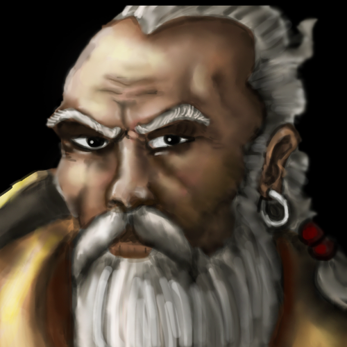


")