• Listen to a special audio message from Bill Roper to the Hive Workshop community (Bill is a former Vice President of Blizzard Entertainment, Producer, Designer, Musician, Voice Actor) 🔗Click here to hear his message!
  • Read Evilhog's interview with Gregory Alper, the original composer of the music for WarCraft: Orcs & Humans 🔗Click here to read the full interview.

Acolyte.blp

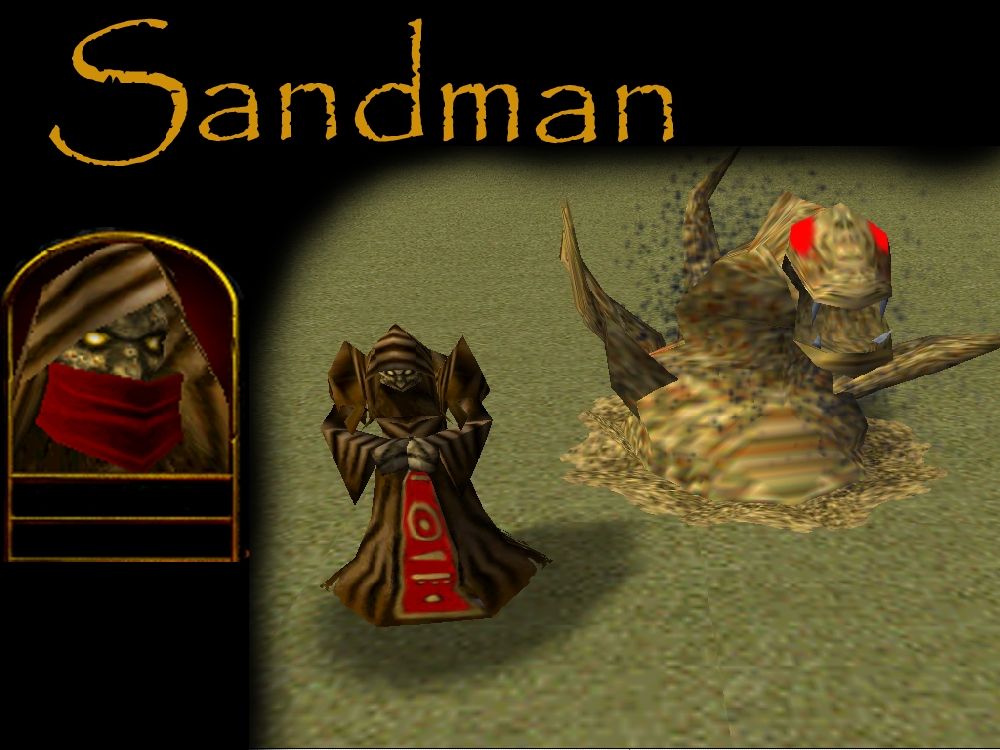
A mysterious man made of sand, and a sand monster, both in the same skin!

Kind of inspired by the Metallica song and the description of Nozdormu in human form in the Day of the Dragon book. I felt motivated to make it when I couldn't find a lot sand themed skins. I feel there are too few Acolyte and Sludge skins too.

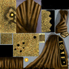
The symbols on the lower front and back of his robe are Egyptian hieroglyphs meaning sand, sandbank, desert, horizon, time, eternity, sun and the like.

The skin could be used for such things as a master of sand (Sands of Time, Dream sand, regular sand, you pick), or just a mysterious mage. And then there's the sand monster skin, good for minions for the sand mage to summon, or for its own hero, or just a big sand boss monster. Again, you pick.

100% freehand. I removed the dagger in his belt and toned down team coloring a bit.

Please give me feedback and suggestions what to change and stuff. I hope it comes in handy for someone. Please give credit if you use it in a map.

Keywords:
sand, sandman, sandmonster, mysterious, mage, caster, acolyte, sludge, slime, monster, time, eternity, hieroglyph, earth, desert
Contents

Sandman (Texture)

Reviews
22:10, 27th Apr 2009 Dan van Ohllus: I'll approve this skin because I find the quality of this skin good enough. The clothes have a decent shading and definition, though the team color on the skirt part could use a little more of that. Face is...

Moderator

M

Moderator

22:10, 27th Apr 2009
Dan van Ohllus:
I'll approve this skin because I find the quality of this skin good enough. The clothes have a decent shading and definition, though the team color on the skirt part could use a little more of that. Face is defined and not too plain.
Sand monster part is quite plain, but still ok in my book.
And I see no sign of recolor and cnp in this skin.

But you're always free to update it when possible.
 
Level 2
Joined
Apr 2, 2009
Messages
27
the slugde skin is to wrapt please fix it, and the eye on the sandmonster looks to red(or team coloured) please make them look more neutral.
 
Level 4
Joined
Dec 21, 2007
Messages
13
Ok, I deperately need someone to define the terms that are frequently used around here, because the full meaning seems to elude me.

- When is it NOT a recolour? I mean, that's what you do when you make a skin, right? You apply and remove colours. I am confused.

- Almost everything is made using the brush tool and I drew it myself using brushes I made myself and I came up with how it should look myself and I applied colours in layers using my own hand and my own digital drawing tablet after the pattern I pictured in my head. Is that freehand? If not, please tell me.


All of the parts of the robe are mad from scratch. I painted over the Acolyte entirely. I did look at the original shading, because it fit in the model, and I didn't want to mess that up. I added creases in the cloth as I saw fit though.

I made the sand with a custom brush I put together, but I'm relatively new to Photoshop and I don't know all the things you can do to make great textures. I looked at a picture of sand and I drew several layers of dots in different colours. I didn't turn out that great, appearantly. I copied parts of the original patch of sand I drew and applied them to the other parts I was making into sand, and then added more layers of dots.

The wrapping on the Sludge seems to be kinda weird. It wants to stretch the skin out on the front, so one pixel turns into a line. That's how it seems to be to me at least.

The highlights were originally brighter, but when I looked at it in game they seemed to "pop" a lot more than I wanted to., so I toned them down.

The eyes on the sand monster are a bit bright I guess, didn't think about that, gonna fix it.

Why is the face ridiculous? I made the skull characteristics more defined and I made deep, dark eye sockets. The guy is made of sand, and his looks are bound to be a bit weird, not being solid and all.


Okay, so anyone else have anything to complain about? Geez, I had no idea how crappy this skin really was...
 
1: you passed over some parts with a different tone brush and that makes it a recolor. instead you should've tried to draw every detail yourself, using only thin brushes.

2: i suggest you take a look at our Hive tutorials on skining. they are very helpful.

3: you should not use custom brushes much.... it just looks.. odd oO

4: there is a way to make highlights more without popping too much. again read out skining tutorials :)

5: your "so called" freehand on the texture makes the face, and the whole sludge skin ridiculous. Alas, i have to mention turorials again *sigh*
~i find no flaw on actual face details whatsoever. just that sand texture~

6: Yeah, eyes are sucky =P you should make 'em more evil and not completly round and glowy.

btw.. "enter sandman" is my fav song =)
 
Level 4
Joined
Dec 21, 2007
Messages
13
1: you passed over some parts with a different tone brush and that makes it a recolor. instead you should've tried to draw every detail yourself, using only thin brushes.

2: i suggest you take a look at our Hive tutorials on skining. they are very helpful.

3: you should not use custom brushes much.... it just looks.. odd oO

4: there is a way to make highlights more without popping too much. again read out skining tutorials :)

5: your "so called" freehand on the texture makes the face, and the whole sludge skin ridiculous. Alas, i have to mention turorials again *sigh*
~i find no flaw on actual face details whatsoever. just that sand texture~

6: Yeah, eyes are sucky =P you should make 'em more evil and not completly round and glowy.

btw.. "enter sandman" is my fav song =)


Ok, so the sand is not that good, just say that instead of making a whole list saying almpst every part is bad BECAUSE of the sand. I'm not that good on textures, I'm still learning. I welcome any advice on how to make proper sand.

And as for nr 6, round and glowy is evil enough. I originally inteded to make them glowing gems but I found less was more. It's a matter of taste, really.

It is called "constructive critique" Even tho it may seem i'm tearing your skin to shredds. it is all in order for you to improve 8)

and look at tuts x3 you sure will find something to help you about sand x3
 
1: you passed over some parts with a different tone brush and that makes it a recolor. instead you should've tried to draw every detail yourself, using only thin brushes.

2: i suggest you take a look at our Hive tutorials on skining. they are very helpful.

3: you should not use custom brushes much.... it just looks.. odd oO

4: there is a way to make highlights more without popping too much. again read out skining tutorials :)

5: your "so called" freehand on the texture makes the face, and the whole sludge skin ridiculous. Alas, i have to mention turorials again *sigh*
~i find no flaw on actual face details whatsoever. just that sand texture~

6: Yeah, eyes are sucky =P you should make 'em more evil and not completly round and glowy.

btw.. "enter sandman" is my fav song =)

I think you're way to harsh. About making everything freehand, i think that's just a silly principal question; he wanted the shading to remain and it did. and also, it is obvious that the sand is made using a brush, since it's far more random than the noise filter that i assume you took it for. I use custom brushes all the time, it works just fine.
And seriously, who would sit there for hours painting every sand grain by itself whith a basic brush?

And to the author: I actually think your model needs one MORE filter: "Smart Sharpen".
It is an excellent filter that doesent make anything less freehand, though makes the texture more sharp and similar to blizzards textures.

Also, to make the cloak less bland you should perhaps draw some fabric texture to it, perhaps stitchings or just thin lines like a net to resemble the cloth.
 
Level 8
Joined
Dec 19, 2007
Messages
410
~blurry
~filter
~recolor
~CnP? oO
~lacks shading
~lacks highlights
~undefined
~face is ridiculous
~sand texture could use some extensive reworking.
~very little freehand

Rating: 2.12/5 Lacking

~Misha~

Those who really Copy and Paste Misha, won't tell it aloud that they do it. For those who hadn't, they'll say they didn't.
So to really to know if they Copy and Paste a model, investigate, plain asking won't help much.
Sorry if that offended you or something.
 
Top