• 🏆 Texturing Contest #33 is OPEN! Contestants must re-texture a SD unit model found in-game (Warcraft 3 Classic), recreating the unit into a peaceful NPC version. 🔗Click here to enter!
  • It's time for the first HD Modeling Contest of 2024. Join the theme discussion for Hive's HD Modeling Contest #6! Click here to post your idea!

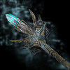
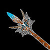
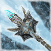
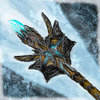
BTNHeavensLightningStaff

This bundle is marked as useful / simple. Simplicity is bliss, low effort and/or may contain minor bugs.
  • Like
Reactions: Licheus
Name
~~ Heavens Lightning Staff ~~
Story
A staff thrown down on earth, for the quest of humans to make peace in the world.
Log

v1: Release
v2: Sharpened the staff and added a much cooler bakground (IMO)
Credits

zombie2279 !
Contents

BTNHeavensLightningStaff (Icon)

Reviews
13:36, 14th Aug 2009 zombie2279: The wips look fake. Give me a .psd or .xcf file, I won't accept anything else. There's a huuuuge difference between the final and the second wip. 08:39, 17th Aug 2009 zombie2279: No proper evidence shown. Notify...

Moderator

M

Moderator

13:36, 14th Aug 2009
zombie2279: The wips look fake. Give me a .psd or .xcf file, I won't accept anything else. There's a huuuuge difference between the final and the second wip.

08:39, 17th Aug 2009
zombie2279: No proper evidence shown. Notify me if it's otherwise.


9:04, 21st Aug 2009
zombie2279: Some more contrast to distinguish the staff from the background would be welcome, and some more visible details to the middle, since the background is now more in perspective than the staff itself. Once you're done, add more shading. Use black outlines instead of white when doing icons.

29th Aug
zombie2279: Improper direction of changes made, advise observation of other icons to achieve a better result. The messyness of the middle has to go.
 
Level 8
Joined
Mar 28, 2009
Messages
247
Awesome, could you mayde supply us with a full size picture ? It will show that you obviously were a good boy and didn't C'n'P

Edit: Never mind I seen first post, I think you didn't copy this but ill be watching you! xD
Anyways as for the icon itself, the staff is a little crowded it looks good at high resolution but when made into an icon, not so much :)
 
Top