- Joined
- Feb 17, 2014
- Messages
- 134

Hello there! This tutorial is under construction; I've posted this since I wanted to make sure I don't lose the work I've done so far. The thought of this tutorial is to go from the very basics of photoshop and how you set it up to some techniques when you're drawing.
")
I'd really appriciate feedback, especially how I can deal with the layout.
Difficulty - Easy
Tools - Drawing tablet, Computer and Photoshop cs6 (will probably work on earlier versions as well)
Hello, I'm known as Mad or McFjury and I'm an amateur digital artist.
Even though I'm not really that experienced, I still got some knowledge that I want to share.
In this tutorial, I'm going to start with the basics in photoshop cs6 (and probably other versions as well) and try to finish with how I make my icons.
English is not my native language, so I'm sorry if there is any errors in the text.
Table of Content
1- Setup
1.1 Equipment
1.2 Workplace
1.3 Downloads
1.4 Keybinds
1.5 Canvas
2- Painting
2.1 Style; Cartoon
2.2 Style; Cartoon (again)
2.3 Style; Sculpt

Wacom Intuos 5
I'm currently using a Wacom Intuos 5 when I'm drawing stuff. But I had a Wacom Bamboo Fun Pen & Touch earlier and it certainly did it's job. The difference between the two tablets would be the sensibillity and the amount of buttons on intuos. But the sensibillity is barely noticable, so if you're starting out and considering what tablet to buy, I'd say that the Bamboo is more price-worthy since it is a lot cheaper and still stays strong.

Wacom Bamboo Fun Pen & Touch
Also; Avoid getting small size tablets.
(
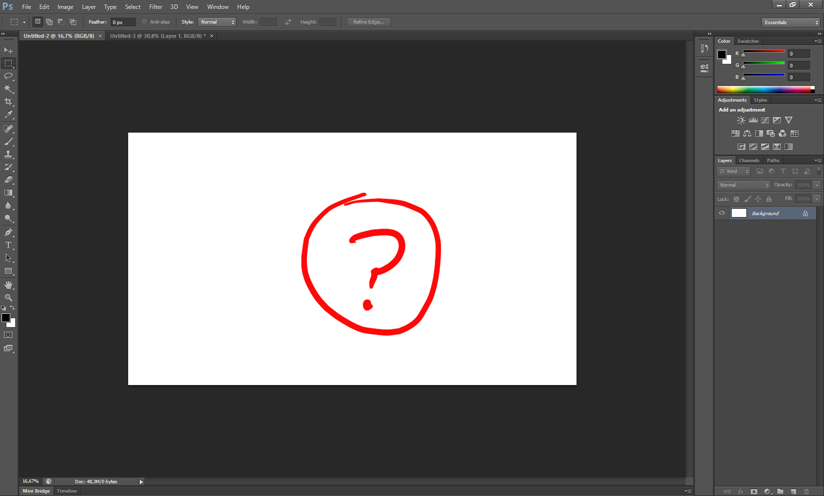
Alright. When you start up photoshop (cs6 in this case) it should look something like this:
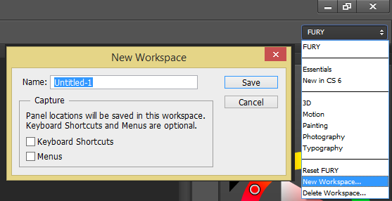
If you click the dropbox that says "Essentials" in the upper right corner (just below the exit /minimize tray). You should be able to see the list of avaible workplaces. Click "New Workplace..." and name it to whatever you feel like. Click "Save" and you have your very own workplace, so feel free to mess around with the UI and if you feel like you need to reset the UI, just press the workspace dropbox and click "Reset <your workspace name>".
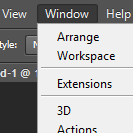
You can find tools (author's note: I need a better name for this) in the window dropbox that you can open with the alt + w shortcut or find on the menu list on top of the program.
Here is how my workplace looks like (for inspiration):
I'll expain what these tools are and why I have them;
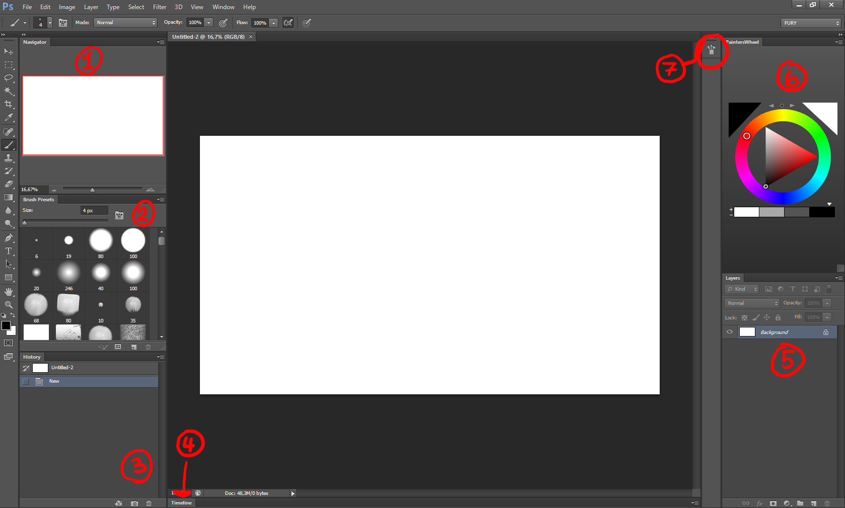
1. Navigator
With navigator, I get a look of the image I'm working on as a thumbnail, which saves me time zooming out and in.
2.Brush Presets
Here is where I keep my brushes. Actually. They aren't mine at all. The brushes I use is a combination of Feohria's brush set and Daarken's brush set (direct download link). I'll go over how you download and install these in a minute.
3.History
This list will save your last 20 actions (if you make a brush stroke or select something for example). In case of you want to anchor an action in your work so it doesn't disappear when you've done more than twenty actions, you can just check the box on the side of the desired action (Author's note: a disaster to explain :I). You can quickly undo stuff with this list as well.
4.Timeline
"Animation" in older photoshop versions. I use this for animation. It isn't as powerful as Adobe Flash, but it is still usefull (An example: here is a video I made for a friend only using photoshop)
5.Layers
One of the more important windows in the workplace. When you're working in photoshop, you'll use layers a lot, since it will make it really easy to edit your image later. I'll explain more about layers later.
6.PaintersWheel
I'm using this instead of photoshop's color selector, since it is a lot smoother to use in my opinion. PaintersWheel was developed by Len White and can be downloaded from here. Photoshop's Color window works as well, but PaintersWheel is what I prefer.
7.Brush
Just like the Timeline window, I rarely use this. But when I do, I use it to adjust my brushes.
So first off; the PaintersWheel. You download it from here and extract the PaintersWheel folder from the zip file to this destination (depending on what version you are using):
Adobe\Adobe Photoshop CSX\Plug-ins\Panels
Where the Orange 'X' is what version you are using (note that the 64-bit version got a seperate folder).
Next is the brushes. Again; I use Feohria's brush set and Daarken's brush sets and it is up to you what brushes you want to use. A lot of artists uploads their brushes to sites like DeviantArt.
How you install these files is following;
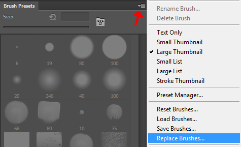
You unzip the files from the ZIP / RAR files and now you should have two files that ends with ".ABR". Now you could just double click these files to imediatelly add these to your brush list. But You should instead open photoshop and click the dropbox in the top right corner of the brush window and select "Replace Brushes".
Do this for the first brush set you want to add. Just double click the file of the other brush sets you want to add in the future to add them to your list of brushes.
Keybinds. They're quite important if you want a fast phased work flow and you can customize your keybinds through "Edit>Keyboard shortcuts" to your personal flavour. Here is how I've set it up my most used keybindings (for inspiration);
Remember that most of these are standard keybinds, there is only two that I had to bind myself and I'll tell you which these are when they appear on the list.
--Without modifiers--
W - Magic wand
R - Rotate view
B - Brush
M - Marquee tool
L - Lasso tool
--With modifier--
Ctrl+Z - Undo one step and Redo to latest step.
Ctrl+alt+Z - Undo (only works up to 20 steps back)
Ctrl+C - Copy
Ctrl+V - Paste
Ctrl+B - Color Balance
Ctrl+shift+alt+B - Black and white (greyscale)
Ctrl+N - New canvas/image
Ctrl+shift+N - New layer
Ctrl+L - Levels
Ctrl+G - Group Layers
Ctrl+F - Flip image horizontal (I changed this manually)
Ctrl+shift+F - Flip image vertical (I changed this manually)
Ctrl+D - Deselect
Ctrl+S - Save
Ctrl+A - Select the whole canvas
Ctrl+T - Transform
Ctrl+U - Hue/saturation
Ctrl+I - Invert colors
Ctrl+O - Open
Ctrl+P - Print
--Stylus--
1. Click
2. Pan/Scroll
3. Right Click
4. Eraser
--Stylus with modifiers--
Alt+Click - Eyedropper Tool
Ctrl+Click - Move
Ctrl+alt+Click - Copy and move
Shift + Click - Straight Line
Pan/Scroll - Pan (duh)
Ctrl+Pan/Scroll - Zoom in
Alt+Pan/Scroll - Zoom out
Right Click - Brushes
Alt+ hovering Rightclick over the tablet - brush size
Eraser - Eraser
Okey, so now we're almost ready, but we need to go through one more thing. The canvas.
Open a new document by either using the shortcut ctrl + N or clicking "File > New...". Now you should have a window that looks like this:
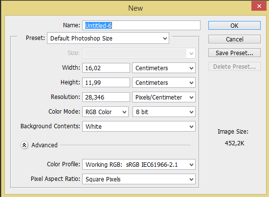
We're just gonna change the resolution for the time being, so changing the centimeters, inches or what you're having to pixels instead and the resolution to 300.
Now you'll have to decide the size of your image. I tend to chose my screen resolution, which is 1680 width x 1050 height. What we're gonna do is to scale up the image times three, so it is 5040 width x 3150 height. The cool thing about this is that you scale down the image when you're done with your work to make it look better than if you'd worked on a small canvas.
Next, save the preset and name it something funny (rather something that lets you remember that it is a large size canvas).
Aight, now it's time to actually draw something. In this first part, I'll cover the easier way to produce an image.
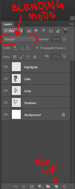
Layers is something that is used frequently when drawing digitally and helps a lot if you need to edit your image later during your work process. You can also change the blending mode on layers in order to make them react to the layer beneath in different manners. Try experiment with different blending modes on layers with different colors and values.
First off; create a new canvas with the resolutions I mentioned earlier.
Then before you start illustrate, you'll have to create a new layer. You can do this by either the shortcut "ctrl+shift+N" or pressing icon that looks like a sheet of paper with a folded corner on the bottom of the "layers" window.
If you used the shortcut, a window with different options will appear, just click "OK" and do not mind the options for the time being.
Now select a brush you want to draw with (I use the brush "Sharp Good" from Feohria's brush set, but try out some brushes and see how they work yourself, maybe you prefer another brush) pick a color and start drawing on the new layer.
Here is how the layers should look:
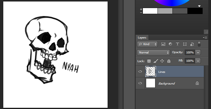
Just work on your new layer and keep the background layer clean.
Time to add some colors then. There is multiple ways to add color to your line art. Here is two ways;
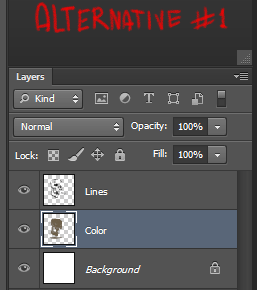
Alternative 1; Having your colors beneath your line layer.
This is works well if your line layer is transperant.
Alternative 2; Having your colors on top of your line art. This requires you to set the color layer to "multiply" in it's blending option. You'd do this if the line layer isn't transperant (like when you scan images).
Now your image might look like this (or better)
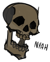
Remember that you can use more colors on your color layer than just one.
Next is creating shadows and highlights.
I create a new layer and paint with a not so very dark color where I want my shadows to appear. This will be the shadow layer (obviously).
So right now it looks like a disaster.
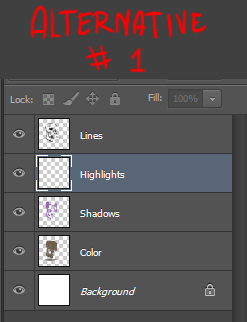
How you make this weird layer into proper shadows depends on what alternative you used earlier;
Alternative 1; If you had the lines on top, you set the shadow layer to "Multiply" as blending mode and place it between the line and color layer.
Alternative 2; If the color layer have "multiply" as blending mode, you will have to put the shadow layer beneath the line layer and keep it as normal blending mode.
When doing the highlight, you create a new layer with the "Overlay" as blending mode and carefully color the image with with color where you think the light is comming from. Place this layer on top of the color layer, but remember, if the color layer is above the line layer, the highlights might affect the lines.
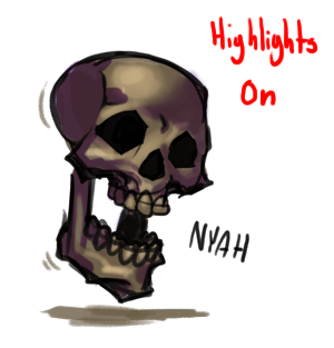
Okey, my image was pretty badly done, I could've made better line art that doesn't show sketch lines. I could I've tried used more colors and worked more in-deph on the shadows and highlights.
I bet that you can do a lot better than what I did if you take your time with your work.
Okey, we start like before, new canvas (ctrl+N) and create a new layer (ctrl+shift+N). This time I just sketch out how I want my image to look in a really basic form.
Next, I create another layer, set the sketch layer to ~50% opacity and start to draw on the new layer, having the old one below. What was important to have in this part is to incoperate more details how the character look. After that, I hide the first sketch layer, lower the opacity on the new one to ~50% and start to carefully draw the line art.
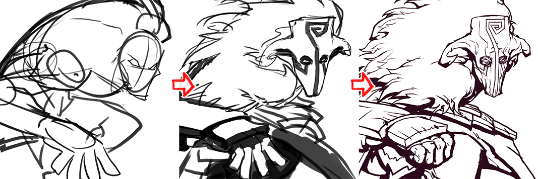
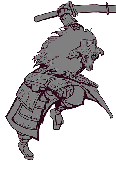
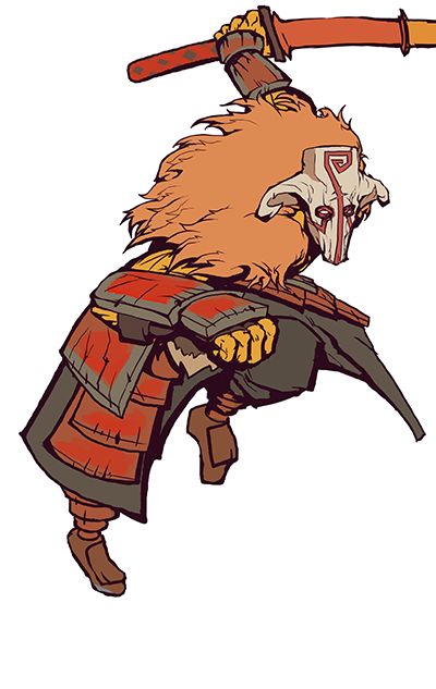
Note that most people just makes one sketch layer and then do the line art imediatelly after. I didn't do it this time, since the first sketch was to catch Juggernaut's pose while the second sketch I started to research how his armor looks.
Another note; I colored the line art when I was almost done with the coloring and shading. I tend to paint lines in black.
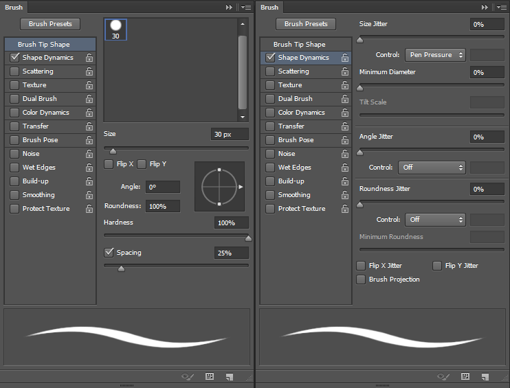
Lastly, when I do line art, I use a brush I've made. I don't know if it is any good but it works well for me. Since Hive doesn't support brush files, I'll put up how you set it up yourself.
Select the brush tool and take a brush that is perfectly round (so you can cusomize it's sharpness). Then you open the window called "Brush" (Window > Brush) and apply these settings (Ignore the locks):
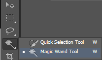
Aight, so the next we are gonna use the Wand tool (shortcut: "W") to select the outside of the character on the line art layer.
If you got the Quick selection tool instead of the Magic wand, just click and hold the tool button and select the magic wand tool instead.
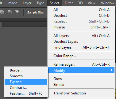
When you've selected everything that is not the character, you expand the selection (Selection > Modify > Expand) by 3 pixels.
Create a new layer again.
Then you invert your selection (ctrl+shift+I ) take the Marquee Tool (also known as selection tool shortcut "M"), right click on the canvas and pick "Fill...". A window should pop up that ask what you want to fill your selection with. Pick 50% grey for the time being and click "okey".
The image should look something like this now:
Look carefully after eventual leaks before you continue.
Next, Create another using the shortcut ctrl + shift + N. This should give you a (familar, if you've used the shortcut) window with layer settings. Make sure you check the box that says "Use previous Layer to Create Clipping Mask". If the window didn't appear when you created the layer, just right click the new layer (and not it's thumbnail!) and click "Create Clipping Mask".
With this new layer you fill in the colors of the character. With the help of the clipping mask, you can't draw outside the character which will make it a little easier to work with.
When you're done with the colors, use Hue/Saturation (ctrl+U) and brighten the colors slightly (since we will use a lot of shadows).
Now you'll have to create yet another layer that you set blending mode to 'multiply' and you check the clipping mask box / make clipping mask for the layer again. Before we start to work on this layer, we'll hide the color layer we just made (by clicking the eye icon, left to the layer thumbnail) and make the grey colored layer to white. Select the layer and open Hue/saturation (ctrl + U) and drag the lightness to +50 or higher. This will make it a lot easier to work with shadows. Select a bright color and start making the shadows. Try experiment with different colors, but just use one at the time for the image.
Make your color layer visible.
Finally, make a layer (don't forget clipping mask) and start doing details, such as rimlight, scratches, etc.
And there we go!
Aight, now when we're done with the cartoon style, we can finally move on to the method (probably only) I call sculpting. When I use this technique, I paint in greyscale and just focus on where the light strikes and where the shadows will appear.
How do I do this then?
If you're looking for making an icon, start out with a black background (you can do this by either selecting a black background in the canvas option menu when you make a new image or just invert the white background by click ctrl+I when you've selected the background layer) and create a new layer.
This will work with any colored background, but icons usually have black background.
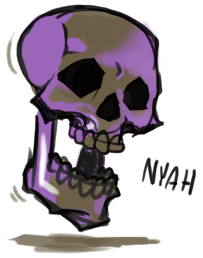
Use a dark grey (75% black, 25% white) and start to draw a sketch of the image.
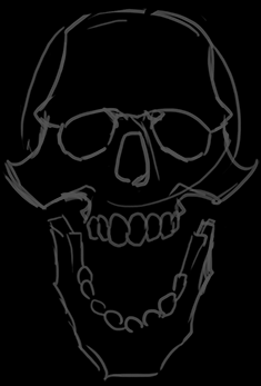
I'm sorry I keep drawing skulls all the time.
Now how you do this is that you use your eyedropper tool a lot. When you draw a stroke, the edges of the stroke will slightly fade into the background color which gives you a good mix between the color from the stroke and the color from the background. I've made a youtube video where I'm demonstrating this in realtime, but unfortunately, I made it a little later in the image's progress, so I put it further down in the text.
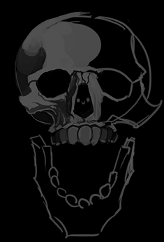
I angled the skull so it faced more upwards and erased the sketch of the cheeks, since I thought they seemed too big.
Here is the youtube video I was talking about earlier as well;
Last edited:


