-
🏆 Texturing Contest #33 is OPEN! Contestants must re-texture a SD unit model found in-game (Warcraft 3 Classic), recreating the unit into a peaceful NPC version. 🔗Click here to enter!
-
🏆 Hive's 6th HD Modeling Contest: Mechanical is now open! Design and model a mechanical creature, mechanized animal, a futuristic robotic being, or anything else your imagination can tinker with! 📅 Submissions close on June 30, 2024. Don't miss this opportunity to let your creativity shine! Enter now and show us your mechanical masterpiece! 🔗 Click here to enter!
human-healthbar-fill.blp
- Author(s)
- Situ
- Size
- 14.21 KB
- Rating
- Downloads
- 509
- Created
- Jan 28, 2015
- Updated
- Feb 21, 2015
- Resources
- 1
- State
 Approved
This bundle is marked as recommended. It works and satisfies the submission rules.

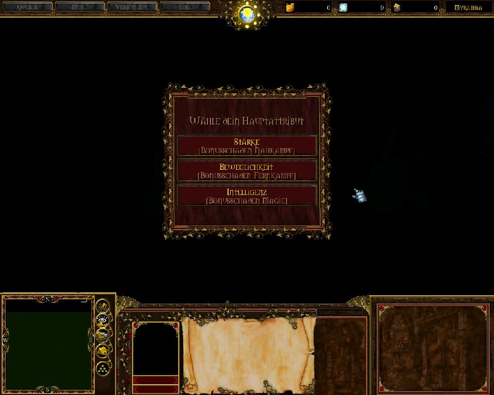
DOWNLOAD HERE ITS A BUNCH OF DATA http://www.hiveworkshop.com/forums/pastebin_data/m6hrpa/_files/UI%20Myrathia.rar
Greetings,
After 5 Yeahrs now i spotted a old Interface for my Projekt Myrathia. I remembered a bunch of people liked it, so i load it up and dont let it die on my pc ^^ I cant help you with installing it cause i didnt open editor since this time, sorry .
The background on right side is a pic from Homm3
Keywords:
Ui,Interface,Myrathia

Reviews


")