Please improve your description and Map Name.
Templates are good but without anything selling it as something special, its just kind of wasting space. I don't mean that its bad, in fact I bet its really good, because I know you make good maps, but I can't tell from the description. "Just another..." is practically asking for
rejection, unless you make it funny or something. e.g. "Just another space bunny zombie map."
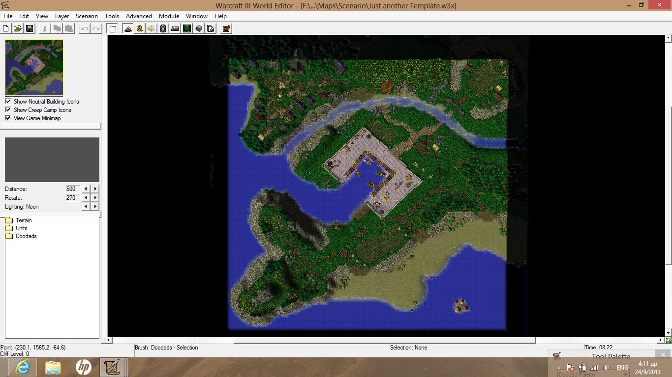
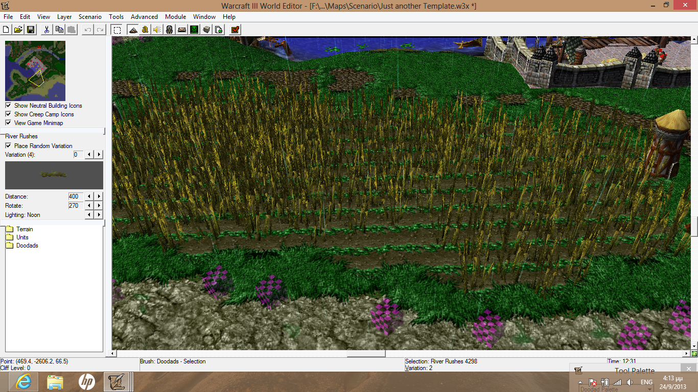
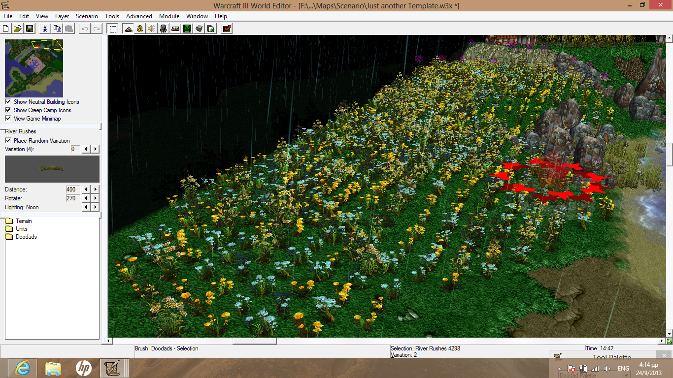
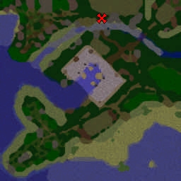
Also, please take better screenshots. The ones you have up now don't really show much of anything. I don't really want to download a template just to look at it and review it. [Also I'm at work and I have no WE]
You should put a simple camera trigger in and use it to take snapshots in game. That could look really nice. I know you do good work and I want to see it. Do you know about CNTR+Mouse Scroll? or how to rotate the map canvas? "View entire map" is ok, but if you give it angle, then people can see more of the depth. It looks like there is some castle section, but I can't see it. These screenies only show flowers and wheat. I know there is more here. Also, crop WE UI borders, we all spend too much time looking at that as it is.
")
Also, a simple improvement would be to add
, [box] or
tags around the whole description and use colored text. Not like [rainbow]rainbows[/rainbow]
but just something besides the default color. I like Pale Turquoise, but you can pick anything you like, many like
silver. |
 Approved