🏆 Texturing Contest #33 is OPEN! Contestants must re-texture a SD unit model found in-game (Warcraft 3 Classic), recreating the unit into a peaceful NPC version. 🔗Click here to enter!
It's obviously alright to update a resource several times but it should still be what you believe is a finished piece when uploading.
That being said!
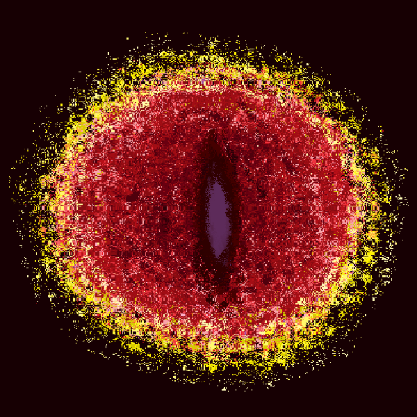
This icon can still find its use, especially if you manage to add an actual eye in the middle as The Panda suggested (that would be awesome).
I should keep layers, not merging them...
- - - - - - -
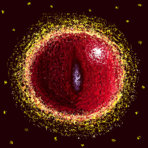
It looks like a poke-ball and XD face. lol Haha! XD
Is it appropriate for me to add a mouth decoration for that orb? It looks like a XD face. Yeah, maybe I can do that...
Edited:
Hmm... I get me wrong. The Panda said that it will be cool if "an" actual eye is added, not "another" eye. (I think it is another eye at that time... That comment appears before my icon is updated (it doesn't have any eye at that time). I suck!)
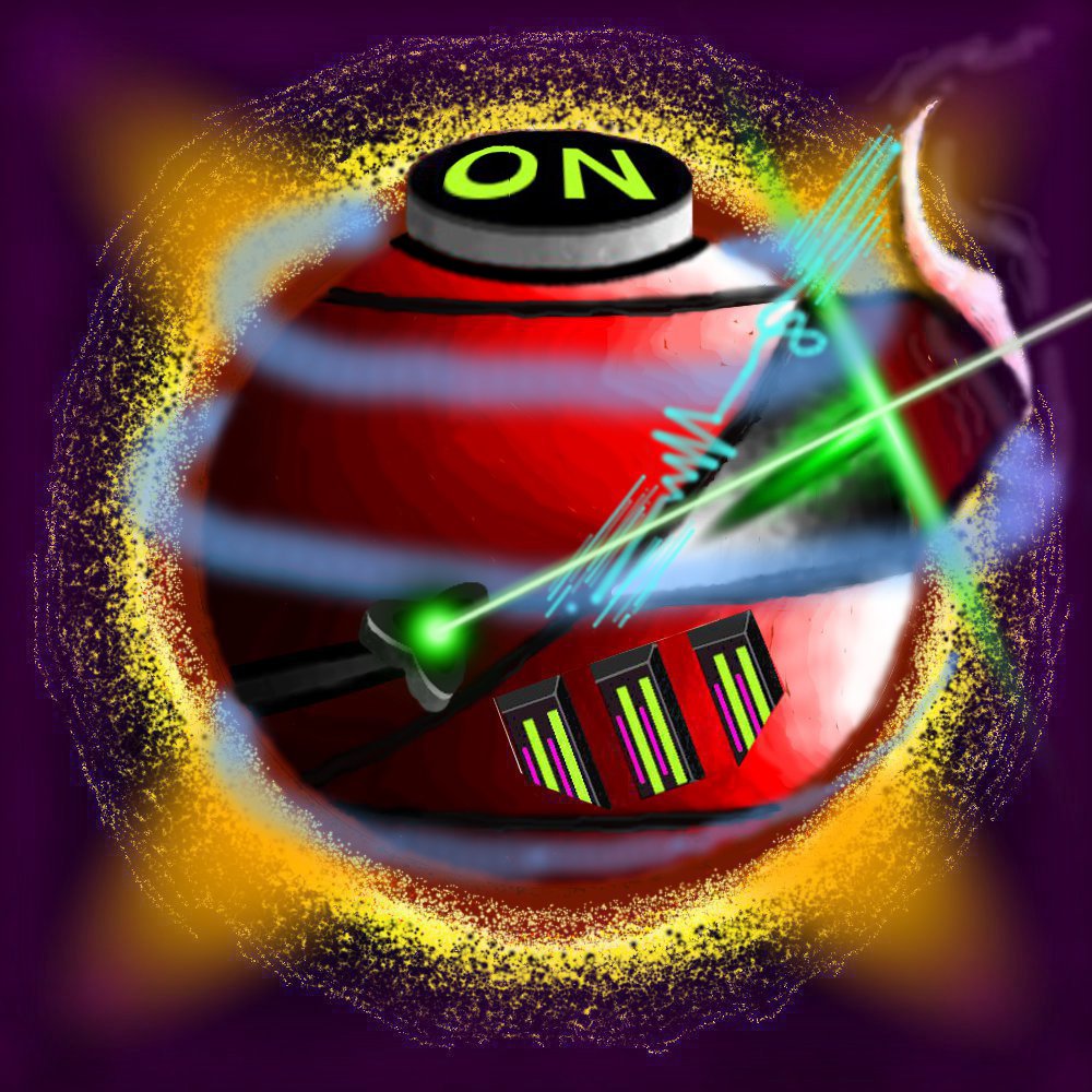
Sure it is colorful and all but what the ... is it? It looks like some high-tech-ball-robot combination shooting laser beams and emitting some bluish rays around itself.
Like i said a few times, it'd be ideal for an icon to be recognizable at first glance.
I don't understand what this is about.
A random thingy, with random details(barely visible) and with a distracting bg.
I want to emphasize that - not every random "creation" can become an icon.
And, as Solu stated, in the icon section we only upload finished icons, not WIPs.
If we want some feedback/advices regarding our artistic works, we have the Artist's Discussion forum.
So, i advise u to decide what u want to draw. Do ur "research" on that theme - to get an idea about how it could be, and then try to draw it.
How is this icon improved in order to become a better icon? I mean... Erhh... Are there more ways to improve it so that it will be better than the current quality.
How is this icon improved in order to become a better icon? I mean... Erhh... Are there more ways to improve it so that it will be better than the current quality.
Less is more.
You have added far too many details which is impossible to see what is.
The orb as you had it from the start was better than the current icon.
Try going back to the base icon and just add an eye. Simple as that, just add an eye.
On that topic. You seem to make very hard lines almost as you painted the icon in Paint. Use shadows and highlights, and use them correctly (read up on how to do that).
Lines almost always look really crappy when they are 100% hard and very childish. Use hardness around 50% as default and adjust when needed, when needed.
This site uses cookies to help personalise content, tailor your experience and to keep you logged in if you register.
By continuing to use this site, you are consenting to our use of cookies.


 Approved