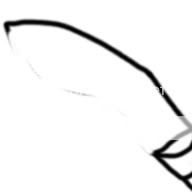
The bottom half of the blade (closer to the handle) should be much more thinner. The Khukuri was made to cut through dense jungle, so it has a heavy top.
I also read a bit of Wiki for this next part:
"Kukri blades usually have a notch (kauda, kaudi, kaura, or cho) at the base of the blade. Various reasons are given for this, both practical and ceremonial: that it makes blood and sap drop off the blade rather than running onto the handle"
So maybe you should put that bit on as well.


 Approved