-
🏆 Texturing Contest #33 is OPEN! Contestants must re-texture a SD unit model found in-game (Warcraft 3 Classic), recreating the unit into a peaceful NPC version. 🔗Click here to enter!
-
It's time for the first HD Modeling Contest of 2024. Join the theme discussion for Hive's HD Modeling Contest #6! Click here to post your idea!
BTNDagger

- Author(s)
- PrinceYaser
- Tags
- CommandButton, Item, Spell / Ability, World of Warcraft, Creep, Draenei, Dwarf, High Elf, Human, Naga, Night Elf, Orc, Pandaren, Blizzard, Medieval, Blood Elf
- Size
- 32.03 KB
- Rating
- Downloads
- 302
- Created
- Aug 10, 2017
- Updated
- Aug 11, 2017
- Resources
- 1
- State
 Approved
This bundle is marked as recommended. It works and satisfies the submission rules.

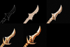
Dagger...
Enjoy!")
Keywords: Dagger, Metallic, Metal, Weapon, Sword, Gold, Golden, Yellow, Orange, Icon, Item, PrinceYaser, Human, Elven, Warcraft
Enjoy!
Keywords: Dagger, Metallic, Metal, Weapon, Sword, Gold, Golden, Yellow, Orange, Icon, Item, PrinceYaser, Human, Elven, Warcraft