-
🏆 Texturing Contest #33 is OPEN! Contestants must re-texture a SD unit model found in-game (Warcraft 3 Classic), recreating the unit into a peaceful NPC version. 🔗Click here to enter!
-
🏆 Hive's 6th HD Modeling Contest: Mechanical is now open! Design and model a mechanical creature, mechanized animal, a futuristic robotic being, or anything else your imagination can tinker with! 📅 Submissions close on June 30, 2024. Don't miss this opportunity to let your creativity shine! Enter now and show us your mechanical masterpiece! 🔗 Click here to enter!
BTNBombardier

- Author(s)
- Scias
- Size
- 44.85 KB
- Rating
- Downloads
- 395
- Created
- Feb 12, 2018
- Updated
- Feb 13, 2018
- Resources
- 2
- State
 Approved
This bundle is marked as recommended. It works and satisfies the submission rules.

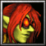
Another model I really liked (might be my favorite Goblin model), is Goblin Bombardier by Norinrad for HandCLAW.
Process image:

Process wasn't as smooth as the process image makes it look. ;P
Enlarged 192x192 version
Process image:
Process wasn't as smooth as the process image makes it look. ;P
Enlarged 192x192 version


Reviews


