• 🏆 Texturing Contest #33 is OPEN! Contestants must re-texture a SD unit model found in-game (Warcraft 3 Classic), recreating the unit into a peaceful NPC version. 🔗Click here to enter!
  • It's time for the first HD Modeling Contest of 2024. Join the theme discussion for Hive's HD Modeling Contest #6! Click here to post your idea!

BTNArakkoaSpell

This bundle is marked as useful / simple. Simplicity is bliss, low effort and/or may contain minor bugs.
the blessing of the great hero of the Arakkoas, 100% freehand


Give credit if you use it :)

Uptade1: made some litles changes.

Uptade2: done what Sin'dorei300 said.

Keywords:
Arakkoa, birdman, spell, arcane, light, terrok, outland, draenor.
Contents

BTNArakkoaSpell (Icon)

Reviews
20:45, 17th Jun 2015 Sin'dorei300: Commented. 18:56, 24th Jun 2015 Sin'dorei300: It isn't better than the old one. Read my comments.

Ardenian

A

Ardenian

An interesting icon.

Could need some work, tho. I suggest to give the glow a center, a little brighter than the glow and less transparent.
The different glow parts could be less apart, the dark / black stripes are slightly too big and also unnecessary.
The feathers should be longer, if you see the ATC you see they are not visible, whereas it would be good they are.
 
That hand looks a bit stumpy and is kinda overcontrasted, while the effect is kinda dull.
The effect doesn't look magical enough.
Also, those black details stand out too much.
I suggest u to try to make those fingers a bit much longer and slimmer.
I advise u, as well, to avoid using pure black/white for outlines or details(scales/grooves on fingers), for this u can use the darker/lighter tones of chosen colors.
It would be nice if some colorful feather parts(like arakkoas have)could be seen around its hand.
Work more on the effect. Must be more intense, more vivid, make some nice brighter details/shapes/trails on it, etc.
The background could use some work as well, the effect radiates some light around.
Some examples that might make it easier to understand:
icons_673_btn.jpg
icons_560_btn.jpg
icons_12137_btn.jpg
icons_16563_btn.jpg
icons_6663_btn.jpg
icons_689_btn.jpg
icons_16493_btn.jpg
 
Windrunner29 said:
...done what Sin'dorei300 said.

Sorry, but i'm afraid u don't.
It isn't better than the old one.
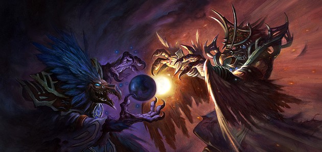
Look at those fingers, do they look like arakkoa fingers?
I gave u some examples.
And, about the colors - i said they are oversaturated. It seems like u used pure yellow and then aplied burn/dodge tools for shadows/highlights.
The effect is a white blob now. Where are the details?
So, the fingers should resemble bird-like ones. Bird fingers have a lot of details, observe some to see.
I don't say to make them like real ones, but, at least, to have an idea about shapes, colors, proportions.
Also, observe feathers and claws.
The color variation is poor, especialy on that effect.
U barely have two-three variations for each color.
This means that the shading is poor aswell, not only coz it's missing/lacking, but also, coz we can't shade properly with only few color values.
 
I can't dictate u what to do step by step, u have to learn urself, i'm not a teacher.
If u're not interested u'll never learn.
Read some 2D art tutorials and practice. Without practice and observation nothing good will come out of it.
If i was harsh, please excuse me, but i said these things several times and i saw no results.
Btw, what art program did u use?
 
Top