• 🏆 Texturing Contest #33 is OPEN! Contestants must re-texture a SD unit model found in-game (Warcraft 3 Classic), recreating the unit into a peaceful NPC version. 🔗Click here to enter!

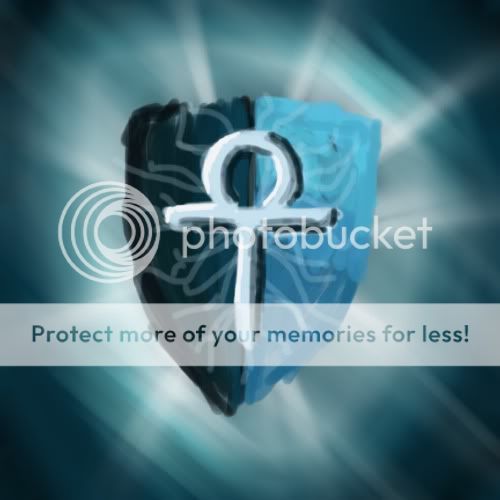
BTNAegisNew

This bundle is marked as useful / simple. Simplicity is bliss, low effort and/or may contain minor bugs.
Okie, so i said I will make an icon a day so here is a late submission for today :D.

It can be used as a shield, damage reduction or whatever, if you require any addiotional formats such as passive, feel free to ask and I will upload them :)

I think this is my best icon yet :D
Am open to criticism :D (Y)

Edited it so the shield is bigger. I like so am not going to change it anymore ^^


Keywords:
Aegis, Shield, Devine, Angel, Monk, Somnium, Glow, Protection, Protect, Hold Position.
Contents

BTNAegisNew (Icon)

Reviews
12:28, 16th Jul 2009 zombie2279: The concept is not bad. Try putting some more emphasis on the cracks, they get really lost on the full pic and working on the cross' shading after resizing. You can't really see its depth on the resized version...

Moderator

M

Moderator

12:28, 16th Jul 2009
zombie2279: The concept is not bad. Try putting some more emphasis on the cracks, they get really lost on the full pic and working on the cross' shading after resizing. You can't really see its depth on the resized version.

zombie2279: Rejected until updated.
 

The Panda

Icon Reviewer
Level 57
Joined
Jun 2, 2008
Messages
8,912
Review,
------------------------------------
1:Looks quite nice man,
2:Shield needs to be a bit bigger.
3:Also, the shield could use some more detail but it looks fine at the moment, good job.
------------------------------------

(All my recommendations to your icon, you can choose to use these or not, your choice.)
Thanks, Army-of-pandas.
------------------------------------------------
 
Level 36
Joined
Jul 1, 2007
Messages
6,677
The object itself is quality, but the glow could use work/removal. I suggest you zoom in to the object a little more so that it fills up almost all of the icon space, and then add some kind of effect around it, but make sure to leave some black background showing.

Right now it's a 3.
 
Level 9
Joined
Jun 3, 2007
Messages
185
huh ? What do you mean make it synchron ? xD

-Somnium

i mean that this shield is shown from front perspective, but the 2 sides (left/right side of the shield) are not synchron, you can also see that @ the fin al icon, so i´d suggest you to take an earlier version, mark one half of the pic, copy it, and mirror it. ofc u have to redo the effects after that.

attached an example of what i am talking about
 

Attachments

  • Aegis.jpg
    Aegis.jpg
    43.3 KB · Views: 73
Level 36
Joined
Jul 1, 2007
Messages
6,677
i mean that this shield is shown from front perspective, but the 2 sides (left/right side of the shield) are not synchron, you can also see that @ the fin al icon, so i´d suggest you to take an earlier version, mark one half of the pic, copy it, and mirror it. ofc u have to redo the effects after that.

attached an example of what i am talking about

I would agree with this, but now there's no shading at all. Maybe if you put some brightness on the top and some darkness on the bottom, it would look better. Remember not to screw up the saturation.
 
Level 5
Joined
Dec 12, 2008
Messages
141
your style of iconism is interesting... i like it! :p only reckon the glow needs to be a different colour or a larger area of white so shield stands out more
 
Level 8
Joined
Mar 28, 2009
Messages
247
Yeah guys i will remove those lines, make it jsut a litle smaller, and add the old background.

And yes my style of making icons is diffrent, I am inspired of Guild Wars icons, I just simply love them. Thanks for the support and i will not be able to make something today so I will do 2 icons tommorow.

Take care all.
-Somnium
 
Top