• Listen to a special audio message from Bill Roper to the Hive Workshop community (Bill is a former Vice President of Blizzard Entertainment, Producer, Designer, Musician, Voice Actor) 🔗Click here to hear his message!
  • Read Evilhog's interview with Gregory Alper, the original composer of the music for WarCraft: Orcs & Humans 🔗Click here to read the full interview.
  • The Hive's 22nd Icon Contest: Creep Abilities is now concluded, time to vote for your favourite set of icons! Click here to vote!
  • ✅ The POLL for Hive's Texturing Contest #34 is OPEN! Vote for the TOP 3 SKINS! 🔗Click here to cast your vote!
  • ✅ The POLL for Hive's Techtree Contest #20 is OPEN! Vote for the TOP 3 FACTIONS! 🔗Click here to cast your vote!

Zeth Holyblade (reworked)

This bundle is marked as useful / simple. Simplicity is bliss, low effort and/or may contain minor bugs.
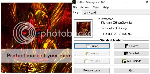
With the reworked skin, and newfound time to spend doing the occasional artwork, I've decided to remake the unit's icon as well.

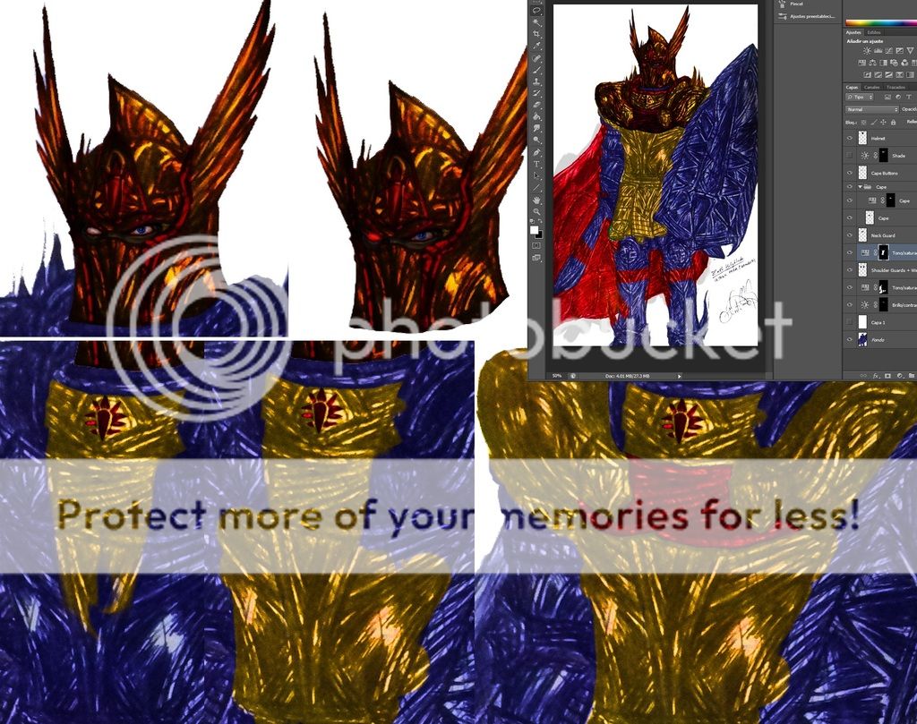
I'm currently coloring this piece, using a pretty interesting method I found out while experimenting with Photoshop... which pretty much makes coloring an easy chore since my hand-drawn artworks usually tend to have a lot of detail on them already.

:
dat%20coloring_zps10kllogs.jpg

Can't wait to finish it xD
Previews
Contents

Zeth Holyblade (reworked) (Icon)

Reviews
Panda
This needs alot of work here, try to make it not so scratchy and blurry looking. The dark reds all blend together and its hard to make out what this exactly is.
San
San
Too many line and details, the major issue remains. Icon goes into substandard as it has stayed in AU long enough.
This looks like Shar Dundred after he has taken a nasty bath in a blood pool.

I admire the effort you've put into line arts, but too much details won't work on 64x64's icons, sadly.
There is a lot of lines mashed up together and the overall red tone may confuse people, as the portraying unit doesn't stand out from the same red-ish background. I think they needs to be cleaned up.

The other icon of yours has clearer and cleaner lines and texture, we can easily recognize his portrait, it's the same helmet if I am looking right.
 
This looks like Shar Dundred after he have taken a nasty bath in a blood pool.
What are you--- Oh yeah, right, now I see it. Yeah, there are some similarities.

Anyway, yeah, it is looking good on the big picture, but as @San said, in 64x64 it is kinda difficult to see anything.
 
Back
Top