Community
Maps
Tutorials
Gallery
Support Us
Install the app
-
Listen to a special audio message from Bill Roper to the Hive Workshop community (Bill is a former Vice President of Blizzard Entertainment, Producer, Designer, Musician, Voice Actor) 🔗Click here to hear his message!
-
Read Evilhog's interview with Gregory Alper, the original composer of the music for WarCraft: Orcs & Humans 🔗Click here to read the full interview.
-
Create a faction for Warcraft 3 and enter Hive's 19th Techtree Contest: Co-Op Commanders! Click here to enter!
-
Get your art tools and paintbrushes ready and enter Hive's 34th Texturing Contest: Void! Click here to enter!
You are using an out of date browser. It may not display this or other websites correctly.
You should upgrade or use an alternative browser.
You should upgrade or use an alternative browser.
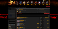
Why did the redesign make the site so narrow?
- Status
- Not open for further replies.
- Joined
- Jan 7, 2005
- Messages
- 7,551
I prefer the narrow width personally, full width always bothers me on forums since there's so much blank space on the posts, narrowing down makes it a bit more compact and cozy feeling. Would be nice to have both options I guess.
Yes, some toggle in user preferences would leave both sides content I bet. I have 2560px to traverse from side to side so I much fancy the narrow layout.I prefer the narrow width personally, full width always bothers me on forums since there's so much blank space on the posts, narrowing down makes it a bit more compact and cozy feeling. Would be nice to have both options I guess.
Tovio
Banned
- Joined
- Mar 12, 2016
- Messages
- 49
It's completely opposite in my case, this tightness and narrowness makes me feel a little bit claustrophobic.compact and cozy feeling
Last edited:
Fixed width makes a lot of things easier and ensures the site and e.g. subsequently map threads have less visual variance to them.
I got used to the fixed width during beta, so I assume you will too.
I'm neither here nor there but it seems the simplified icon artstyle doesn't go well with full width.
Not sure if there's going to be a toggle since it can lead to weird visuals, such as:

I got used to the fixed width during beta, so I assume you will too.
I'm neither here nor there but it seems the simplified icon artstyle doesn't go well with full width.
Not sure if there's going to be a toggle since it can lead to weird visuals, such as:
Ralle
Owner
- Joined
- Oct 6, 2004
- Messages
- 10,216
The current style was not designed with 100% width in mind. It was 1400px as what you're seeing now.
Making it a preference is a cool idea. But as of right now. The design does just not work properly in 100% width for multiple reasons:
So this is not to say that the site will never be full width again. But I cannot stand how Archian's design is broken by full width.
If you strongly agree with this. There is a fix you can make today. You can use something like Greasemonkey and change the CSS:
Making it a preference is a cool idea. But as of right now. The design does just not work properly in 100% width for multiple reasons:
- The header buttons look way ugly in full width.
- Posts show up in 100% width which makes it unreadable. There have been many studies confirming that 9-11 words per line is the sweet spot for readable text and we're way past that.
- Many things are way wider than what we wanted them to be. They just look ugly in full width.
So this is not to say that the site will never be full width again. But I cannot stand how Archian's design is broken by full width.
If you strongly agree with this. There is a fix you can make today. You can use something like Greasemonkey and change the CSS:
CSS:
.p-body-inner { max-width: 100%; }Archian
Site Director
- Joined
- Jan 1, 2006
- Messages
- 3,152
Indeed, being able to toggle between fixed and full width is a good idea. But...
As I've stated earlier, we plan on making a redesign of the menu. There are many things we want to use header for.
But as of right now, there are many other things that require our attention. So a new menu will most likely be a few weeks away.
As I've stated earlier, we plan on making a redesign of the menu. There are many things we want to use header for.
But as of right now, there are many other things that require our attention. So a new menu will most likely be a few weeks away.
I'm not sure if this is caused by the website being narrowed down now or not, but I didn't notice it before and it seems it could be:

The [2] streams notification box is cut in the quick navigation bar, and it's a little weird that it shows the navigation bar when the icons are right there where they normally are as well.
The [2] streams notification box is cut in the quick navigation bar, and it's a little weird that it shows the navigation bar when the icons are right there where they normally are as well.
Archian
Site Director
- Joined
- Jan 1, 2006
- Messages
- 3,152
This is a known issue. It appears to happen on diffrent sections of the site.The [2] streams notification box is cut in the quick navigation bar, and it's a little weird that it shows the navigation bar when the icons are right there where they normally are as well.
- Joined
- Jan 7, 2005
- Messages
- 7,551
I actually prefer the narrower width. The icons (Forums/Maps/Models/etc) were too sparse and it looked wrong 
I once thought of using Greasemonkey to make proof of concept themes for the Hive
I once thought of using Greasemonkey to make proof of concept themes for the Hive
- Joined
- Jul 10, 2009
- Messages
- 535
Absolutely feeling the same way. The narrow design feels quite uncomfortable to me (might be related to my issues with motion sickness, though).It's completely opposite in my case, this tightness and narrowness makes me feel a little bit claustrophobic.
Having the choice for 100% in the future would be perfect!
- Joined
- Dec 13, 2018
- Messages
- 2,372
Hold ctrl and scroll till you reach a desirable zoom distance. Works fine for me at a 1440 monitor.
- Joined
- Jan 7, 2005
- Messages
- 7,551
@FeelsGoodMan I like to use that trick too! Especially in Office 365 apps. 
- Status
- Not open for further replies.
Similar threads
- Replies
- 88
- Views
- 5K


