Review - Ungrateful Land
(Version May 10th 2023)
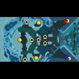
Synopsis: Ungrateful Land is a two-player melee map featuring the Icecrown Tileset. The map fails to meet standard melee criteria in its current state, and thus cannot be recommended.
Map Aesthetics: The Icecrown Glacier features some very gorgeous visuals, which is why it's a shame that they haven't really been utilized very well in the map. The tile usage is very simplistic and indeed, better tile usage is required. The dark and light-tones standing independently, some times over large areas, make the ground hard to read and my recommendation is to make it more natural looking, which also helps the visual readability. The placement of decorative props also poses issues as they lack the umph-factor to enhance the visual contrast between areas of interest and the background. Furthermore, some doodads (such as the Crystal) are hard to see, and thus should not be placed near walkable areas as stand-alone props. Something very weird is also going on with the Raise/Lower -tool around the map, giving it very unnatural look that is hard to work with. Regardless these issues there's a clear logic behind some areas of the map - such as ice-spike walls behind dragons or frozen crystal walls near the east-edge of the map. They're good ideas, just the execution is lacking and requires more polished finish to make them functional in a melee map.
Map Layout: The map layout is very unorthodox, having large portion of the map essentially locked away by long walk distance and partially by guarding creeps. Overall the map looks a bit too large for its own good. The fountain on the left seems unnaturally distant to grant any actual benefit (to overtake it one would need to unfocus from everything else that is useful on the map and disposition their troops immensely). There is quite a few very narrow corridors in the map that restrict a fluent movement of armies and overall the map is weirdly claustrophobic feel to it despite its large size. The layout also strikes as hard to read.
Neutral Objectives: The creeps fit their environment thematically, but the microplacement of the creep camps would benefit from polishing. Some creep camps are pushed too deep into hard-to-reach spots (green murloc camps near the murloc huts), whilst others are uncomfortably close to some pathways and should be pushed a little farther away if possible. A couple of the camps do not follow a general difficulty-reward curve and having a Level 8 Camp drop Level 2 Permanent and Level 2 Charged is too strong. I'd recommend going through all the creep camps and checking their positions and rewards. The layout also gives some neutral objectives very strange macro-placement (Fountain) and thus they probably won't see too much play.
Map Gameplay: The gaps between trees, inconsistency with item drops, and poor visual readability along with lacking visual aesthetics make the gameplay not so enjoyable. The biggest issue (with the gaps) is the difficulty of readability: narrow corridors are hard to spot and are often unpractical along with an unusual overall layout requiring the players to focus too much on reading the surroundings rather than what's important.
Notes: The map has potential but I'd urge you to enhance the readability of the map and try to see if you can find a few minor edits to the layout to improve the visual readability and gameplay flow. At the moment, the map layout looks cluttered and sort of 'unplanned'. Also, fix the other issues mentioned. Set to Awaiting Update.
Also, attach the screenshot to the description of the map instead of posting it as a separate comment.
 Awaiting update