

Feelings/Emotions
Brace yourselves, as we embrace in a big emotional hug and secrete sticky pink goo; it's time for a feelings contest!
Participants are to create a terrain that shows or captures an emotion/feeling, e.g. love, happiness, loneliness, anger, etc.

Some notes about the way that I judge.
1. I take creativity to be exclusive to the theme. You can be as creative as you want to, but if I don't see how it relates, it doesn't really help at all.
2. I am not as up-to-date with terraining and methods used. I can't always tell what models and techniques were used. Hopefully that doesn't hurt anyone in Detail or Technique.
3. Relating to 2, I don't judge heavily on technique and detail. You could make the most difficult terrain, but if it isn't as appealing as another it probably won't do as well. This doesn't mean I disregard how difficult something might have been. I would give higher points to a terrain that looks as good and is more complex/harder to make.
4. This should have been 1. Whatever. I do not judge on a bell curve. That means I judge each terrain separate from one another based on its own merits.
5. I have little time. I realllllly wish I could give you guys more feedback (next time I’ll do it in the thread as you post WIPs). Also these take me a long time to do; I give my scores serious thought. This also means that I antagonize over every rating. I always feel I haven’t been as fair as I should be, so believe me that I would take any concerns over my judging to heart.
6. On that note, I tried to be kind, complimentary, and constructive. I also tried to be honest. If I came across harsh, it was not intended, and I meant to be helpful. Sorry.
sigelang
CreativityExcellent job here. It definitely has a sense of foreboding and death. I would assume fear is the emotion most vivid here. Excellent use of fog and sky. 14/15
DetailGood use of doodads. Grass/brush was used well to create the forest floor, and props (everything that isn't nature) were not overused or misplaced, except for what I am assuming is a gargoyle in front of the moon. If it is or isn't, it takes away from the terrain. 11/15
TechniqueWhile none of the techniques used were very difficult or creative, they were used well. 12/15
AestheticsWhile the terrain meats the theme very well and is good in the other two categories, I didn't find it as strong aesthetically. It's a good terrain overall, but not a great one. There simply isn't a whole lot going on here. 10/15
Total47
Twilight
CreativityIt's very hard to tell what emotion the terrainer was going for. I got a sense of longing. Almost a memory one remembers fondly. The leaves falling really helped here. 9/15
DetailThere seems to only be a handful of doodads used in this terrain, and not to great effect. End of the world might not be visible, but one can assume it exists directly behind those hills. Better use of depth of field is needed. As stated, the leaves falling was an excellent touch. 6/15
TechniqueNot a lot of techniques here. Tile variation is present, which is good, but it could be better. Fog, sky, and lighting are all fairly basic as well. 5/15
AestheticsI gotta say, I really like those leaves. 7/15
Total27
Shadow Fury
CreativityThere really isn't much emotion going on here. 3/15
DetailI can definitely see some knowledge of doodad placement. Doodads are being clumped around each other, and each one seems to be placed with purpose. 5/15
TechniqueOne of the things that really hinders this terrain is the angle. It's difficult use techniques well when there is so little space. 3/15
AestheticsThe use of doodads is the strongest point in this terrain. The biggest improvement would be to find a better camera angle and zoom out so the textures don't stretch. 6/15
Total17
Edge45
CreativityThere seems to be multiple emotions here. I felt conflicted on what I should feel. There seems to be sadness with the man, but a sense of hope and joy with the sunrise. While this could be seen a more complex use of emotions, I didn't feel the execution (if it was intended) was well done. Overall I thought the multiple emotions took away from either one rather than add something new. 7/15
DetailStrong use of doodads, especially the use of the man. 11/15
TechniqueVery good techniques used. Strong depth of field, good lighting, and while tile variation wasn't prominent, doodads took it's place well. 12/15
AestheticsIt's tough to give this terrain a low creativity because it is a good terrain, it simply didn't meet the theme as well. 11/15
Total41
rushing_epic
CreativityThere really isn’t any emotion conveyed here. 3/15
DetailSome good use of doodads, it’s a detailed environment, but I find the swords an odd touch. As well I find it slightly busy and unfocused. 9/15
TechniqueSome good lighting is used, but other than that not much is present. 8/15
AestheticsIt’s a decent terrain, but it is slightly unfocused and doesn’t meet the theme well. 9/15 Total 29
Chaos.
CreativityThe sense of romance and love is almost overwhelming. Awesome job with the theme. 15/15
DetailGreat use of colour, and doodads are used well. The pond is a beautiful touch. 13/15
TechniqueReally good lighting and background. The use of reflections is perfect. While this terrain doesn’t have a particularly difficult technique used, it’s all done really well. 12/15
AestheticsIt’s simply gorgeous. My favorite part is the background. It’s subtle but a perfect complement to the foreground. No idea how it was created, but it’s great. 14/15
Total54
tobyfat50
CreativityThe sunrise gives this terrain a sense of peace and perhaps order, but the theme was the weakest point in this terrain. 8/15
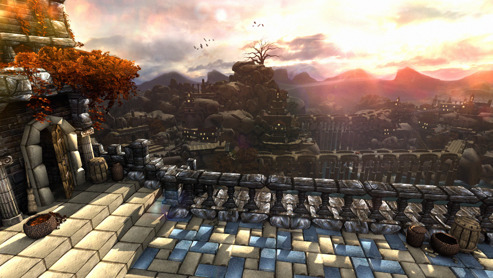
DetailAmazing detail. The city is very well built and the use of doodads on the foreground is even really well done. 15/15
TechniqueI was conflicted here. I really don’t understand all the techniques used here, and I’m going to give toby the benefit of the doubt and allow this terrain. I do have reservations about it, but since I don’t understand it and no one else mentioned it, I’m going to accept all the model work used. Therefore, amazing job again. The shadows and mountain background really stand out here. 15/15
AestheticsIt’s a really good looking terrain, however it almost doesn’t look like wc3 anymore. Especially the foreground. 13/15
Total51
fladdermasken
CreativityWhile I do get a sense of loneliness, it strikes me like the cubes have each other. I think one cube would have met the theme better. 9/15
DetailGreat detail. The cubes are really creative, the building is very well constructed (by cubes, nice touch), and the environment is very natural looking (which is good). 14/15
TechniqueLighting is excellent, especially on the building. The background has solid touches of doodads that really gives the viewer the sense that the landscape continues past what we see, which is something wc3 often struggles to do. 14/15
AestheticsI really like this terrain, although I still don’t know what to think or feel about it. Really tough one to judge. 13/15
Total50
Keiji
CreativityFairly strong sense of forboding here, more so than tension. 11/15
DetailGood detail, although I find the corpses off somehow. I think they need to be blended in a little more into the rocks. Hard to describe. 13/15
TechniqueSome good techniques used (tile variation, sky) but I find the lighting to be off. There I go being vague again with this terrain. I’m having hard time nailing down what bothers me about it. Sorry man. The eclipse is a really nice touch. 12/15
AestheticsA good terrain. The foreground is especially well done. 11/15
Total47
fladdermasken
Creativity 14/15
Very original idea. The best part about it is that the loneliness feel doesn't get thrown in your face right away, it takes a bit to notice it but it's definitely there and portrayed very well.
I tihnk the feel could have been stronger if the eye was further to the right side and/or if it looked up to one of the cubes.
Detail 13/15
The temple could have used some more love. Why isn't the entrance (and the window) square-shaped as well? Could have kept everything in cube form.
And while grassy landscapes can look to bloated very fast, some parts of the ground could have used a bit more variation.
Very well thought out tree placement.
Technique 12/15
Good sky work and a great lensflare effect. I'm not sure if it's because of the lighting or a blurry grass model but parts of the ground look off/unpretty.
It *could* have used another layer of mountains for more depth but it's not a must in my opinion.
Aesthetics 13/15
Chaos.
Creativity 15/15
Considering the theme, I'm very surprised that I diidn't see more surrealistic terrains. Very simple, very clever. and it portrays the theme perfectly.
Detail 10/15
Detail is a hard one for a picture that lives off its simplicity.
The reflection is a nice touch. The ground is too flat and the trees could have been more different.
The background would have also been a place to add some more detail.
Technique 8/15
Two major problems. The background is boring and not up to par with the rest of the terrain. The rays coming through the trees are questionable at best and the lensflare is badly executed.
Aesthetics 11/15
Keiji
Creativity 11/15
Certainly not a place I want to be in. It's definitely a very tense scene and kind of threatening, but not too much, which is a good thing my book.
So while the theme was captured very well I have to say that the whole skulls and a hanging person stuff is not a brand new idea.
Detail 11/15
The amount of details is very good, but it lacks variety, especially the midground (the ship-areaand the area under the hanging man). Some very small details in the foreground would have been a nice addition as well.
Technique 14/15
A close to perfect execution. There's pretty much nothing that I find wrong in the picture. A minor thing would be the ground near the ship that seems to be brighter than it should be.
But that's about it. The sky and the transitions between its different parts is absolutely amazing. The moon looked a bit weird at first but it does a fantastic job and is a huge plus to the overall picture.
Aesthetics 13/15
sigelang
Creativity 8/15
Scary, could be straight out of a nightmare in a way. But I don't know if it's just me but those skeletons sticking out of the ground look funny. Which is somewhat bad because it ruins the scary feeling the longer you look at the picture.
A dark forest with skeletons is also not the pinnacle of creativity.
Detail 8/15
The amount of details is okay since it doesn't need a lot. The gargoyle is a nice touch.
The sky could have been spiced up a bit and a few more rocks or branches, especially farer in the back would have been nice, it looks rather empty in the back.
Some more different details like the fence are lacking.
Technique 10/15
You would expect more trees in a forest like this, as in the horizon would be blocked by trees. The only explanation for your picture would be that it's at the edge of the forest which again makes you question why it's so dark. It also lacks depth now because the horizon is so close (edge of the world).
It's not a very complicated terrain but it was executed well and has only minor flaws besides the point stated above.
Aesthetics 9/15
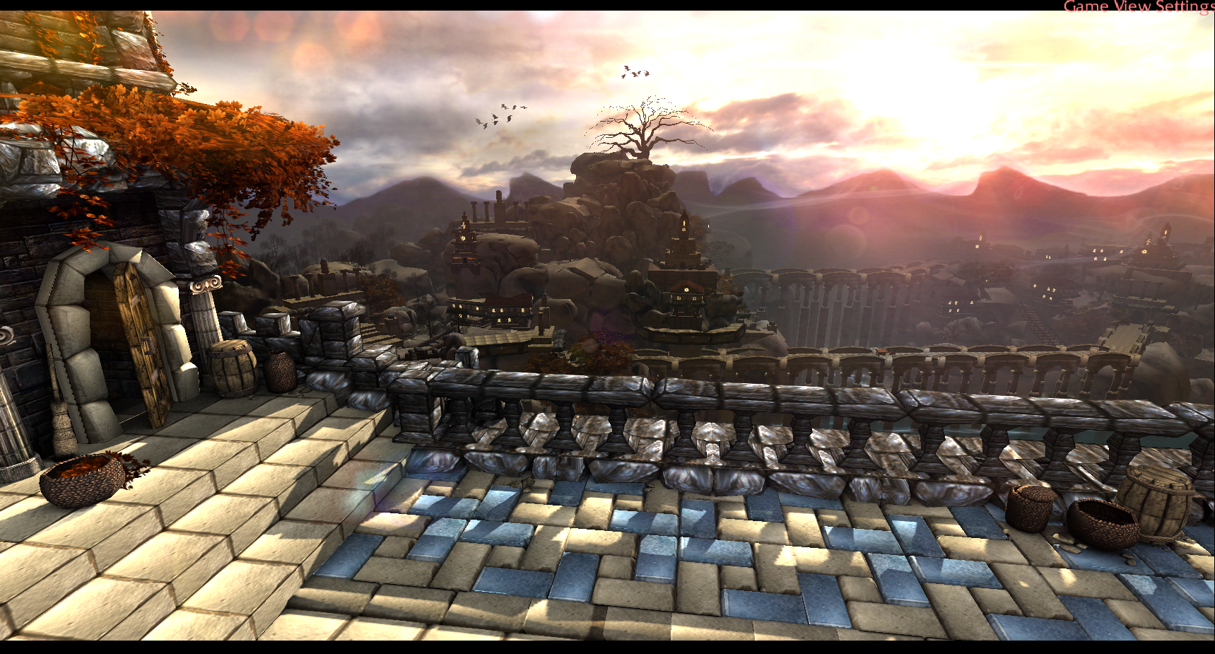
tobyfat50
Creativity 6/15
One of the entries where I had to take a look at the post to make sure which emotion is being shown, which is not a good sign.
The village at dusk/sunset thing can definitely work, but I guess it's usually better to go for a small, cozy village instead of a drawn out village with a huge landscape.
The idea is there and it's okay but other entries are doing a better job at conveying an emotion.
Detail 13/15
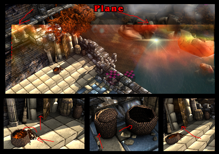
The foreground could use some small (smaller than the baskets) details. The horse and wagon the bridge is so cool, some more details like that throughout the village would have been great.
Especially the background is already very detailed though.
Technique 13/15
The only big problem is the railing. You have like 4 different stone textures just in the foreground and they fit more or less together but the one from the railing clashes hard.
The background could use a bit more color variation to add some contrast.
Besides that it's stunning. The effort put into the picture and especially the background is just great. Love the shadow work in the foreground.
Aesthetics 15/15
Edge45
Creativity 8/15
Solid. The picutre conveys the emotion very well on the other hand is that about the oldest idea in the book. It certainly hits the theme though which is the most important thing.
Detail 7/15
Details are sparse, especially unnatural ones. It's okay on the plant side of things. And the sky is too monotonous.
Technique 7/15
The right side is too empty or the left side is too cluttered, pick one. The sun effect is nice. The gorund lacks tile variiation and is too flat. Not a fan of that rock path in front of the house, the textures are very stretched. It also looks like the house is open and that there's nothing inside.
I like the contrast of the dark branch on the top right and the bright sun on the top left, there should have been more play with brightness in the picture!
Aesthetics 8/15
rushing_epic
Creativity 3/15
One of the entries where I had to take a look at the post to make sure which emotion is being shown, which is not a good sign.
I kinda see how it's supposed to be sadness, there are some "sad" elements like rain, a woman walking away and it's somewhat dark, but it looks more like tenstion. There might be a story behind the picture that explains the sadness but the picture alone is not really cutting it.
Detail 9/15
Besides the fact that the camera field is small, there are a lot of details. The bottom left side is a bit too cluttered, the background could have used some more love and that weapon rack is very questionable.
Technique 6/15
The picture lacks atmosphere, it should be darker and the fog more dense. The ground is too flat and the foreground is a bit too messy.
Also either don't use the game view settings or cut the text off.
Aesthetics 5/15
Twilight
Creativity 11/15
That's a nice idea, it feels very tranquil witht the moon rays reminding me of the actual Keeper of the Growth spell. Speaking of the moon rays, there are too many, a lot of leaves look good but a lot of rays don't. This kinda ruins the feeling a bit.
While the leaves, rays and the sky do a good job at conveying the emotion, the ground doesn't.
And I assume those are two people kissing in front of the moon (my eyes are bad)? That's cute.
Detail 3/15
There's a huge lack of variation, the amount of different doodads can probably be count on two hands. The ground also lacks tile variation.
Technique 4/15
The ground in the foreground is a bit too flat, the picture lacks depth, the fog and sky don't work together and the sky is too bland and also too dark compared to the rest of the scene.
The stars are a nice touch but they get lost behind all the rays and leaves.
That the text is awful (and it's also against the contest rules).
Aesthetics 6/15
Shadow Fury
Creativity 1/15
One of the entries where I had to take a look at the post to make sure which emotion is being shown, which is not a good sign.
I guess I can accept loneliness somewhat if I try really hard. But there's nothing really there.
Detail 8/15
The detail is okay, the doodad variation is pretty decent. Some more doodads closer to the camera are missing, covering the entire ground with grass doodads to hide the ugly tiles would have been another possibility.
Technique 7/15
The camera is too close up, tiles that are too close to the camera are very ugly. The fog density and color is well picked and gives a good forest feeling. The trees are placed well.
The worst thing is the camera, you can't see enough and it's holding the entire terrain back.
Aesthetics 5/15
((Votes / Total Votes) * 25) + ((2-P + Gilles)/Total Points Possible) * 75 = Final Score (cut to two decimals)
fladdermasken: ((7/77) * 25) + ((52 + 50)/120) * 75 = 2.27 + 63.75 = 66.02
Chaos.: ((16/77) * 25) + ((44 + 54)/120) * 75 = 5.19 + 61.25 = 66.44
Shadow Fury: ((0/77) * 25) + ((21 + 17)/120) * 75 = 23.75
Twilight: ((0/77) * 25) + ((24 + 27)/120) * 75 = 31.88
rushing_epic: ((1/77) * 25) + ((23 + 29)/120) * 75 = 0.32 + 32.5 = 32.82
Edge45: ((4/77) * 25) + ((30 + 41)/120) * 75 = 1.3 + 44.38 = 45.68
tobyfat50: ((31/77) * 25) + ((47 + 51)/120) * 75 = 10.06 + 61.25 = 71.31
sigelang: ((7/77) * 25) + ((35 + 47)/120) * 75 = 2.27 + 51.25 = 53.52
Keiji: ((11/77) * 25) + ((49 + 47)/120) * 75 = 3.57 + 60 = 63.57

4. Keiji
5. sigelang
6. Edge45
7. rushing_epic
8. Twilight
9. Shadow Fury
5. sigelang
6. Edge45
7. rushing_epic
8. Twilight
9. Shadow Fury
Thank you Gilles and 2-P for judging the contest. Thank you all participants who submitted entries. Meet you again next time.
And thank you fladdermasken for taking care of all the mumbo, jumbo contest hosting and calculations and shit, ta.
Contest | Poll (click here to view the entries)
