Detailed Review
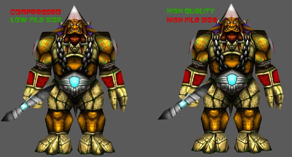
As far as concept go, it doesn't really look a lot like a sea giant any longer. It's more of a sunken ruins (as in the tileset) golem. Although it packs a warlord feeling, it seems more like some outer force has given him things they can't make themselves - particularly the teal lights on the metal pieces as well as the eyes.
Otherwise, it's a little bit too colourful, a few too many colours have too much saturation. I've personally come to the conclusion that any WC3 unit is best represented with only one strongly saturated colour. If that colour is a primary colour, I like to dampen the team-colour to avoid too much of a clash. You have green, blue, orange and purple in fairly high saturation, making it look very colourful. The grey metal also contributes to this problem by not being saturated.
I'd suggest you go for a seagreen colour for the skin, so that it matches the sea giants better while still maintaining the contrast you get from the blue lights. Then I'd probably make the blue lights a dim orange and make the metal ornaments like the rock armour. Apply the seagreen to the face fins as well. This will give you a less colourful appearance, it will look more like a Sea Giant, and it will still be a warlord.
Anyway, that's just my idea, and I'm by no means more correct than anyone else. I've just been doing this for a very long time and I think this would be better, although probably be less original. If you want to keep the orange skin, I would make the armour contrast the skin and still get rid of the metal parts and lights. Metal armour and rock armour in the same skin doesn't really fit.
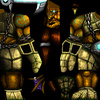
Finally, I just needed to add some praise in the end, because the execution is very well done, and the shading is fairly appropriate for WC3. The level of detail is just where it should be as well, and it wraps smoothly from what I can tell by the previews.


 Approved


