• 🏆 Texturing Contest #33 is OPEN! Contestants must re-texture a SD unit model found in-game (Warcraft 3 Classic), recreating the unit into a peaceful NPC version. 🔗Click here to enter!
  • It's time for the first HD Modeling Contest of 2024. Join the theme discussion for Hive's HD Modeling Contest #6! Click here to post your idea!

Report/reply confusion on profile page

Status
Not open for further replies.
Level 17
Joined
Apr 5, 2011
Messages
324
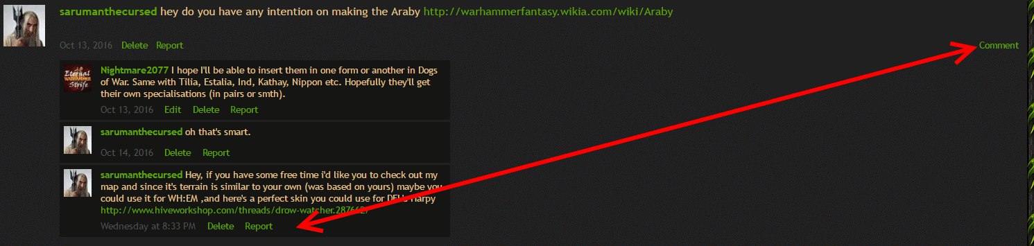
On the profile page, I've recently accidentally reported a message that I meant to reply to. And this evenhappened twice... I can imagine there are people who are tempted to make the same mistake daily. Such missclicks should really be much harder. The word "report" looks almost exactly like "respond" at a glance, and the button is right below the message; whereas the comment button is very VERY remote in right hand corner. This is just begging to be misused.
Can we do something about it? Make report button in red colour, or anything really...
PjJJgmcCRnE.jpg
 

Deleted member 219079

D

Deleted member 219079

If you happen to use Chrome, you can try this Stylish snippet:
Code:
a.report { color: #535454 !important; }
Or replace the #535454 with "red" (no quotes) if you rly want it red..

So my suggestion: make it blend in with the background, you don't mistake it for common feature.
 
Status
Not open for further replies.
Top