• Listen to a special audio message from Bill Roper to the Hive Workshop community (Bill is a former Vice President of Blizzard Entertainment, Producer, Designer, Musician, Voice Actor) 🔗Click here to hear his message!
  • Read Evilhog's interview with Gregory Alper, the original composer of the music for WarCraft: Orcs & Humans 🔗Click here to read the full interview.
  • The Hive's 22nd Icon Contest: Creep Abilities is now concluded, time to vote for your favourite set of icons! Click here to vote!
  • ✅ The POLL for Hive's Texturing Contest #34 is OPEN! Vote for the TOP 3 SKINS! 🔗Click here to cast your vote!
  • ✅ The POLL for Hive's Techtree Contest #20 is OPEN! Vote for the TOP 3 FACTIONS! 🔗Click here to cast your vote!

Raise da Dead!!

Status
Not open for further replies.
Level 9
Joined
Jan 1, 2007
Messages
220
lol i got bored thought so i thought id draw something and i hadnt visited the hive in ages since ive0 :confused: been pretty occupied with other stuff, but thought i might upload this really quick thing i might work on it more idk ill see when i get more spare time i guess.

sorry if its a bit bright to see
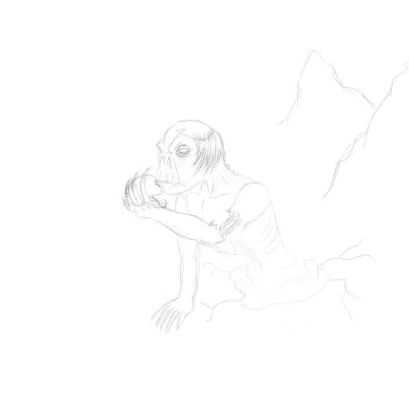
ghoulwip.jpg
 
i got 1 question i got 2 computers 1 i work on and 1 i dont i look at my avarta on one of them and it seems fine the colours and all but then whe i look at it on my laptop it seems really dull and grey i just wanna know what u guys see >.< so i know wether to raise or lower the contrast one either of my computers :confused:
 
To be or not to be :) If u are drawing it digitally then my advice is to never use white background . It is not just bad it is dangerous for your eyes !

You forgot to mention that working on the white background gives a bad impression of contrast while you work, which can result in horrible contrast once the piece is done. That's why you start from the black background
View attachment 1225157340
Notice how that gray looks darker on the white background.
 

Attachments

  • example.PNG
    example.PNG
    561 bytes · Views: 154
@HT: yarr, separately it would have a greater impact and also it's a bit too small.

@INF3RNO: Your av does seem a little undersaturated, although that could be just me. And yeah, white background = bad, try a warm grey or a coloured background.
 
Status
Not open for further replies.
Back
Top